Portfolio Research
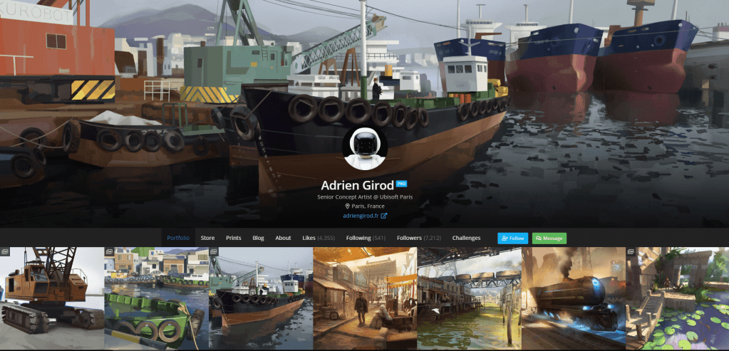
This image presents us with an online portfolio featured on art station that belongs to a senior concept artist, the first thing we see when looking at this portfolio is a wide array of art pieces produced by the artist, there is also a blog present on this profile that presents a project they have been working on within the games industry. What I like about the layout is how it has been designed to open up straight into the portfolio which prevents the viewer from having to search the profile for this section, the portfolio presents a number of impressive artwork whilst the font on the menus and the about section remains simple and does not stand out as extravagant as this artist wants you to focus solely on the quality of their artwork. The layout is easy to navigate between sections as they are all presented in the same location and are placed horizontally preventing you from having to pro long your interaction with the UI attempting to find the section you wish to look at. Despite the vibrancy of this senior concept artists portfolio work there is the presence of a bland background as it is entirely black with only the top banner of the profile holding any scenery, although this is a feature that I criticize its purpose could be to not cause any unnecessary distraction to the viewer and make them focus only on the work in the portfolio so that they do not spend too much time admiring their layout and background. The menus are simple and state what their purpose is through singular words as to not over complicate things and avoid causing any confusion in the viewer, this allows us to easily navigate the profile and find what we are looking for within each section thanks to the contextual simplicity of the menu titles and layout. One more thing though that I have to criticize about the portfolio for this senior concept artist is how disorganized their work is laid out as we do not see any titles or even annotations present on any of the art pieces which fails to give us any context as to what it is we are looking and why it was created, although we see impressive and intriguing artwork I do believe that it could have been better presented with the inclusion of annotations and titles that would tell the viewer what the image is presenting.
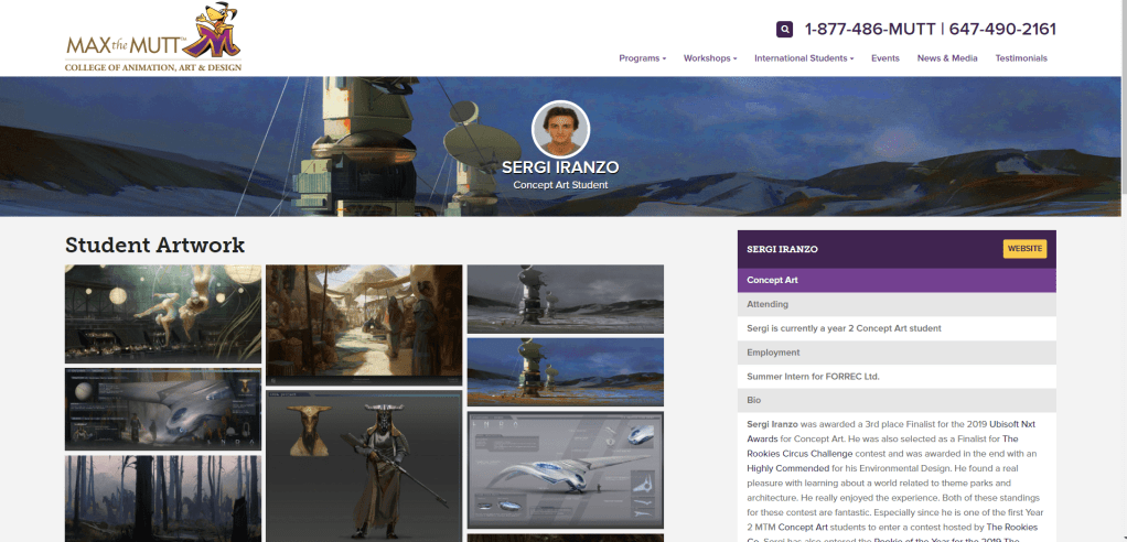
In this portfolio we can see the concept art produced this time not by a senior concept artist but a student instead. For this portfolio we are given context as to who this artist is making us feel more connected to their work than with the previous portfolio I have viewed, I am not able to see any menus or areas for me to navigate and so this portfolio is kept simple with the exclusion of a blog and the sole inclusion of the impressive art work they have produced. Whilst this keeps the portfolio simple and straight to the point the inclusion of a blog could help them stand out more as it would allow them to document the process of their concept art allowing us to get a view of a hands on experience rather than just being presented with the finished product. The background for this portfolio contains the colour white and purple which helps to make it stand out more so than the previous portfolio as this makes the whole thing brighter and more eye catching for the standard viewer and despite the lack of any menus this does create a positive factor which is the fact that the viewer does not have to put in any effort to navigate through the portfolio and has everything present on the page laid out before them making the need for a search unnecessary. The header image presents us with an intriguing piece of concept art showing us some of the students best work that immediately grabs the attention of the viewer and entices them into viewing all of what they have to offer on their portfolio. Whilst this portfolio still lacks annotations as does the previous one we are still given a biography that introduces us to the artist and provides a degree of context that tells us why the artwork was created and what purpose it serves. The font type once again remains simple and bears no intriguing or eye catching features with the reason for this possibly being the fact that this concept artist still remains a student and is only interested in us viewing his concept art pieces but overall the portfolio is presented in a straight to the point format that allows us to easily find everything we are looking whilst gaining some bonus context about the owner of the portfolio and their artwork.
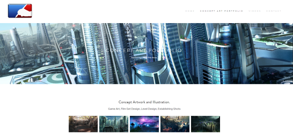
In this portfolio we are presented with the concept art produced by a professional within the industry, the first thing I have noticed about this portfolio is how much more organised it is than the others with the presence of headers that separate differentiating artwork from each other such as the first section presenting concept artwork and illustrations that then moves onto another section showcasing matte paintings and various other pieces of artwork. This layout makes it much more easier to tell what each art piece is as we know now what purpose it serves and whether or not if it serves a final design or an initial level concept. The font for this portfolio is also a different style to what we have seen in what was previously viewer with these font for this text taking on a more solid and professional presentation in a style that looks attractive and stylish whilst maintaining a suitable presentation that fits the portfolio. The background colour holds no specialties as it remains a cream white texture which whilst it looks relaxing and emits a comfortable aura around the portfolio it does fail at what I believe to be holding an overly bright presentation that could cause strain for some viewers when they look at but despite this the texture makes me feel comfortable with the portfolio and encourages me to view the vibrant artwork that makes up for the lack of background colour. A negative aspect that I can see on the header of this portfolio is the colour of the text as thanks to the presence of a concept art piece taking up the background space behind it this has caused the white text to blend in with the background making it hard to see and so this prevents the viewer from being able to read the title of the page which could be easily fixed through the use of a darker colour for the text. This portfolio also neglects to include a blog that could detail a step by step process for some of the artwork as well as any information about the artist themselves, but despite all this the portfolios layout and presentation remains my favourite out of the 3 and holds a style that makes me feel comfortable and makes me excited to view the rest of the page.
Portfolio Providers
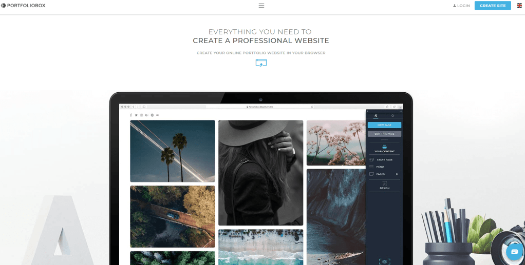
This portfolio provider can be found under the title portfoliobox. This portfolio provider allows you to create a free online portfolio for no price at all that has a professional presentation and has an interesting layout that catches my attention although it seems more oriented towards use by professional artists and not so much for students as the style and layout are not as simple as what you might find on portfolio providers such as art station whilst portfolio box seems to appeal more towards free lancers and professional artists looking for opportunities to expose their creations so that they can gain attention and possible work opportunities. This provider whilst appealing and having an interesting design will not suit me personally as I wish to use a more student friendly and orientated site.
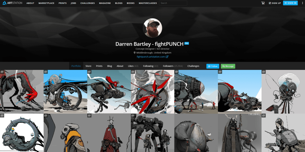
In this image I am presenting a portfolio that is available for viewing on the online portfolio provider Artstation, this site allows you to professionally present artwork to a large audience that may include 3D modelers, fellow concept artists, and game developers. This site is one that I hold a great interest in due to the simple layout available for you to use which allows the viewer to navigate between sections easily without getting confused as to which header is which, another reason why I like this site is how you can set up your portfolio as you can group individual images into albums and collections which helps to lessen the amount of images you see popup at once and lets the viewer navigate through the images in a more organised and less overwhelming matter. This online site also has free membership and is appropriate for students looking to expose their artwork.
In the end I have made the decision to go with using art station as my portfolio because it is a site that I personally have used to gather reference material in the past as well as holding aesthetics that I visually appeal to me. Another reason why I have chosen art station is due to the vast amount of concept artists that use as this shows that it is an appropriate provider for my chosen profession that has the potential to gain me a large audience for my work.
