Week Number & Date:
Week 3 16/02/2020
List of Tasks planned for this week:
Produce 2 initial Vampire concept sketches
Photobash reference images
Simple character design drafts
Current Position –
- What did I do this week and why did I do it? (Screenshots/Videos/Photos)

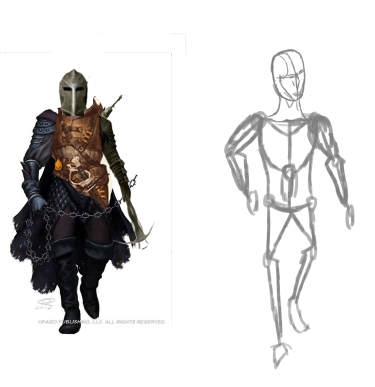
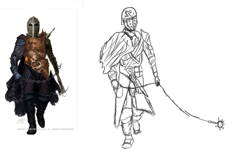
In this first image I have begun sketching out the rough outline of my first vampire concept of which I am using a reference for which can be seen to the right of my sketch. This outline has been produced to allow me to implement the detail onto the correct proportions of the character that I have in mind and will help me with developing the pose and stance I need for the character as with the outline I do not need to start detail from scratch and can just use photoshop to lower the opacity and then add a new layer which will allow me to draw the detail over it whilst taking inspiration from my reference. The reference I have used was chosen as I need to take inspiration from a visual source that can influence the design of my concept as thinking of a character from scratch is often time consuming and can result in difficulties whilst using a reference allows you to produce concepts quickly and without any complications.

This next image also shows a similar figure to what I have sketched above and presents an outline for my second concept that has been produced also with the use of a reference though it is not visible in this screenshot as the outline I have created presents a different stance than what is visible in my reference as I would like to create my own stance and posture for this concept whilst the reference will be used only to influence the implementation of the detail. Whilst this outline is very simple it does give me a structure to work with and does not have to be followed fully as once I get the grasp of the proportions it assists me with I am free to design my character how I please and can change the position and posture to my desire.

After producing the outline that is visible in the first image that I have annotated I since then have implemented visual detail which completes the sketch as a simple character concept that I can use to influence further designs and what I like the most about this simple sketch is the way in which I have concealed his hands whilst making them look as they still belong there without any altercations in the design and this cloak is a feature that I have practice with on numerous personal designs since the beginning of the course and I believe with further refinement I can make this cloak apart of the finished piece and produce it to the characters advantage. Whilst the legs are simple and don’t hold much detail this is an area that I was not focusing on for this design and so the detail has been focused primarily on the head, face and center mass locations on the vampire which has led to a finished simple sketch that serves to boost my confidence in character design as well as creating an illustrated stance for my drawing.

For another outline I have decided to produce it using a different shade of colour as I would like to experiment with colour coding different sections of my design and so for this outline I have sketched it out in a light blue using simple shapes to construct the basic anatomy of my character whilst placing it in an appropriate stance that will allow my concept to be more illustrated as well as interesting to look at rather it just being a dull t pose from an uninteresting design. This sketch has given the proper anatomy and structure I need to move onto my next stage and produce another character concept which can be used to serve as a personally created reference.

After the production of the above outline I have used the anatomy I have structured as well as the reference I gathered I’ve now produced another sketch showcasing a basic concept that could be used as inspiration for a final product for my character design, I have once again used different colours for each area of this design and this has been done so I can draw attention to certain areas of this sketch as well as being able to see the detail that I have implemented more easily so that I can change it without encountering any complications of it overlapping the base outline.

This next concept presents a more illustrated and polished sketch which showcases a concept for my vampire character design performing an action of movement which is an area that I am aiming to gather more skill in due to not working often with postures in my drawings and what I like about this initial design is how I have structured the waist and center mass as I have managed to make it look consistent and fit together without causing any irregularities in the design and whilst there are areas that require improvement this concept still serves as a suitable staging area for progressing further into designing initial concepts for my ideas generation.
- What did I find difficult or easy?
The tasks that I found easy this week was the production of my initial sketches and whilst I have kept them simple in a rough design they are still effective at forwarding what I have visualised for a final product and can be used to influence the final development and lead to the creation of a high quality art piece.
- What tasks didn’t I complete from this week?
This week I was unable to begin work on photobashing as I instead focused my work on producing a number of initial sketches that will be serving as references whilst I also failed to create the additional sketches I have planned but these will be completed in stages over the next few weeks.
Planning for next week –
- How do I plan to catch up? Do I need to change anything about my work or planning?
I need to focus on individual tasks and work realistically whilst maintaining an effective development blog that shows my work effectively.
Week Number & Date:
Week 4 24/02/2020
List of Tasks planned for this week:
Produce 3 Photobashes
Initial Character Sketches
Monster Hunter Concepts
Current Position –
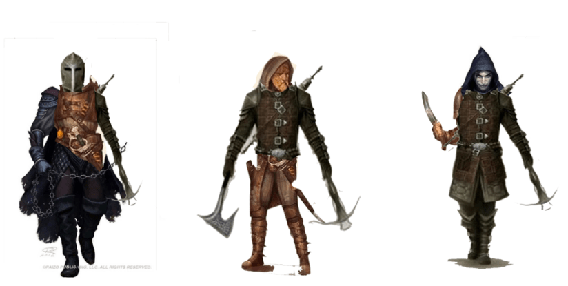
In this image I have produced 3 characters using the photobashing technique which involved me gathering a number of existing art pieces and then cutting off bits and pieces and attaching them onto other characters to create a new unique appearance and the reason why I have chosen to go with this technique is that it is easy to do and requires little time allowing you to get effective results that present a series of initial ideas that you can use to further develop your product and what I like about this photobash is how I have created a series of monster hunter characters with each one bearing weapons and armour with an intimidating posture or facial expression and this session has shown me how I can implement multiple features onto one another and keep the design consistent and realistic without any eye sores standing out in the imagery.

This screenshot shows the original images that I used for my photobashing before the session started and each one presents a different variant of monster hunter making them suitable samples for my photobashing and I have included the original imagery to show where I received my ideas from and how I developed them into alternate appearances using their existing features.
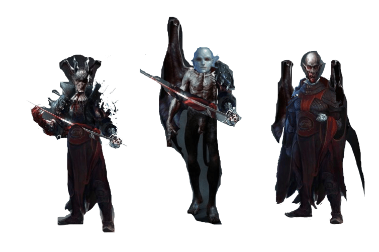
In this next photobash I have focused on creating concepts for my vampire character which I’ve gathered a series of images from the genre titled dark fantasy which provided me with dark character concepts that are out of the norm for ordinary fantasy and so after collecting this pictures I have removed and pieced them together just like in the image above to create simple yet effective and plausible references that I can use to further my blogs development. The creation of this photobash was possible due to the tools and functions available on the application photoshop where I imported all of the images I found on the site pinterest. With these photobashes completed I can now move onto developing more sketches using these references that I have finalised myself.

Showcased here are the images that I have used for the screenshot that I’ve annotated previously and this has been done to show what the original art pieces that gave me assistance looked like before I manipulated them into a photobash, it also shows where I got my ideas from for each concept pictured in my photobash and provides the viewer with an insight into my concurrent work flow.
After finishing my sessions on photobashing I have now moved onto using these creations as references that can influence the production of a rough initial concept and so the vampire hunters that I have experimented with are now being put to use towards producing a series of initial sketches focusing on this character design and in this image you can see that I have produced a simple basic outline positioned in a similar pose to that seen in the reference, I do not want to make it an exact replica as I aim towards making my own design and so I am only taking inspiration from what I have as visual aide, after producing this outline I can now move onto implementing various features of detail to bring this concept to life and get the result of a rough sketch.
As seen in this image my reference from the photobash has been extremely helpful especially with designing a pose and posture for this character and what I like about my sketch is how I have used a lining to drape over his right arm and part of his chest as it gives him that lone wanderer sort of appearance and implements an aura of mystery whilst the long flail attached to the rope held in his hands outputs an intimidating atmosphere as it shows they are not a peaceful individual and are on the hunt. Besides being successful in designing an effective rough sketch which has provided me with very satisfying results I did struggle in the design of the head and so instead sketching the helmet as seen in the photobash I have used a design previously used by myself in a personal session I conducted a few months ago which served as a suitable replacement and made my design more personal due to using one of my own creations in 2D art. Overall this was an effective session and provided me with good results and so my photobashes will continue to serve as references before I finish my ideas generation and move onto the development of my final product.
For my next sketch I have utilised another photobash as reference from the number that I have available and has been used to help me produce a sketch once again focusing on the monster hunter character that I have outline within my proposal and this sketch has heavy inspiration taken from my photobash as this is one of my favourite experiments and is one that has provided me with improved results that is noticeable in some of my previous sketches and what I like the most about this design is the hood and face design as these are areas that I normally struggle with especially the facial hear present on the bottom of the mans face and so successfully implementing this opens up my final products development to many more possibilities as with this practice session done I can now implement hair and facial features more effectively than I was previously able to. Besides the satisfactory results of the face I am not too keen on the body that I have produced for this concept as it is not consistent with the head of the character and so it stands out as an irregularity and will have to be resolved in my next phase of ideas generation.
Once again focusing on my vampire hunter concept I have utilised another photobash from the range I have available for reference usage and this one as before influenced the outcome of this concept heavily. For this concept I replaced the face with a mask as I attempted a few previous designs and wasn’t happy with the outcome and so I have instead replaced it with a mask that allowed me to focus on designing the hood and progression onto the rest of the character. Overall for this design I enjoyed creating the hood which wraps around the head as well as the pieces of armour presently attached to the legs whilst the feet stand out as irregular and need improvement and so this design will only serve as a simple concept which has shown me the areas that I still need improvement on and what details I am currently neglecting.

Further progression now leads me to using imagery to focus on the production of sketches for my vampire and have chosen to not use my photobashes as I feel the stand alone art pieces I have found as research are more beneficial to my development process and so I have focused on only one art piece.What I like about the design in the above image is how I have used the brush tool to add a sketchy like overtone which makes the character appear in a rough yet gritty atmosphere that allows them to stand out as a well inspired art piece within the fantasy genre, what I also like is how I have come close to resolving the issue of designing a waist for my characters as this is an area that I have previously encountered issues with and so using a new technique in this product I’ve now stepped over this problem and created a successful simple sketch showing my concept in a unique style though it still lacks certain amounts of detail and texturing this piece does only serve as a simple reference for future work and so it will remain as a rough and unpolished design to show me where I need to develop further.

For my next vampire concept I have looked at graphical art pieces that present interesting concepts that I can take inspiration from and although I am going for a more dark fantasy approach with my design than a Victorian esque style I do still have an interest in this art style as the above sketch I have produced presents a unique approach to designing a character in this genre and what I like the most about my concept is how I have managed to keep consistent proportions that are reliable to one another as well as the process of implementing certain details such as the markings on the clothing. Whilst I have enjoyed creating the detail for this image I’ve also implemented an amount of shading which is mean to present creases and overlapped areas of clothing that are present on the cloak and the way in which I created this is through the simple process of using the stylus to colour in areas of the design using a light grey that gives off the effect that I was aiming to implement and so overall this design is one of my favourite initial concepts and is definitely one that I will be using to influence my development.

In this next concept I have focused on creating a more illustrated character where I’ve directed my attention to implementing small and high amounts of detail that work together to present an eye catching and unique character who presents vampires in an uncommon format. What I like the most about this design is the way in which I have sketched the center mass and connected it to the arms as the structuring is appropriate and gives them the proper dimensions necessary to be able to have arms and a waist of suitable length, although I have inadvertently sketched one hand to a smaller size than the other I am pleased with the center mass design of this character as the line art makes sense and connects to all areas making a competent and intriguing that also utilises an external feature I have not yet experimented with which are wings and I enjoyed implementing these as they add an aura of personality and dark atmosphere to this design and give me something to consider for further development in future phases of this project.


After the production of the previous concept that I have sketched this next image presents the initiation of my colour ideas and what I am producing for this section is 3 vampire concepts alongside 3 Vampire hunter concepts as I would like to get experience in texturing my concepts and experimenting with different brush types and colours that can present a character in a unique stance. What I like about this current colour idea is how I have managed to implement a dark pale looking texture that makes the Vampire appear as an ancient worn out being who has an evil look about themselves and what I’ve also experimented with in this concept is giving them a gaunt appearance which I have done through mixing a number of blues and greys together along with some purple tones to get a pale dark skinned texture that envisions what I am aiming to improve for my final product. In the images next to the finished idea are my outline and sketch which show how I have started off this design and what I used to construct the proportions as well as the stance that appears in the fully texture character, this shows my flow of development from the very start of this session.

For my next texture idea and sketch I have decided to produce this concept using a more illustrated appearance with a number of new features such as armour and extra items of clothings that make them more polished and to start out this design I have gathered a reference from pinterest to use as a reference and used this to inspire the production of a simple outline that gives me a stance to work with as well as proportions and limbs that have been scaled suitably. Despite this outline helping me with the design of my character I could still improve the waistline as this is a common area where I find the majority of my struggles when designing the proper length and height of a 2D character.

To make this sketch a finished colour idea I have now implemented a texture onto this design and for this I have tried to use a dark colour scheme that gives them an aura of evil and makes them easily identifable as a vampire and fit in with the fantasy genre. For this design I have once again decided to implement a cloak which can be seen in two segments draping across the chest plate of the vampire of which I have given a golden texture using two tones of yellow and overlapping certain areas within the cloak whilst on other areas of this design I have attempted to make them look similar to existing armour so that the design has a realistic appeal to stand out to my audience and not go too over the top with a fantasy concept. Though I do like this design most notably the head I see some areas standing out such as the waist which is an area that of my artwork that I need to focus on improving.
- What did I do this week and why did I do it? (Screenshots/Videos/Photos)
- What did I find difficult or easy?
The tasks that I found easy this week was the production of my photobashes as this was a simple and quick task that I am very experienced with and so I was able to finish this within a suitable time frame and provide myself with additional references that increase my creativity.
- What tasks didn’t I complete from this week?
This week I was unable to begin production of my turn around concepts as well as finishing my texture ideas.
Planning for next week –
- How do I plan to catch up? Do I need to change anything about my work or planning?
Next week I plan to finish all of my texture ideas and begin focusing on my turn around concepts and colour ideas
Week Number & Date:
Week 4 02/03/2020
List of Tasks planned for this week:
Finish texture ideas for Vampire
Start and complete texture ideas for monster hunter
Begin turn around concepts and colour ideas.
Create a colour palette for Vampire Character Design
Illustrated Outlines
Design emblem and independent assets
Silhouettes
Current Position –
- What did I do this week and why did I do it? (Screenshots/Videos/Photos)


To start off this next week of my problem solving tasks I have finished the last of my Vampire colour ideas and sketches and for this one as seen in the above images has started out a simple outline that serves to give me the necessary pose and proportions I need before I start to implement the detail and texture. After the completion of this simple outline I then focused on producing the basic sketch which serves as the first skeletal structure of my concept and after this I went over it with a brush set to 100% hardness which is because it will give me a more sketchy and refined look to my line art and give this image a more polished appearance. Whilst using this brush setting I moved onto implementing additional features of detail to make this design really stand out such as the lumps on top of the vampires head which I have decided to include purely for cosmetic reasons, as well as these lumps I have decided to design this character in a way that they appear as if they are a traditional victorian style vampire and so they wear a large cloak which drapes around them all the way to the floor covering up the legs and feet whilst bearing symbols representing the vampire whilst the ears present on the side of his head are sharp and pointy protruding upwards in such a way that they may appear as almost elven like. After the implementation of this detail I then moved onto the final texturing process which I believe has gone rather well due to the detail I previously inserted onto this character and what I have done for this texture is used a variety of reds, purples and dark yellows to bring their clothing to life and give it a dark atmosphere whilst the red eyes and dark grey around them give that vampiric appearance necessary to allow them to be presented within this genre. Overall I did at first struggle with this design as the structure of the head and face changed multiple times over the course of this concept but in the end I was able to get a look that I am happy with whilst the rest of this design went smoothly with most decision making taking place primarily on the texturing of which I had to use a variety of references before making any final choices.

In my next colour idea I once again began the production with a basic outline though which gave me the necessary scale and proportions needed to be able to fully design a 2D character and after successfully accomplishing this I then moved onto implementing the large amounts of detail needed to give this character a polished and stylized appearance that fits them into the genre my project is revolving around. During the creation of this concept I encountered a number of obstacles such as my distaste for this design and the struggle of implementing the legs and arms. These struggles are the reason why this is not a finished concept as I spent too much time on this concept and so made the choice to just texture what I have done at this point and then move onto the next phase of my problem solving and although I dislike this design there are a few features that appeal to me such as the colour tones I have utilised in the texturing of the face. Although I have not had much success with this concept it has shown me that I need to be able to manage my time better and not get caught up in obstacles that I am struggling to resolve and so for my next step I will be able to encounter less issues and gain more effective results for my ideas generation.

In this next image I have chosen to work on something else before finishing my colour ideas as I would like to expand upon my problem solving and practice with more designs and in this session I have produced a quick simple concept of armour that I could use for my Vampire hunter though of course a finished version would be more considerably detailed and this image only shows a rough draft of how this idea is visualised and what I like about it is the waist area as it has a leaf like design which overlaps one another in certain areas whilst the shoulder pads also stand out as effective areas of protection. One aspect I need to improve upon is the side of the armour so that it can have a more 3 dimensional appearance with a realistic texture.
In this next image I am presenting a sketch that I have produced that shows a fantasy helmet that would go well suited with the armour that I have designed previously. This sketch has been produced as designing helmets is an area that I would like to improve upon due to my interests in including for my final product and so for this session I looked at a small number of references and then worked to produce this simple sketch which has given me more insight into the production of assets such as helmets. What I like about this sketch is the engravings I have implemented onto the face plate which add a unique personality of character to this design and makes it more independent from other concepts that are currently existing within the fantasy genre.

Pictured above is a face design that I have worked on focusing around a vampire and to produce this one I wanted a more vampiric feel and decided to view a step by step guide online just to expand upon my current technique of designing a head and although this design isn’t one that I am to keen on pursuing it did still provide me with extensive context as to how certain areas should be re worked using my own technique such as the mouth and lips alongside the ears, nose and eyes. The lessons that I have taken from this will be applied to my future tests pieces and I will refer back to this image when it comes to producing a developed drawing that will precede my final product. There are multiple areas that need improvement but overall this was an interesting session that allowed me to practice with a more realistic and polished style which will help me progress further in my ideas generation.

After producing a semi realistic drawing I then decided to produce a series of silhouettes as I have not treaded into this area much since starting the project and so I spent a few moments sketching out silhouettes in black using various poses and proportions for the characters. The reason why I chose to produce these is due to the aid it gives you in getting a rough idea of how you want the stance to look without producing a fully detailed drawing and so creating simple concepts like these provide me with a wide range of thoughts as to how I can develop them further as well as what else I still need to experiment with using the silhouetting technique such as managing to complete a basic outline which I could possibly develop further through this method of designing a simple character idea.

Focusing on another session of silhouetting I have now produced more developed and outlined poses with a small amount of detail such as the symbols and armour features which have been done just to make these sketches appear slightly more polished than they really are. These sketches were done very quickly using techniques that I have used previously in character designs and this is because I wanted to apply my current knowledge of character design to be able to quickly produce poses and proportions that give me suitable outlines for further develop as this is an area that I need to able to work quickly in so I can get fast results within a short time frame whilst keeping them detailed and suitable for further progression.

For the last session of this week I worked on creating a colour palette for my vampire character concept and to start out this next phase of my problem solving I sketched out a face of a vampire which featured a large growth on the top of his head for some extra detail and to make them stand out, I have also given them long curved and sharp ears which protrude from the side of their head and the mouth has also been sketched in a way that allows me to present the fangs inside their mouth and after the production of the sketch I then made multiple duplicates of the layer so that I could texture 3 using a different colour scheme and then decided which one was best after consulting some of my peers. For each design I have used shading that has been developed through using a darker tone of the colour used to texture the skin and has been imprinted on areas such as the jaw bone and along the borders of the head whilst filling in some white areas as to give them some shadowing and after this I then used the main brush tool to use a variety of colours to bring out a realistic and polished concept using the tools available at my disposal. This session was very useful to me as it allowed to have a visual example of what a single design looks like in different textures and after producing 3 of these the one that has gotten the most notice from those I have consulted as well as my personal preference is the number 3 which is the center green one and is what I believe to be the more creative of the 3 with a multitude colours that have been blended together to create a consistent and realistic facial design.
What did I find difficult or easy?
What I found easy this week was the silhouetting as these were only simple basic sketches that helped me greatly to find a new way of producing an outline and implementing detail onto a sketch.
- What tasks didn’t I complete from this week?
Due to editing the tasks list for this week and expanding upon my range of ideas generation I have been unable to finish the production of my character colour ideas and sketches as well as the turn arounds and although these tasks were not met I do believe I made the best decision to shift my focus onto other areas that I had not yet worked on and expand upon my tasks and experiment with various techniques that have given more results than just solely working on character designs.
Planning for next week –
- How do I plan to catch up? Do I need to change anything about my work or planning?
For next week I will produce more sketches and asset designs whilst progressing towards my turn around concepts and developed drawings and so to change my way of working I will need to speed up some of the more simple tasks I have assigned myself so that I can focus intently on the priority detailed tasks I have listed.
Week Number & Date:
Week 5 10/03/2020
List of Tasks planned for this week:
Sketches
Turn Around Concepts
Colour Palette Tests
Developed Drawings
Current Position –
- What did I do this week and why did I do it? (Screenshots/Videos/Photos)

To start off this weeks development log I have produced a series of simple gesture outlines which present very basic skeletal structures in various poses that add a bit more personality to the design and the main reason why I have decided to do this is due to my intentions to produce two character designs who I am aiming to produce in an illustrated style which will require me to sketch them out in a pose such as seen in the image above as this will give my art work more personality as well as making it seem more polished and professional as to just keep it in a basic stance without much creative thought will not be as eye catching to my audience due to this outcome being a boring and drab design that would look much more refined in an illustrated posture.

After designing a few simple gestures for my experimentation I have then moved onto producing 2 basic turn around experiments and what you can see is the very basic outline of what I have in mind for my 2 character concepts as in my proposal I have outline a turn around design for both of them and so since this is an area I have not yet encroached upon I decided to spend a couple of minutes sketching out a few ideas before moving onto the priority task I have been eager to delve into. After producing an initial outline and some detail for each concept the challenging factor decreased as there is not much difference to designing a front facing character as all the necessary features in anatomy remain the same though some have to be more noticeable such as the presence of some muscles on the back which I attempted to implement in these sketches. Below these 2 drawings is a illustrated pose that I did not want to finish as it was done just as a quick session to practice with a pose and the reason why this has been neglected is due to my dissatisfaction with its outcome but as for the other 2 concepts I am pleased that this is an area that I will no longer find complicated and will be able to produce more designs that have detail to the best of my abilities.


Moving onto my priority task I have now began producing a developed drawing for my monster hunter and what I have prioritized on for this sketch is the implementation of detail and realistic scale as this has been an area where I have struggled previously due to over complicating certain aspects of the image and so for this one I am ironing out my main faults and discovering ways that I can jump over them such as my existing conflict in properly implementing legs which in the sketch above can be seen to be properly scaled to fit the character unlike some of my previous designs and although they still stand out as not being proportional they are an improvement from what has appeared in some of my previous character art pieces. After producing a sketch and outlining more detail into it I have now begun texturing this developed drawing and I am aiming to use a mottled and forest like colour scheme that will allow them to appear as an almost ranger like character which I want as this is a hunter who must remain unseen and maintain the ability to camouflage with the environment and so this colour palette is one that I found sensible to implement. After I finish my texturing I may implement a few more aspects of detail which will be done on an overlaying layer and could include me imprinting numerous emblems on areas of the character that have been textured which will make them seem more fanatical as well as professional. Overall this session is one that I have found enjoyable and will be continued until I have a finished developed concept that will give me valuable insight into the areas I am still troubled with.
![IMG_2357[1]](https://spencersblog.fashion.blog/wp-content/uploads/2020/03/img_23571.jpg?w=310&h=414)
Starting off the next day I have decided to perform a quick study on sketching faces and head structure along with hair implementation and in this image I have presented 5 sketches that were produced on paper due to my more efficient workflow occurring in this format and so for each face I have attempted to feature some personality onto each of them through the form of a facial expression which gives them their own individuality from one another and what I like about each of these simple sketches is how I have managed to keep them all relatively the same size with similar proportions as this is important due to my ambition to produce two character designs whose features will need to be of an identical or very similar similar structure so that they are kept consistent and overall this quick session that I focused on for a short while provided me valuable insight into constructing a face and head quickly and although there is some errors present this was a quick session where I was not too focused on how detailed they came out but rather the proportions and facial structure results I received.
![IMG_2356[1]](https://i0.wp.com/spencersblog.fashion.blog/wp-content/uploads/2020/03/img_23561.jpg?w=409&h=545&ssl=1 "IMG_2356[1]")
![IMG_2355[1]](https://i0.wp.com/spencersblog.fashion.blog/wp-content/uploads/2020/03/img_23551.jpg?w=408&h=545&ssl=1 "IMG_2355[1]")
After producing the initial face and head sketches featured prior to this duo I have now move onto producing initial quick character designs once again using paper so that I can get a rougher feel for these designs and what I wanted to go for each one of these is to give them a renaissance like stylish appearance that makes them stand out and appear as unique individuals and using this style I have achieved 2 basic concepts that each present a rough idea for what stance and features I can use for my developed drawings that are currently in the works. What I like about both these sketches is how I have designed them both in a particular stance that makes them appear more polished and shows a clear path for where I want my ideas generation to head which is to designing more illustrated characters that serve to inspire my final product whilst also showing me which areas need more improvement such as the hands and feet which are relatively outstanding within these concepts.

Moving back to my developed drawing I have now finished applying a texture onto the sketch that I produced using a variety of colours to create a mottled colour scheme that makes them able to blend in with a forested environment which suits the role that this character is currently serving within my project. To make this character appear polished and stylized I have utilised the mixer brush tool to blend some of the colours together to create a camouflaged like texture that makes the character look like a forest dweller. What I like the most about this drawing is the way in which I have designed the helmet, hood and cape as these blend in effectively with the rest of the character and an area that I have improved in is designing helmets and facial cosmetics as the helmet I created for this design looks suitable within the overall design and has been textured thoroughly so that it fits in with the rest of the image. Overall this design is one that I have produced effectively and enjoyed creating.
In this image I have produced a few sketches outside of college hours and the reason why these have been done on paper is due to my current graphics tablet functioning incorrectly and so I have decided to produce some work on paper and in this session I have worked on sketching a turn around design of a vampire lord as this is a part of my project where I have not ventured towards much and so this turn around sketch is to resolve some of my issues currently present and as well as this design I have also produced a closeup face design as well as a frontal full bodied sketch which I have made similar to the backside of the turnaround. These sketches show a full character concept that will help me with the development leading towards my final product.
Moving onto the hunter design I have once again sketched out two concepts with one being a close up of the face and upper body with the other featuring the entirety of the character and the reason why I have done this is to practice implementing proper detail onto all aspects of the image and designing one area in a close up presentation allows me to focus on more deep details that cause it to stand out within the image and although not much detail is seen on the close up in this image it does serve to show what I can do to improve it as well as learn new perspectives into how I can work out a character concept before moving onto the final product. Designing character outfits is an area that I improved in greatly as this sketch has all areas of clothing fit in with the proportions of the character with no outstanding inconsistencies.
This next sketch shows a brief simple concept that presents some features that I could use for my final product, these features include the hood seen in the top right corner alongside the cloak which drapes across the chest as well as the hair which I decided to experiment with implementing as this is an area that I would like to include within my final product despite my existing conflicts in this aspect. I produced this sketch as I wanted to experiment with designing a simple skeleton and then building it up with small areas of detail that I have not yet delved into such as the braces on the legs and although this sketch is vague and doesn’t present my final idea it does still work as a showcase for what areas I can work on to add further detail for my product. The features pictured in this sketch are all reference material for what will be my monster hunter.
For my next sketch I worked on producing one final monster hunter concept using traditional art skills before gaining access to my new graphics tablet with a monitor and what I was going for in this design is an exaggerated design that presents an over the top presentation that features oversized pieces of armour and a helmet that shows them as a fanatical individual who features many intimidating aspects on their design. The reason why I wanted to produce an exaggerated concept that featured many eye catching cosmetics so that I could experiment with a different style of character design so that I can expand my ideas further.
What did I find difficult or easy?
The tasks that I found easy this week were my character designs as this is an area that I have now boosted my confidence in and as of now receiving a new graphics tablet my digital art will be able to go through improvements and allow me to produce higher quality work. The texturing that I went through this week has also allowed me to improve in this sector of art and has resulted in many improvements in my rendering of 2D characters.
- What tasks didn’t I complete from this week?
This week I have so far been able to produce only a small number of character turn arounds and so this is an area that I will need to address further whilst for my poster designs I have yet to start work on them and so this is a task I will be setting myself for the next week.
Planning for next week –
- How do I plan to catch up? Do I need to change anything about my work or planning?
Focus on producing character turn arounds and poster designs.
Week Number & Date:
Week 6 16/03/2020
List of Tasks planned for this week:
Poster Designs
Character Turn Around Sketches and texturing
Current Position –
- What did I do this week and why did I do it? (Screenshots/Videos/Photos)
For this week I am shifting my hours in college to producing an number of poster designs whilst my character turn arounds will all be produced using my new tablet with monitor at home so I can get efficient results. In the image above I have spent a session working on desigining a simple concept for a propaganda poster and what I mainly focused on was getting used to laying out areas and utilising new tools that as well as resolution functions to get an appearance that I find desirable and starting this one off I first gathered a number of images with one presenting a skull as well as a paper texture that I wanted to utilise so the poster looks more rough and aged due to the setting being medieval. Another image that I have utilised is a picture of a phoenix of which I have cut down with the magic wand tool to remove any irregularities and then used the hue/saturation settings to give it a darker tone and have it look less polished. I have also included labels on this poster that say abomination and destroy whilst using the hue and saturation settings to make it look like as if they have been taped onto the poster over the phoenix and to get these labels I had to open the paper texture on its own in photoshop and use the polygonal lasso tool to form a rectangle and then copy and paste the clipping onto the poster document and use it as I see fit. After creating the labels I simply moved the text onto them and made sure they were an appropriate fit before moving them into the same folder. Another image I have included is one of a human skull which I have smudged over with a brush using a dark brown to add an extra effect to the poster. The reason why I made this poster is due to my intention to include one within my final product as I would like to test my skills in poster creation as well as include a unique art piece within my exhibition display and what I like about this poster is how I have used the hue and saturation settings to edit the look of the poster and give it an aged worn out look that fits it in line with the fantasy/medieval setting that I have set my project within. Overall whilst this poster presents a simple and basic concept I will be working on numerous more during this week and the next few sessions will be focused around producing various designs that each present the theme of my project in a unique and eye catching way whilst remaining efficient in representing order & chaos.

For the next poster that I have created using the tools and features available at my disposal I have produced another simple and basic poster that shows various aspects that I could further improve upon and use for my final product, with this poster I have included a duo of religious symbols that are acting as a place holder for what will be my own symbol once I have sketched on out and applied it to a poster which will come during a later session. What I like about this poster is the background texture I have utilised to give it a medieval and handcrafted appearance that allows it to fit in with what I have in mind for my final product and although this poster does not show much and hardly acts as propaganda this is just me experimenting with layouts and possible features that I can develop further to create a more suitable propaganda poster for my final product.

In the next layout concept I have included more images than what is seen in the previous one and I have used 2 different symbols and presented them differently, laying them out in symmetry with one another but not directly next to one another which I have done as for my own personal taste this has a larger appeal with a fanatical tone to it. Creating this concept I have once again made use of the magic wand tool to remove certain parts of the images that I have used so that they are able to more effectively blend in with the poster without any irregularities standing out.

For the next concept I have used two images that have been produced by artists that present a grainy art style that allows the pictures to blend well together when implemented for poster usage, for this concept I have used a grainy dark background with black borders to add an eerie atmosphere to the poster and what I went for in the appearance of the skull and reaper is that I wanted to make the skull look like a melting candle and have the reaper rising up through the scalp and I achieved through making use of the mixer brush tool which allowed me to get that smudge like texture that makes it seem as if the brim of the skull is slowly trickling away which is a feature I wanted to add as it makes my poster look more creative and is an interesting aspect that I decided to experiment with. What I like the most about this most recent concept is how I have made the text blend in with the background effectively as the font that I have used has made it appear as if it has been hand written onto the dark canvas giving off the effect that I was aiming for. The font that I have used is called Pristina on photoshop and gives off a medieval like style to the writing which is why I have selected to use this font in the development of this concept. Overall whilst still not a finished poster design it does give me context as to how I can go about with laying out certain areas of the poster and what tools that I can utilise to be able to produce one to high standards and meet the target expectations of my audience.

The next concept that I have produced features another paper like texture that makes the poster look more handmade and crumpled which gives it a more realistic and appealing texture and what I have done for this poster is made it seem more severe and dark than the others with some authoritarianism propaganda mixed into it which can be seen in the text boxes that I have implemented onto this concept. The center of this poster features yet again another skull and the reason why I keep on implementing skulls is due to the way in which they appeal to me as they are a feature that I can make into many possibilities and so utilise this skeletal bone has helped me explore multiple ideas that give off the effect I am after. I have used a symbol from the 40K universe to showcase the message I want to convey in this concept which is one of provocation and to blend it in with the main texture of the poster I utilised the hue/saturation effects to get the correct tone that I required.

Moving back towards my sketches I have once again gone through a basic three step process which began with the sketching of an outline and editing the proportions to then a simple sketch giving me a better outline to follow with all correct proportions and small amounts of detail required to progress further which is seen on the final step with a basic character concept produced which presents more detailed than those previous. During this time of character design I was not at my best work flow due to the recent closure of the college which has dampened my spirit since, although I was in the end able to work through the session at home and get the results I needed to improve the current range of my ideas gen. What I would like to improve on in this design is the head as it appears very blocky and unstructured which was caused my personal feelings conflicting with my work at the time.
For the next sketch I have produced a short concept showing some features that I amy include for a final product, these include a kilt, next scarf and a cloak that wraps around the shoulders. Producing these areas also helps me come up with alternatives that can replace any areas I currently have conflicts designing as for some designs implementing arms and legs in full detail can be a struggle and the use of cloaks and kilts that cover up certain surface areas are very efficient for me to work with and so these are concepts that I will definitely be making more use of over this project and although I have not textured this design I have gotten some insight for certain features that I could develop further and include in any developed drawings that I work on for my problem solving that can help to provide further inspiration for my final product. This sketch was not completed fully but still shows the areas that I have directed my focus towards and the next images I produce will show more detail and give a more developed presentation which will more efficiently present my final idea.
- What did I find difficult or easy?
A task that I struggled with this week was beginning my propaganda poster concepts and this is because of how long it has been since I have utilised photoshop in this way and so to get the hang of creating posters again has caused a minor obstacle that I am using this task to overcome and what I found easy this week was being able to complete the majority of the tasks that I have set myself for completion despite their current state.
- What tasks didn’t I complete from this week?
This week I have been unable to produce any character turn arounds and so this is an area that I need to directly focus on as it is an essential part of my project.
Planning for next week –
- How do I plan to catch up? Do I need to change anything about my work or planning?
Due to the current lockdown and being stuck at home for the next hopefully few weeks I need to directly focus towards getting my work done and getting rid of any distractions that are currently lingering, I need to work patiently on my 2D art and not rush to any conclusions as I need to develop a series of turn around developed drawings and so I will need to work slower and be more relaxed when working with my tablet.
Week Number & Date:
Week 7 23/03/2020
List of Tasks for this Week:
Review Project Timetable
Produce2 Developed Drawings with turn around concepts
Annotate images and maintain development log
Current Position –
- What did I do this week and why did I do it? (Screenshots/Videos/Photos)
Project Timetable Review
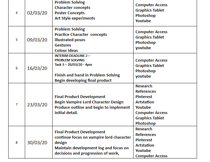
In the image above I am showcasing the time table that I created and posted onto my proposal and this gives me a rundown of the tasks I should be focusing on for each week of the FMP and at the time of this screenshot we are at week 7 where I have listed myself to begin producing the final product though at the moment this is not the case as due to recent developments such as the college closure and the stress of working at home I have still yet to finish my ideas generation and so with the extension we have been provided for task 3 I will now be using week 7 to iron my ideas generation and produce the developed concepts I need so that I can have efficient problem solving that will help me for when I progress to the final product on week 8.

From this current week there are now 8 weeks left until the final hand in on the 18th of May and with my ideas generation ideally being submitted in time for this weeks deadline I should be spending as many hours working on my final product as I have been working on tasks 1 2 and 3 before the college closed. Working with my usual college hours every day including a few extras on weekends now that my working hours have been cut I will be able to submit my polished final product on time due to the extra personal hours that have now been freed up due to covid-19.
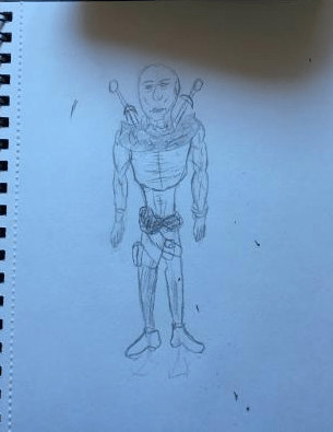
This sketch pictured above presents a simple concept for my character and shows a number of features that I will be developing further. This concept was produced on paper due to my current work flow and from now on all sketches will be produced digitally and I will be spending more time on each one whilst making use of a wide variety of references to help me with detail, anatomy and scale.


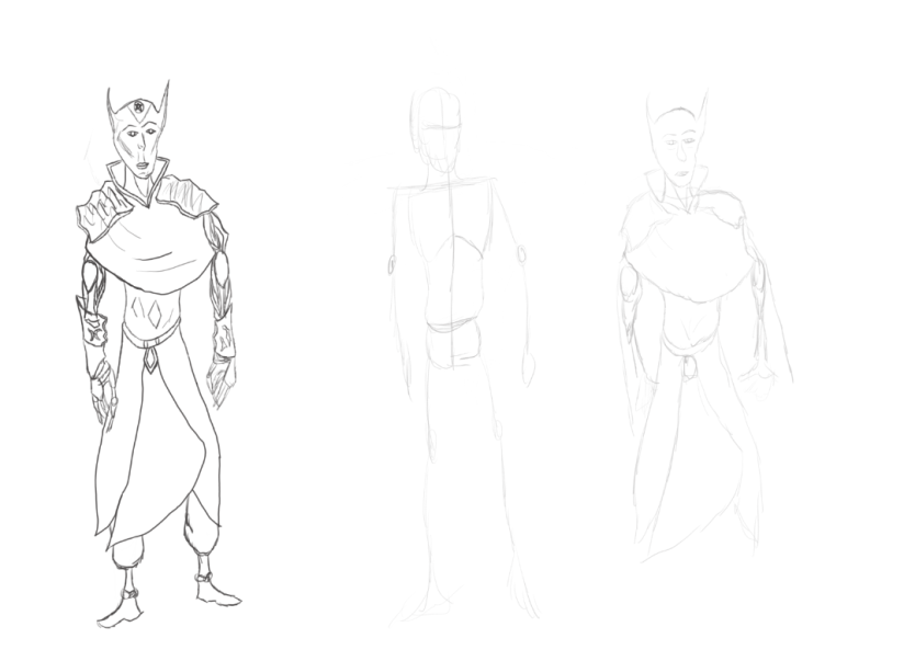
The above images present a detailed character concept that I have produced using 2 stages of development as with my other sketches and this design although I was not pleased with in its outcome due to the unsatisfying appeal I have towards it I have still taken pointers from this design such as the way in which I have designed the hood and features that have been included on the feet, the outline that I used to assist me in getting the correct anatomy was basic and has not served my purposes all too well which is why although I have fully completed the sketch with a large amount of detail present on its design I am choosing not to develop this one further as I would like to try a different style that is more suitable for me to develop and despite this design being scrapped it has still helped me with choosing how to implement detail and so not much was lost during this session despite my decision not to take it a step further.


With the deadline approaching on Friday and the lack of developed drawings present on my blog I have decided to spend this session on producing a concept of one of my character and instead of including a turn around I have just designed the front face of this character and before I started off with this concept I spent an hour before the 10:30 briefing viewing a series of character designing videos that provided tips and advice on how to create and bring to life your imaginary character which greatly inspired my workflow for this rough draft. To start off this design I produced a simple sketch which can be seen on the left with the line art acting as a rough outline that gives me a place to fill with colour, one area that I have worked towards improving is the waistline as this is apart of human anatomy that I have always struggled with fitting into my character designs and the videos I viewed before working on this session have led to me improving in this aspect and moving on from the waistline I have also improved my arm design whilst implementing an extra aspect of detail which is some sci fi features that go along with the fantasized appearance of the design as this is one of my favourite genres and I would like to be able to use it in some aspect for this project. After finishing the sketch I have now fully textured this design in a rough manner and the reason why it is rough is due to the reason for it being part of my ideas generation task 3 and so it serves just as a draft that I can view and see what I need to improve on. I wanted to use dirty and rough colours that make this character seem solitary whilst having a rough personality. Overall this is a design that I really like due to how I have developed it and the techniques I used to produce the sketch whilst keeping it simple and easy to follow along with.


Following on from the frontal design of this character concept I have now expanded upon it and produced a turn around where I show this character from a different point of view and what I wanted to go for was to keep the same pose present in the above concept for this expansion and just present it with the viewer seeing them from behind rather than standing infront of them. Creating a character design this way makes them seem more real as you are able to see both sides of them and are not limited to knowing what is only on the front side and so this adds a bit more of an individual personality to a character and is one way of effectively conveying a specific concept. The features for this character as well as colour scheme have all remained the same and so there is not much variation in the colour palette as I did not want to conflict with the design that already exists. When I started sketching the turn around I used my previous frontal side sketch to help me so I could present the correct details and proportions I needed but just draw them at a different angle and leave out detail that is present on the front and so following on from that my concept has gone through 3 stages of development where in the first is just a simple basic sketch whilst after that is the line art which presents more detail and a finalised outline for my character with the final picture showing the finished texture and whilst the texture is basic it does serve only to act as an experiment and is just a way of seeing how I can produce these concepts effectively without overcomplicating every aspect as I have struggled doing on previous projects.
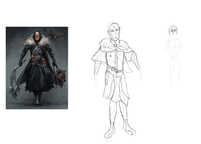
Moving onto my next turn around concept I have designed the front facing appearance of my vampire character design and I have attempted to use the same style utilised during the production phase for my monster hunter featured above and I have even reused some of the assets that are featured on him such as the cloak covering the chest which I have done to link some sort of similarity between the two characters so it appears that they have some sort of connection with one another, I also enjoy using it as it allows me to be more flexible with my designs and so it has become a worthwhile inclusion in this technique of character design that I have developed despite its presently rough appearance which I will be refining when moving onto the final product. To make the vampire seem more chaotic I have imprinted a pentagram on the forehead along with some steel plating which make them appear more sinister as well as the inclusion of a collar and which extends further down into the cloak. One aspect of the design that I think is unique is the way in which I have created the arms as I wanted to make it appear that the arm is sort of disjointed and separated into multiple tendons and the reason why I wanted to do this is because of my urge to experiment in different ways of drawing arms and so this technique has stuck with this design and although it needs further refinement I am happy with its rough appearance. Hands and feet are also an area that I need to develop and these will be a sector that I will be spending a lot more time on developing when I begin designing the final product on Monday. Overall this is a sketch that I am happy with as it uses the same style as the previous design and fits well within the theme of the project.
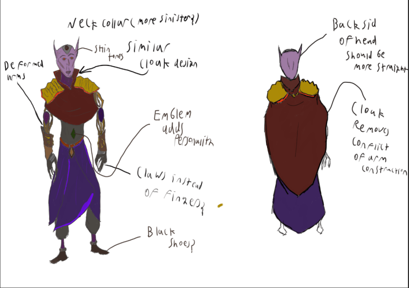
After producing the sketch that I have annotated above the next phase for this concept was to begin implementing a texture as well as creating a turn around which shows the character from a different perspective. Whilst designing this concept I took a different approach and decided to include and point out annotations on the image itself where I have pointed out areas that I like and how it reflects on the character such as the collar that extends down into the cloak presented as an almost sinister like design. Whilst texturing this character I used 2 tones for the skin colour and this was because I want the face to be more noticeable lit up than the rest of the character whilst the neck and other areas of skin are shrouded over by the neck collar and cloak which darkens the surface area that is present. The colour for this character eyes are once again red as this is a colour that I believe makes them seem the most evil and makes them more recognisable as vampires alongside the pointy ears that they are also famous for. To shade in and add highlights to certain areas of the design I have utilised lighter tones of the texture used originally and painted in certain areas where light is reflected and this adds some more life to the character and brings them out more as an individual. For the turn around I have only textured the main body and cloak areas as these are the features that I want to be the most noticeable of the body and I have pointed out areas that require more detail such as the back of the Vampires head which I have mentioned should be more straight so that it fits in better with the rest of the character, there is also a new feature visible which is the extended cloak that drapes around the back and this has been done to surpass the conflict of reconstructing the convoluted arm design that I have gone with for this character. Overall this has been an effective turn around and although still a rough concept it will allow me to have some of my own reference material for the sessions where I will be creating the final product.
- What did I find difficult or easy?
A task that I accomplished with little difficulty this week was the production of my turn around concepts as for these 2 designs I was able to visually imagine my characters and create them with correct proportions and anatomy. All of them have been presented to a rough design and effectively present the idea that I have in place for my final product.
- What tasks didn’t I complete from this week?
This week I was able to complete all the tasks that I set myself despite initial difficulty that I encountered from now having to work at home, this environment is one that I can produce work in despite my sporadic mood swings. With this weeks tasks all completed I can now use the rough designs I have completed as reference material that can lead to me creating a suitable polished final product that presents what I outlined in my proposal.
Planning for next week –
- How do I plan to catch up? Do I need to change anything about my work or planning?
I need to work more efficiently at home and find ways to motivate myself more as well as approach others for assistance and guidance where it is needed, after this week I am now able to start work on the final product and will use all resources that I have gathered and created to aid my progress.
