Presentation Board Experiments

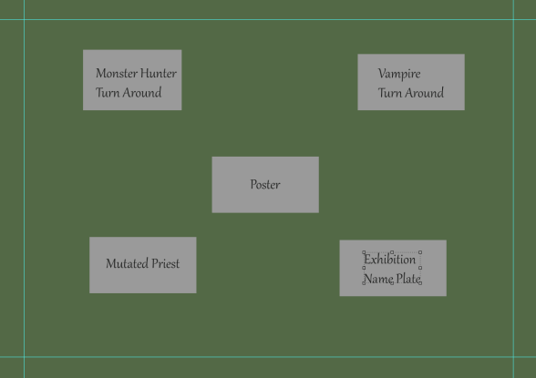
In this section of my exhibition research I have experimented with how I will be laying out my presentation boards for exhibition and seen above is a canvas I have worked on where each grey box represents a board for my art work and in this layout I have included the poster at the top of the main art pieces so that it can act as an introduction to my project and the turn arounds that I have produced can be seen below and placed next to each other which I have done so that are in the direct center of my exhibition and will be able to grasp the attention of my audience. My exhibition name plate is located in the bottom left placed beneath my main art pieces to give the viewers an example of who I am and what my specialism was for this project and corresponding to this is the board for my mutated priest who for being an additional art piece is located in the bottom right as an extra concept for the audience to take notice of. What I like about this exhibition layout is how I have directed the viewers focus to my main art pieces as well as the way in which I have used the poster as an introduction to my project.
For my next presentation board experiment I have laid the art pieces out in a wide radius which forms a square around the poster which for this session has been made the center piece with the other art pieces branching off of it and the reason why I did this is because I want the poster to be able to act as an introductory like piece to my project which presents the title and dark atmosphere of what I have created and so I have centered it in the middle of this layout. The dominant art pieces of this project have been placed in the upper area of this layout in line with the borders that I have placed on the canvas, this has been done in a way that will allow the viewers attention to be directed immediately to these two pieces once they have taken notice of the poster.
Returning to my presentation board research I have now produced a more effective demonstration of my art pieces can be laid out for the exhibition and what I have done to achieve this layout is by screenshotting my art work and laying it out in the formation I would like my exhibition to be presented in and the reason why I have chosen to produce this final piece of research is because I wish to provide a deeper insight into how I would like my work presented with a more visualised example rather than just letting the viewer look at grey boxes that act as nothing but place holders so with this technique I can experiment with my art pieces to full capacity and the layout I have set up here is the same as seen in the above annotation and I followed this one as it was the most feasible for me to follow through with and is the one that appeals to me the most.
Presentation – Vampire Turn Around

Starting off the development for my presentation board I have begun by creating a new photoshop document on an A3 landscape canvas and when entering the background layer I made use of the eye dropper tool to sample the colour of my previous background on another document and transfer it onto this one. Once I had gotten the base colour for my background I then applied a gradient to the canvas so there would be light coming downwards from above the canvas and work as a simple lighting effect whilst remaining consistent with the background texture and this tool worked through the process of having me drag the gradient in the direction I want the light to be coming from which is what has gotten me this outcome and the reason why I fashioned it in this way is because it will make more sense for the presentation quality of my work to have the light be casted down upon the art pieces rather than come up from the ground and potentially hinder the viewers focus on the art piece. With the light coming from the top the viewer is also provided with greater focus on the art pieces due to their presence as the dominant image on this canvas.
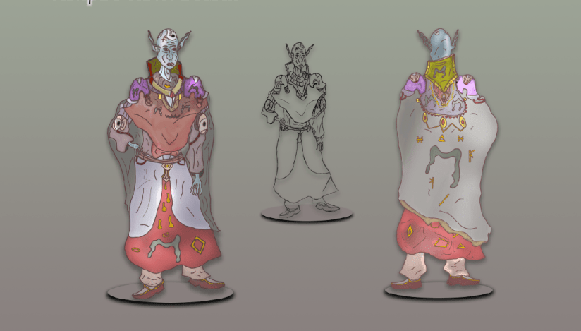
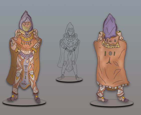
To present my art work on this presentation board I returned to the document where I originally produced these pieces on the A3 canvas I have previously worked on shown in my development log and to transfer them onto this new document I have simply selected the necessary layers and clicked and dragged them onto the new canvas that has the gradient applied to the background and once I had achieved this I organised the layers into their own respective folders and began laying the art pieces out on the canvas with the turn around being presented as the largest piece with both being horizontal to one another and in the center a sketch that I have included as this was part of my development process and including it in final presentation can give the viewer insight as to what development I went through and how different it is to the final product. To make my presentation more effective I have added in some shadowing using the layer blending options box and lowered the distance so that the shadows appear slightly below them and make it seem as if they are casting a shadow on solid ground so that they do not appear as if they are just floating without a surface to place their feet upon and to improve this I have made use of the ellipse tool to make vector circles beneath the feet of each art piece and then made them look more solid by using the drop shadow tool which has given them the effect as if they are protruding out of the ground.
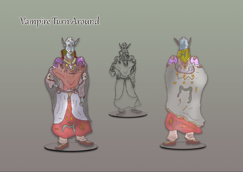
To finish off the presentation of my Vampire Turn Around I have worked on implementing a text layer to presents the name of this art piece which I have titled Vampire Turn Around which is straight to the point and conveys to the viewer exactly what it is they are viewing should they have difficulty when viewing the work. To create this text I selected the appropriate font that best fit the theme and then scaled it to a suitable size and placed it above the art work though in a distance that allows the presentation board to feature all areas consistently. To create the effect that I wanted to go for in this text I first made the letters a solid black to make them stand out and then I have applied a drop shadow and changed the colour for this area to white so I can get a white glow around the text that adds atmosphere to the presentation. Overall with this board set up I am happy with the way in which I have presented my work as although the background is simple I have still made use of the gradient tool to add in some lighting and I have made use of the tools available to me that have allowed the focus of the board to be directed entirely onto the art pieces which shows how effective this board has been.
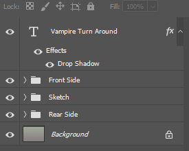
In this image you can see the layer stacks that I have set up which were done to provide me with a more organised working place such as grouping each side of the turn around into their own folders so I could work on them individually without interference of the other art work as in this style I can hide the folder I don’t want currently on the canvas and so organising my layers in this style has allowed me to work more consistently and make my workspace seem less crowded and overwhelming and so grouping the layers as seen above has allowed me to work more effectively and section down the areas that I wanted to focus on one at a time so that I could get a firmer grasp on the quality of my products presentation.
Presentation – Monster Hunter Turn Around

For my next presentation board I am now working on the exhibition layout of my monster hunter character design who I produced to be the representative of order in my projects theme and to start out this session I have gone through the same process as outlined above which involved me sampling the same background texture onto a new photoshop document and then applied a gradient onto the canvas to make it appear as if there is light casting downwards onto the art work. The canvas layout I have chosen for this exhibition board is landscape and this is because I need to ensure I have enough room to present the turn around that I have created as I am certain these would not fit well onto a portrait canvas and cannot be effectively presented on their own and so creating this landscape document will allow me to work more efficiently and find a suitable way of presenting this project.
To begin presenting my art pieces I returned to the original document on which I produced them on and gathered together the necessary layers and then dragged them across onto the new A3 document that I have setup in the standard landscape format. For these art pieces I have replicated the process I went through for my previous Vampire turn around which involved me placing the art pieces next to one another with the sketch placed in the center and scaled down to make it look as if it is further away and it has also been included to show some of the development I went through for this project and with this presentation my dominant art pieces now take up the most negative space on this board and take the viewers eye more directly due to them being the main designs located on this board. To present them more effectively I once again have made use of the layer options blending box and the ellipse tool which has given a podium like effect beneath the characters that gives off the effect that they are standing upon platforms that rise from the ground and the shadow implemented through the use of the drop shadow option box allows a shadow to be casted down upon the podium. The reason why I have chosen to include the podium like effect to present my work is because of how it creates the effect of the art work standing on a solid surface as it prevents them from appearing as if they are floating in mid air alongside this it also an effect that appeals to me and is one I would like to use in the presentation of my art work.
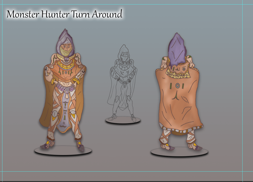
After laying out the art pieces that I transferred over from the production document on photoshop I have now produced a text layer which presents the title of this art piece “Monster Hunter Turn Around”, this title is straight to the point and conveys to my audience what it is they are looking at so there is no obstacle hindering them from knowing what the art piece is showing. The text has been placed above the art work in the same fashion that can be seen in my previous turn around and for this text I have increased the font size to exactly 56.93 as this scales it to a suitable size and allows the viewer to read it without having to squint or focus to be able to read it. To finalise the text layer I added in a white drop shadow which was done through opening the blending box and then using the functions available in that section to create a white shadow that works as a glow around the letters that comes from behind which has allowed an effective title presentation that grasps the viewers eyes so that they are able to read what it is they are being presented with before viewing the art work itself as this will give them the context that they need to be able to understand what it is they are looking at.
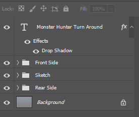
Presented in the image above are my layer groupings and I have decided to include this here as it shows how I have organised my work area and to set this up I did the same process as shown in the creation of my Vampire Turn Around presentation board which as included me separating the art work into their own separate folders so that if necessary I could view them one at a time with the intrusion of any other on screen assets and so to group my work in this way allows me to work effectively and eliminate the issues of having a cluttered work area which would have prevented me from producing my work effectively.
Presentation Board – Priest

For the final presentation board that showcases the last of my character designs I have once again set up another A3 canvas on Photoshop which I have then manipulated through the use of the gradient tool which has given me that lighting that casts down from above that will bring atmosphere to my art work. The background texture has been applied once again through the use of the colour sampler tool which has allowed me to paste it into this canvas and get the background I wanted before applying a gradient to it.
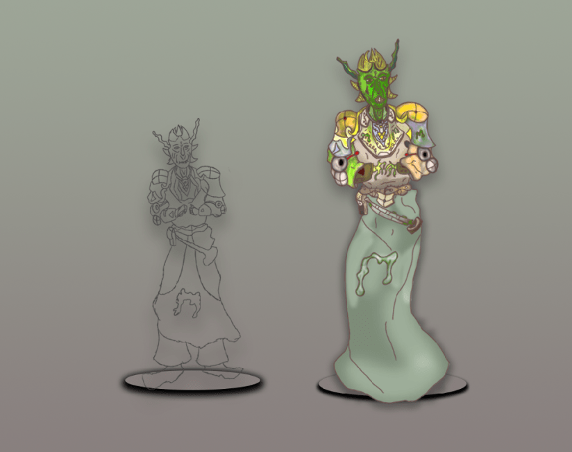
Once the gradient was applied I then transferred the art pieces I have produced onto the new canvas that I have set up and once this was done I then rescaled the size of my finished and textured character design so that it would appear large and cast a shadow down onto the sketch that I have included, presenting my work in this style allows the viewer to see the bigger picture of my production and take a look at where my art piece started so they can see how successfully I have been able to develop it from that original outlook. For the podiums that I have once again created using the ellipse tool and the layer functions I placed my textured character design in the center of one of the them and positioned them so they would appear as if their cape is draping over the edge which has helped to make this work appear more professional. My decision to include the sketch was done to take up the negative space on the presentation board as well as it being my own choice to branch out my exhibition a bit more in a way that allows me to show how I progressed through the development of this art piece and what I have done to add to its appearance is applied a drop shadow and stood it on top of the podium that is rising up from the surface, this makes them appear more solid and suitable for presentation.
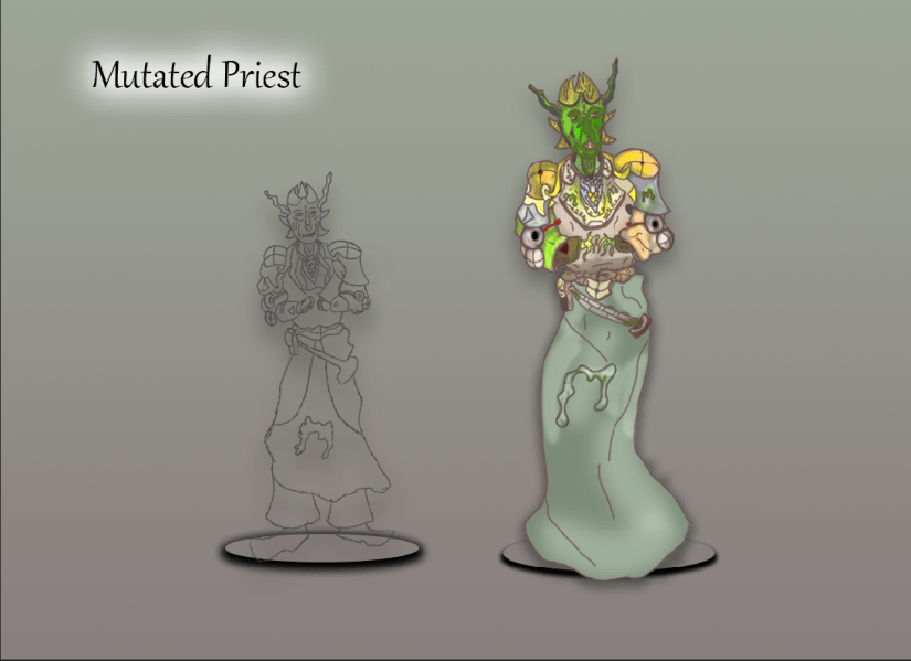
To finish off the presentation board for this final character design I added in the text layer which presented the title of this art piece “Mutated Priest” which is another name that provides direct context to the viewer and allows them to immediately understand what it is they are being presented with whilst being aware of their role within the theme I have created. To get the glow effect I used the same process I have previously outlined which is using the layer blending options box to implement a white drop shadow and then manipulate the sliders to get the glow I wanted to have shine around the text layer, this presents the title in a suitable way for my presentation board and the way I have laid out my work shows a clear process as to how I have created this character.
