Exhibition Research


![IMG_2358[1]](https://spencersblog.fashion.blog/wp-content/uploads/2020/03/img_23581.jpg?w=449&h=599)
The boards seen in the image I have captured using my iPhone above have been presented to showcase the most prominent art pieces in order such as the main conceptual piece taking place at the very top of the single file presentation style. What I like about the most about the way in which this project has been presented is how the artist has laid them out in order to direct the viewers attention to the most important and best conceptual pieces produced by themselves such as the one on top and those on the bottom which present environment pieces and assets which are within the viewers direct line of sight. As well as the presentation boards the nameplate is also suitably placed taking spot right below the art pieces which causes the viewer to first look at the art pieces so that they gather interest in who has produced it instead of immediately moving onto the next piece after viewing the name and only 1 art piece.
![IMG_2359[1]](https://spencersblog.fashion.blog/wp-content/uploads/2020/03/img_23591.jpg?w=497&h=663)
For the next boards I have viewed you are able to see which art piece the artist wants to direct your attention towards due to the way in which they have set up their exhibition such as the main piece taking position in between the least prominent pieces that directly guide the viewers gaze towards the center piece of their art pieces. The images have also been presented using suitable lighting and atmosphere which makes them appealing to look at without any inconsistencies that might cause any eye sores. The artist has also used the lighting to cast more onto the prominent areas of the image so that the viewer is able to see the dominant image of the art piece that has been created by the artist.
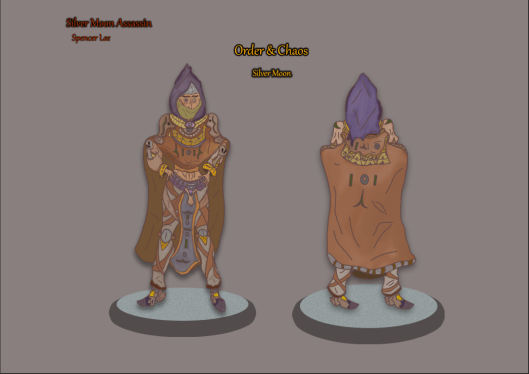
Presentation Research

For my project I will be designing 2 character turn arounds and so to get an insight as to how they should be presented I have found this image online which presents a simple draft of a character design that presents 2 designs that are similar to what I will be doing for my own assignment and from what this image shows me is how far apart the two concepts should be placed as well as what scale they should be placed at. One part of this image though that I do not like is how blank the background is and so the only insight I will be taking from this source is how I can layout my characters and what the most appropriate size I should be scaling my character turn arounds at.

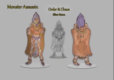
This image presents a character turn around which is more inline with what I am aiming to produce as it shows the two sides that I currently have being developed which is the frontal and rear perspective of the character and what I like about how the background has been utilised is how all of the border regions are darkened whilst the closer it gets to the art work the brighter it gets which allows the art work to have a brighter presentation whilst the shadows present make the presented character look as if they are not just floating in the air but are actually standing on a solid surface, in the top corner of this design we can also see a title for the art work which conveys to the viewer what the artist is presenting and how they have linked it to a theme which shows the audience what purpose their art work serves. From what I have learnt from viewing this image I will be able to utilise some of these techniques for my own character turn around as well as take inspiration from how the art work has been laid out on the presentation canvas that the artist has arranged.

Looking at this next presentation of professional art work we can see that the artist has used a greyish background and brightened it towards the bottom and we can see that they have also utilised the tools available on photoshop to create a shadow effect beneath the characters feet which allows them to once again appear on solid ground which makes them seem more realistic and life like characters. The artist has also included a title and product name in relatively low scale which is there for the viewer in case they interested in who the artist is whilst in the right corner we are also presented with the name for the company this character design was created for allowing us to see what its purpose will be in the industry. This presentation is simple but effective presenting the art work the artist has produced and gives me valuable insight into how I can setup my own presentation board.
Exhibition Board Studies
In this session I have experimented with what I have learnt from the recent research I have gathered on presenting 2D art work and what I have done on the A3 canvas my work has been produced is that I have made use of the background layer to apply a light grey/red tone which allows great focus to be directed towards my character and whilst I have gotten a new tone for the background I would also like to make it seem as if my character design is standing on a solid surface and the way in which I have conveyed this is by utilising the ellipse tool and then placing it beneath the character before going into the blending options and using the shadow tool to create a podium like effect beneath after increasing the opacity which has given it a more solid and flat feel. Upon the ellipses I have also added in some noises which makes the ellipse act as if it is a tile with many cracks and specks featured on it and I have achieved this by making use of the noise function which has caused these specks to be more noticeable and draw them out some more upon the podium. After working on the podium I then added in a shadow on the turn around art work which adds a dark hazy glow around the drawing that casts a shadow downwards from the shoes, once I had implemented this effect it made my art work now seem as if it is standing on a solid surface rather than floating in the air without any meaningful presentation. In the text I have implemented I included the name of my project whilst also the title of the theme and these have been placed in the middle so that they can take up some of the free space available and this text has been given a yellow colour that I have given a black outline through once again making use of the shadow tool available in the blending options that gives them that cool 3D like effect which I have also utilised for the text in the upper left corner which features the name of the artwork alongside my own first and last name. This way of presenting my work is one that I am happy with as it allows me to fully present my characters in a way that shows them off in full detail as well as showing them standing on a podium making it feel more of a formal appearance.

Moving onto my next presentation study I have setup a new A3 canvas and transferred my Vampire turn around art work onto this new document which I will be using to stage a presentation experiment and the reason why I have chosen to do this is because I wish to gain some insight as to how my art work can best be presented as well as what tools I can make use of within photoshop to assit me in this development process. In this session I used the layers blending options for both art pieces to implement a drop shadow and glow that radiates a dark aura around the Vampire whilst also using it to cast a shadow down onto the podium below to create the illusion of standing on a solid surface. To create the podiums for my character to stand on I have first created an ellipse from the tool bar section and scaled them to the size that I found appropriate and after this process I then used the drop shadow function in the blending options tool box and maximized the shadow to create a solid base for the presentation podium of which the 2 largest are on either side of the board with a smaller one in the middle used to present a prior sketch I produced which I decided to include in my final presentation to show the audience some of my development process that otherwise would only be seen by those marking the work and one more detail I added in before finishing the podium is that I implemented some noise to give freckles to the podium as this is a feature that I would like to have presented. For the text that mentions the projects title I have used the noise filter to add a hazy effect around the text that gives it a unique blend into the texture that I have used for the background. What I like about this presentation board is how I have used a dark/midtone colour for my background gives my art work a full presentation and mixes in well with together. Though I have kept the presentation simple it works effectively to show off the art work and draw the attention directly towards the character Design.
Setting up another presentation board for my monster hunter I have this time decided not to include my name on the art work as it may diverge the viewers focus away from what the topic of the character design is although 3 other text layers remain that provide context as to what the audience is viewing. To make the text look solid and have a rougher/solid feel to it I utilised the layer blending options box to implement a thin shadow around the rims of each letter which has given it the desired effect I was looking for. As in the previous board I also have included a shadow to provide this product with more atmosphere and extra detail whilst the sketch in the middle has a higher tone of shadow implemented around its outline as this is my darkest area of the design which lead me to make this decision. The podiums that are presented are this time much thinner as I decided to experiment with different proportions of this aspect and despite my appeal towards the previous design this new concept is one that I would like to work with due to how effective it has been on this turn arounds presentation.

Onto my next presentation board study I have produced one more focusing on the exhibition of my Vampire Character turn around concept which I have made some noticeable differences too than what was seen in the previous study. One change I have made is the colour and design of the text as it can now be seen with a silvery texture to it that I have used to add in some differentiation as well as further experiment with the set up of the text and for the blocky shadowing around the letters I have made the drop shadow a lot thinner than previous as I want to direct it to presenting the words in a 3D text format that shows off my design in an eye catching maneuver. To finish off this presentation I have for my sketch in the center applied a glow that gives them a shine and presents them in a more notable fashion as without this it would fall into obscurity and not be seen clearly by the viewer. What I like about this presentation board is the way in which I have set up the text due to how its new visuals show off my art work whilst also fitting into the background texture and presenting the theme of the project. Overall this is my favourite study so far as all the features I have used have laid out an appropriate exhibition board that I can further utilise to inspire the final layout.
Presentation Board Experiments

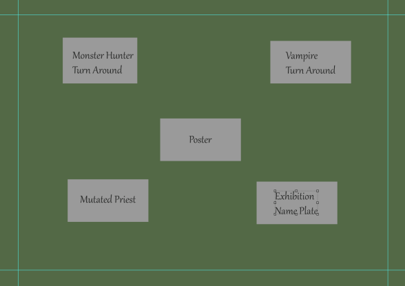
In this section of my exhibition research I have experimented with how I will be laying out my presentation boards for exhibition and seen above is a canvas I have worked on where each grey box represents a board for my art work and in this layout I have included the poster at the top of the main art pieces so that it can act as an introduction to my project and the turn arounds that I have produced can be seen below and placed next to each other which I have done so that are in the direct center of my exhibition and will be able to grasp the attention of my audience. My exhibition name plate is located in the bottom left placed beneath my main art pieces to give the viewers an example of who I am and what my specialism was for this project and corresponding to this is the board for my mutated priest who for being an additional art piece is located in the bottom right as an extra concept for the audience to take notice of. What I like about this exhibition layout is how I have directed the viewers focus to my main art pieces as well as the way in which I have used the poster as an introduction to my project.
For my next presentation board experiment I have laid the art pieces out in a wide radius which forms a square around the poster which for this session has been made the center piece with the other art pieces branching off of it and the reason why I did this is because I want the poster to be able to act as an introductory like piece to my project which presents the title and dark atmosphere of what I have created and so I have centered it in the middle of this layout. The dominant art pieces of this project have been placed in the upper area of this layout in line with the borders that I have placed on the canvas, this has been done in a way that will allow the viewers attention to be directed immediately to these two pieces once they have taken notice of the poster.
