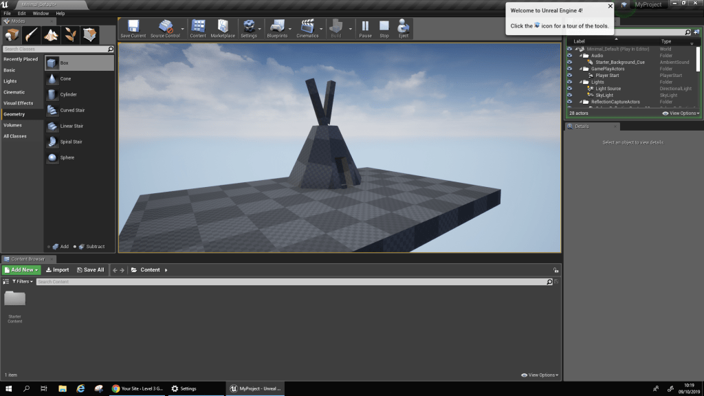
Firepit Block Out
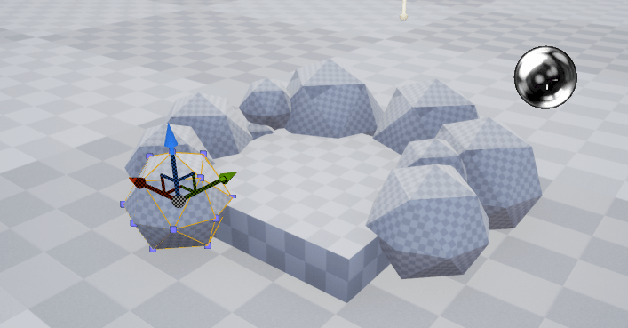
In this image I have started blocking out a firepit using the assets available in the Unreal engine. The objects I have used include a cube and a series of spheres which I have all scaled down and laid out appropriately. For the spheres I have scaled them all into different sizes so that they can appear more like stones which are all irregular in size and shape making no stone related at all and so I have used the tools available on Unreal to manipulate my spheres into making each of them as independent as possible.
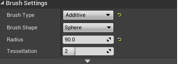
This image presents the radius settings for the spheres, this tool allowed me to set the size of the spheres so that I could create my layout of the firepit, the tessellation could also have been of use but it did not fit the requirements for my blockout and so I have only made use of the radius tool which has led to the completion of each of my spheres.
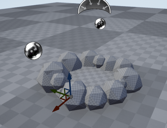
After laying out all of my stones the base of my firepit now looks like this. My next stage is to begin adding the firewood and place them in the center of the base so that they do not overlap with any of the stones that I have put into place.
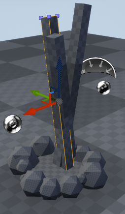
For my firewood I have used a regular cube and scaled it into place which I have then followed through with duplicating and re positioning using the rotation tool. The reason why I have chosen to use cubes to serve as my firewood in this blockout is because of the way in which they can be scaled as using the settings I can make them appear thinner and longer so that they can be seen more like pieces of firewood. I have also made them overlap one another so that they can form a cross making it easier to see multiple logs of wood shifted into multiple directions.
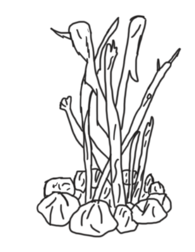
After blocking out my firepit using unreal I have since imported an image into photoshop where I have sketched over the image of my blockout to form a more refined conceptual piece of art. I have added in some extra details and remove some of the sphererization from my stones making them appear less round and more jagged with some curved lines added onto the surface to make them look more aged and weathered down.
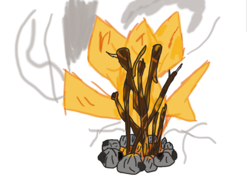
Since sketching and refining the image I have blocked out and drawn I have created a colour idea using realistic colours that make the fire appear hazy with an orange and yellowish glow reflecting onto the pieces of firewood that I have added a dark brown colour onto. Each of the stones now has some shadowing done which I have added through the use of using a dark grey and shading in corners of the stones present on the base. Alongside the fire and shading done on the stones I have also added in a smoke plume which though looks a bit disorganised at the moment still adds in an extra effect that makes the fire seem more warm as well as hazardous.
Blockout Sketching
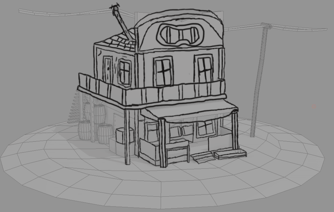
For this image I have placed an image of a 3D model into photoshop aligned into a side view perspective and then sketched over it through the use of a graphics tablet, whilst I have followed the lines as accurately as I can I have attempted to include some of my own detail which can be seen on the banister and the roof which features a circular curve with a logo centered in the middle of it. The reason why I have done this sketch is to experiment with the technique of using a blockout for an outline as creating a model in 3D and then inserting the image into photoshop makes it much easier for you to work with perspective when drawing as the model is already laid out for you. This was a useful experiment that I will most likely use in the near future for my project.
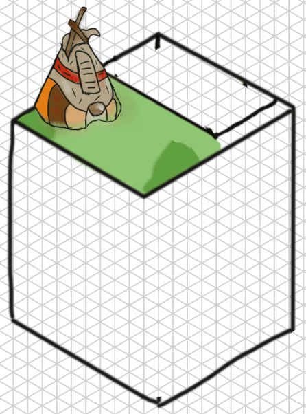
Isometric
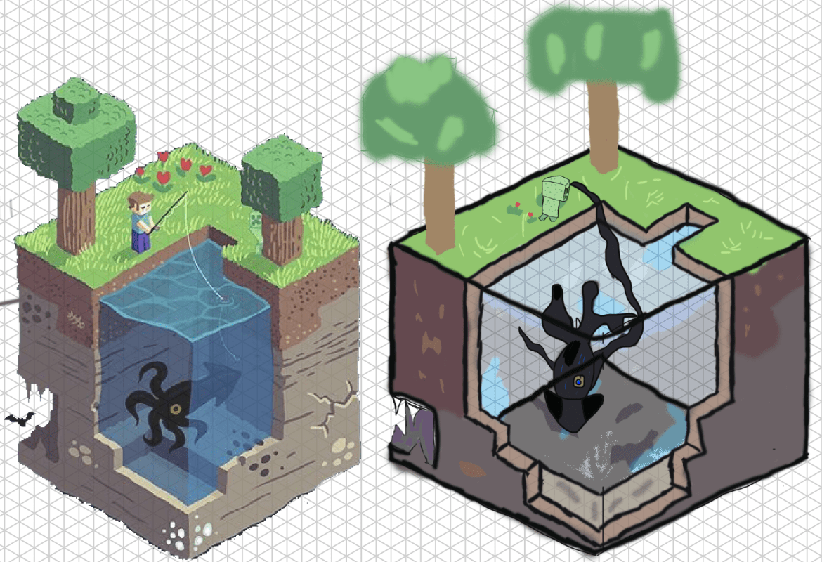
In this image I have gone through a session focused on isometric art where the art work produced on the right side is from the result of my experiments in using the grid layout. Starting off with the grid was at first confusing as laying out all the lines and forming the correct box shape was to begin with a challenge for me to achieve but after getting the right shape and implementing the outline of some of the detail it became much easier and is an effective way at producing a small scale diorama. To make my scene look more livelier I have added a squid and a creeper who now inhabit my environment.
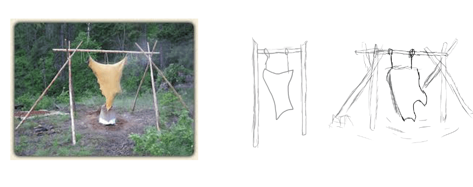
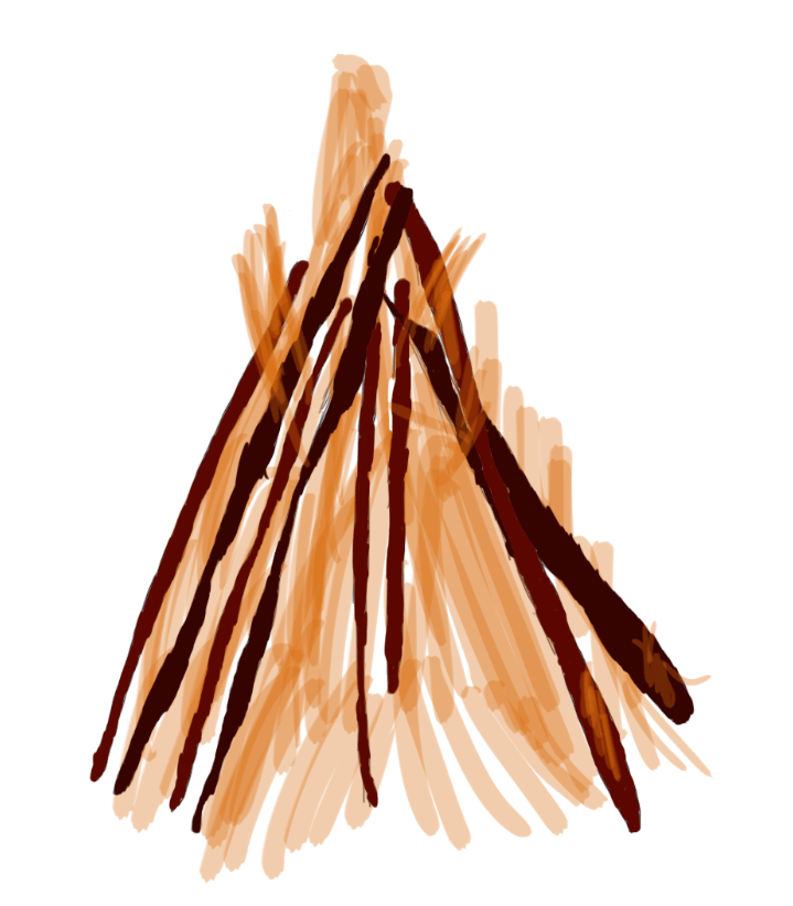
Tipi Sketches and diorama prototypes

For this sketch I have drawn out 3 diorama prototypes each featuring a tipi and a firepit. I’ve produced 3 images as I wanted to try out different cosmetic styles for the tipi as well as experiment with scale and perspective which can be seen in the final image where I have drawn it facing forwards with a slight view of the interior through the entrance. These sketches help me to see which type of design for my tipi is best as well as how they should be laid out and arrayed with the inclusion of the firepit. My references each featured wooden sticks protruding out of the top of the tipi indicating their presence as support beams and so for my sketches I have replicated this with my own design and then drawn the animal skin rapped around it in a cone shape so that it more resembles a tipi. Although I can still refine my skills in tipi drawing this session has still shown me how best to sketch the shape and proportions of a tipi whilst it has also boosted my confidence in building a multi asset scene that includes objects of different perspectives and so the notes that I have taken from this will assist me greatly in further practice on tipi drawing.
In my next phase of ideas generation I made the decision to perform some more practice in isometric art as this is an art style that has recently taken my interest due to how effective it can be at presenting a diorama. As of now I have finished and coloured a tipi though it is still to be refined some more before completion whilst the rest of my scene is still being laid out with some struggle occuring on the side of the grid where I have attempted to create a pool of water, so far I have been unable to do this as getting the perspective and layout right is proving to be a challenge and so this is still a section that I have to work on. My end goal for this isometric art piece is to have a prototype diorama that presents an outline of what I am looking for in my final product and see what I can add or remove to make it stand out more.
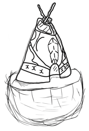
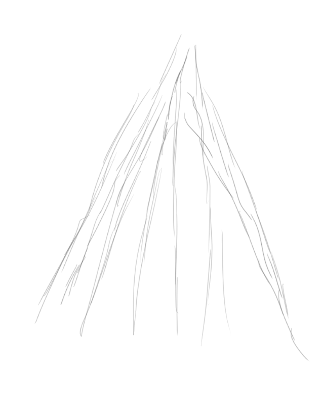
Tipi Refinement and Sketches of Outlines and Assets
Even though I have already practiced in drawing tipis I at this point still wish to get a refined sketch of one done which holds more detail and a larger scale than the others I have created. To achieve this I have first blocked out a rough tipi shape using the unreal editor which I will be transferring a screenshot of into photoshop for me to sketch over and refine into a realistic looking tipi so that I can get an idea of how best to achieve my aims for this project.

This image features my newly designed tipi featuring a closer perspective than my other sketches which were merely just my own practice for designing cosmetics and proportions whilst for this one I have used all of my references and previous work to design a properly sized tipi that features more detail than my previous creations. During the creation of this tipi I made use of the mixer brush tool to add in some shading that will make the tipi look as if it has some wear and tear such as dust and dirt which can faintly be seen along the bottom rim of the image. Overall designing this tipi has helped me understand how they should be drawn and scaled so that they can accurately resemble the tipis seen through out old western media.
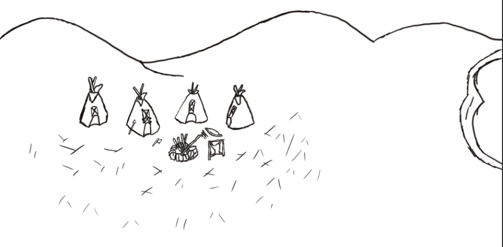
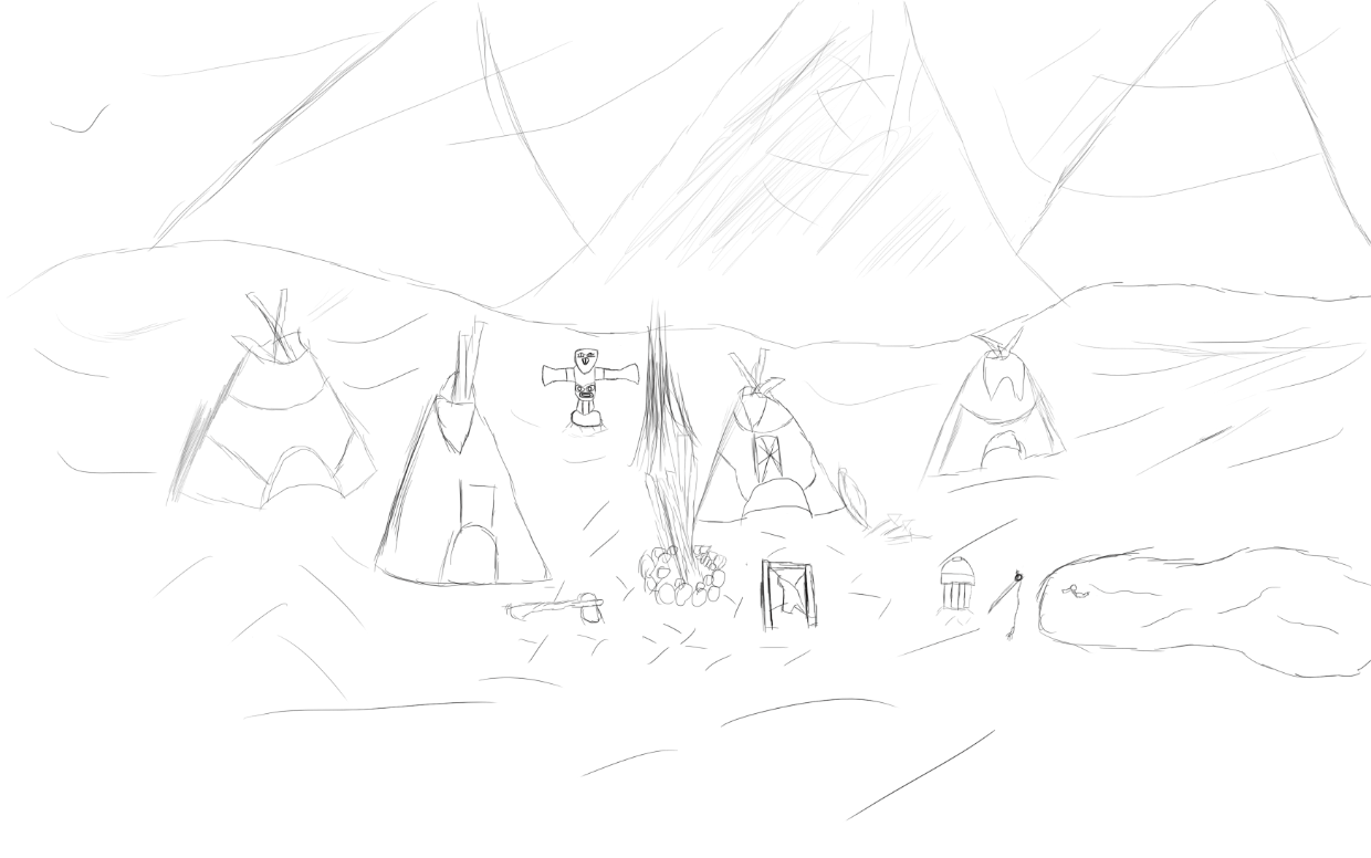
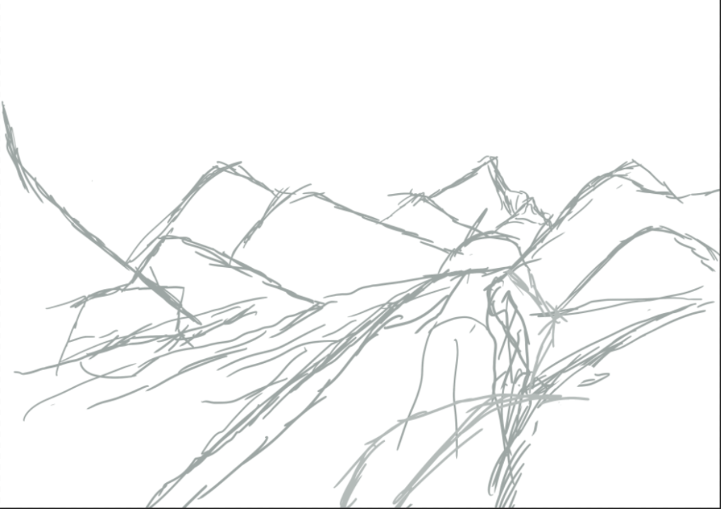
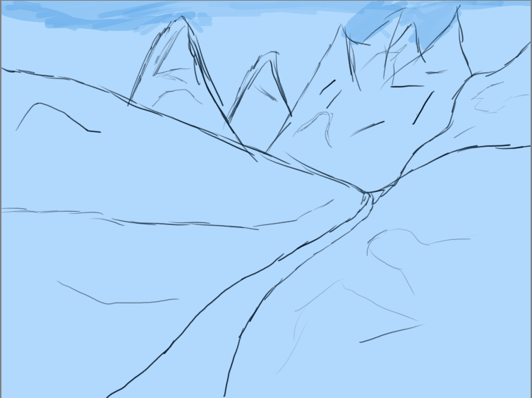
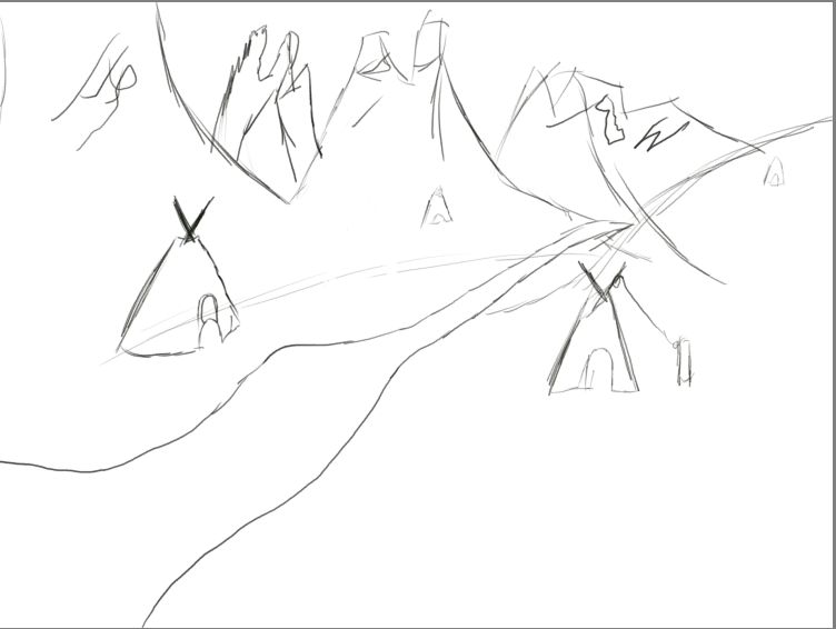
In this next screenshot you can see a rough concept of an environment art piece I have created. This sketch was done so that I could practice with laying out an environmental scene with multiple assets such as the tipis which I have drawn 4 of with a series of tools scattered around the camp site that also features a fire pit as well as a rig for working on animal skin. The reason why I have done this practice is so I can get the feel of designing a large scale environment where the focus is on multiple assets and not just towards one lone feature. I also do not have much experience in environment art and so creating rough sketches like these help to educate me on how best to position major landmarks such as mountains. This sketch also shows me where I need to improve such as the design of my lake which stands out of and does not fit into the scene properly. To improve on this art style I will also design stand alone sketches of the tools so that I can get a feel of how they are structured.
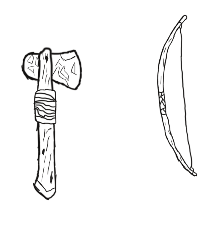
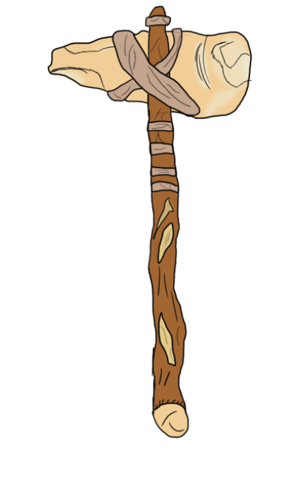
In my diorama there will be a series of tools and weapons scattered around the campsite including hatchets and longbows which are common place in the western genre in use by Native American settlers. These two weapons will be among those included in my diorama alongside a few others of which I have not yet designed. These sketches have helped me in understanding how one of these tools should be scaled along with how to best implement detail whilst being able to accurately follow a reference.
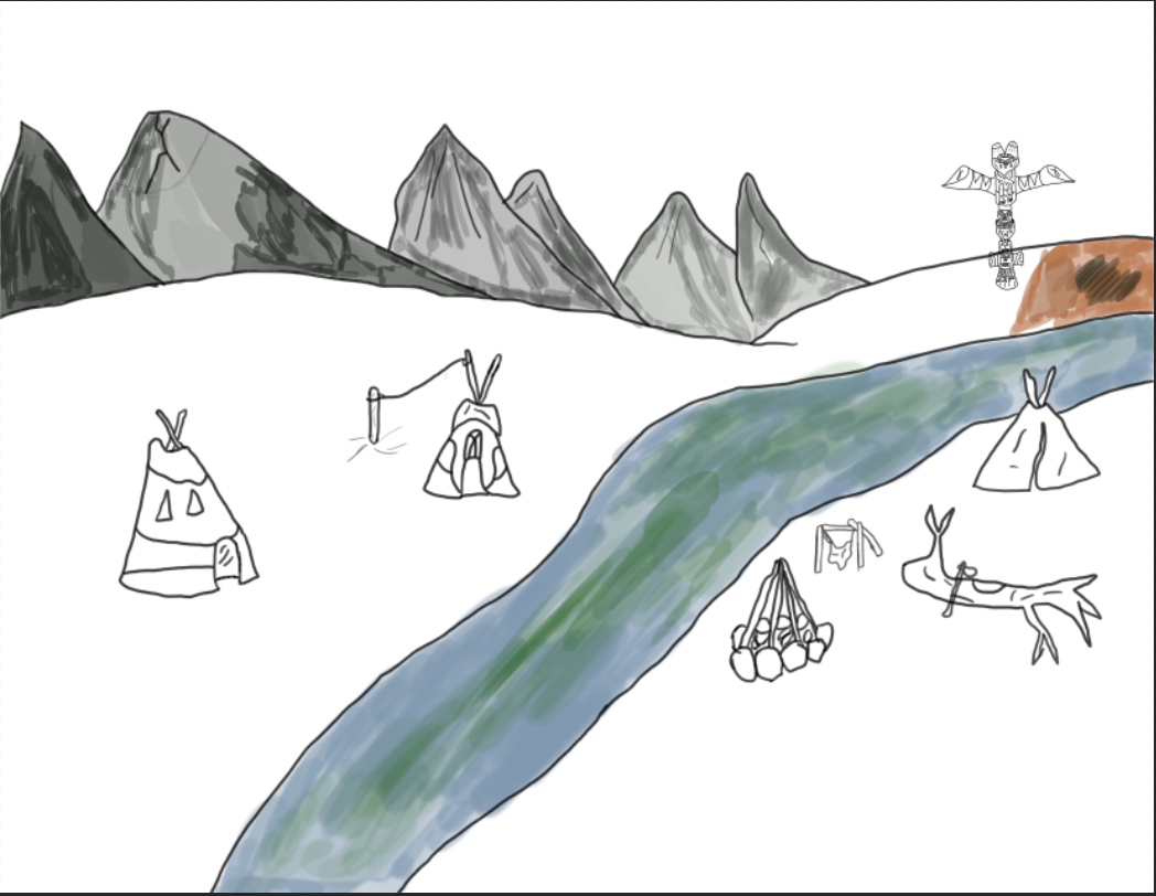
In my second piece of environment art I have made a few changes in the way I have designed it, the first major being the settings for my brush where I have now set the hardness to 100% and resized it completely, this has since made the lines I draw a lot sharper whilst it also seems that I am now able to draw straighter and cleaner than before and so I have put these new settings to use and successfully developed a prototype scene that allows me to see how my rough scene looks as a sketch. In order to develop my environment drawing skills I have also included a totem pole and a number of tools around the camp site such as a bucket and fishing rod, these are all tools that were used by the culture that I am presenting and so to include them in my scene makes it seem more unique and directly focused around that subject.
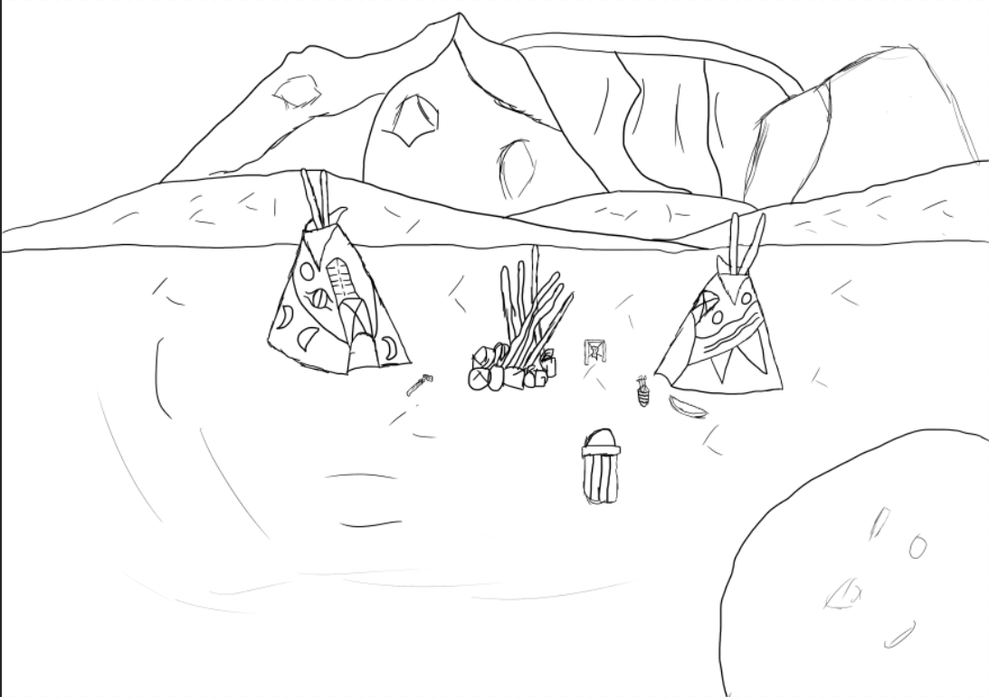
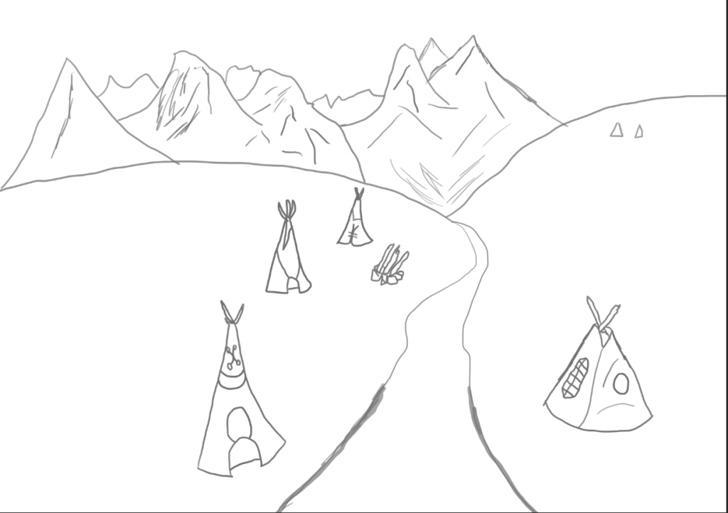
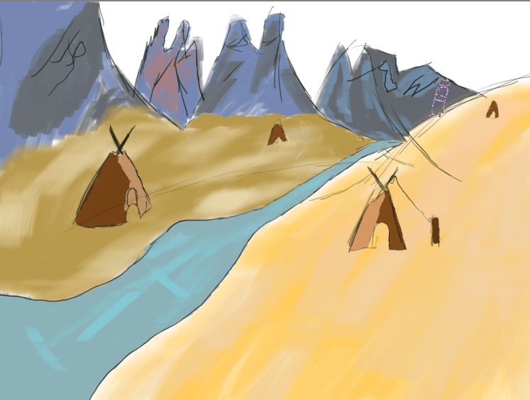
In my next environmental piece I have reduced the amount of assets that were included in my previous scene as for this one I wanted to focus on a more simplistic sketch of a concept just so I can see if it looks more suitable in this style, so far this one is appealing more to me as it provides a good focus on both tipis of which there are now only two as using 4 in one scene stretched it out too far and didn’t allow me to scale them to a medium size that the audience could fully appreciate. The mountains are a cosmetic feature I have added so that the background has a bit more life to it but they do not fit in with my overall atmosphere and so may be removed in my next rough concepts. The body of water is also a feature that I am struggling with implementing properly and so before I make my final decision on whether or not it will be included in my final scene I will do some more practice on sketching it out and making it fit into a scene using the correct perspective.
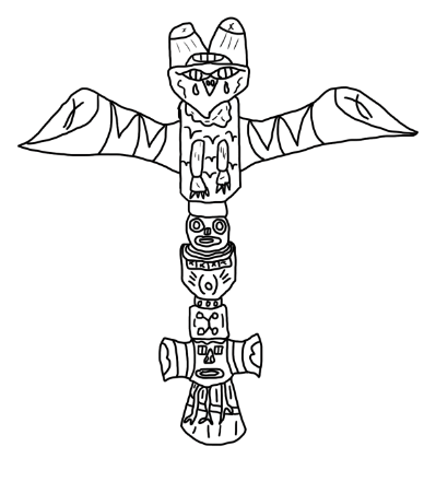
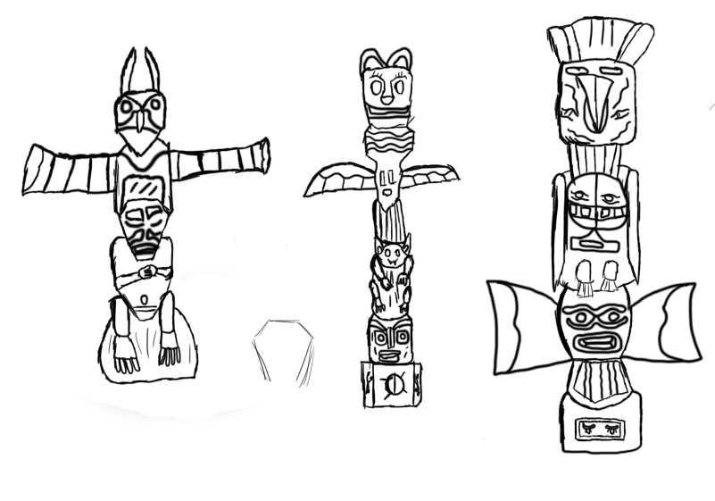
In this next stage of my ideas generation I have begun practicing my designs for totem poles of which one will be included in my diorama watching over the campsite. The reason why I have decided to include a totem pole in my project is because of their association with Native Americans as they are commonly seen in areas of wilderness and in campsites inhabited by the natives whilst I also hold an appreciation for the creativity that goes into creating these monument like structures. My scene will include a single totem pole and will be of my own design though I will be using the drafts I have created along with the references gathered for my moodboard to provide me with inspiration and a notion on how to scale and structure the pole.
In this image I have gathered a picture of a hide tanner (Not completely certain on the name) and sketched out two images using different styles taken from the reference present. The first image is one that is the most simple of the two due to its easy design and lack of complexity in its structuring and so this design could be of use to me if I were to have it in the background far away enough that it would not stand out as much, though I do have a second design which I have created to be placed closer to the viewer in my scene in case I decide to give the assets in my diorama a good perspective to be viewed from. Out of these two sketches the one that I like the best is the one on the right as I have put more work into it as well as some thought into the impact it will have on my diorama as a whole because now if someone were to look at it they would see a detailed asset and wouldn’t be underwhelmed by a simple and boring sketch much like the previous.
This design features another tipi of which I am going to add colour too and the reason as to why I have created another independent tipi is because of the various differences that can be implemented onto its cosmetics as many of these assets feature their own unique art styles as well differences to how they have been structured and so I have created this one to experiment with different means of finalizing a tipi and exploring which kind of textures work best with this asset. Whilst drawing this image I ran into some difficulty with getting the cone shape despite doing it countless times at this point in the project though after doing a few practice sketches and studying my previous imagery I have been able to get a sketch that I am satisfied with.
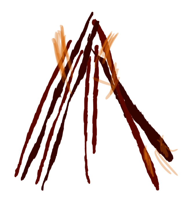
For this next sketch I have done a second design of my fire pit though this time I have gotten rid of the base made of rocks and just made the wood support itself through their stance on the ground. I have produced this second design of my camp/bonfire as I am trying to experiment with multiple styles of each asset so I can decide which design I feel would fit my diorama best and from this image I can see that it would fit just as well as my previous campfire. Although I like this design I did struggle with multiple aspects of it which included structuring the fire wood and implementing the texture as even though I had the assistance of a reference image for this art piece It was still difficult to draw the firewood due to the irregular shape of it and trying to make them all scaled different from one another. For the texture I was unable to neatly keep the colour inside the lines but did my best in keeping the texture strictly located to the firewood as this was the only area that would have the dark red scheme. Whilst I struggled with creating the firewood the creation of the raging fire in the center was relatively simple as all I did was create a new layer and lower the opacity before painting the fire onto the scene.
Continuing with my Native American tools I have produced another design of a hatchet, I have decided to do another one of these assets as I am experimenting with different styles and textures like my other assets. For this hatchet I started out with a simple sketch that put down the appropriate proportions and scale before refining that sketch with the paintbrush and then adding detail which has then led to me implementing a texture onto my hatchet. Whilst painting I have made use of the mixer brush tool which has added a sliverish tint to my weapon that makes it look worn out. Overall I prefer this design to the previous as it contains more detail and accuracy to the period whilst I have given it a texture unlike the previous.
Since I lack experience in designing entire environments and creating realistic landscapes I have spent a session practicing on how to create a scenic environment using the tools in photoshop available at my disposal. Since this was just to practice creating an environment I have not included any of my western assets and have just focused on designing the landscape which I believe has come out looking reasonably well as I followed a youtube reference tutorial on sketching the background which has taught me not to be afraid of having uneven lines and a messy rough concept. This is because the colour in the end will make it look neater and add a refined texture to the concept art. Though I am happy with this outcome and the new knowledge I have gained on drawing environments I did encounter a few struggles one of which was encountered implementing the texture as the colour at first was too solid and did not fit in to my design although I was able to fix this by just adjusting the layer and brush opacity giving me the appearance now present in my art piece. Overall this session has helped prepare for designing a final piece of art for my diorama.
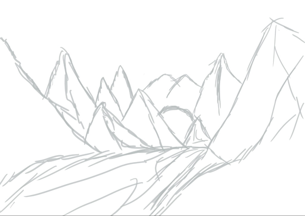
In my next rough sketch I have designed another environmental piece this time using a different texture and layout of the landscape. As I am still practicing with creating environment art I have decided not to include any western assets onto this sketch as I would first like to get a feel on how to create a scenic environment using a variety of colours and brushes whilst manipulating the opacity level on the brushes and layers.

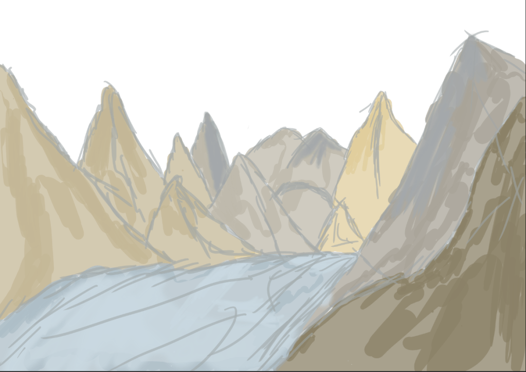
In this set of images taken from photoshop I have produced yet another environment piece though this time I have attempted to implement a landmass that did not appear in the form of a mountain such as seen in my previous sketches. I included this as in my final diorama I may exclude certain features that I spoke about in my proposal as what I said in that didnt include any feature of mountains but now that I have practiced designing mutliple landscapes with mountains I may now make the decision to include them in my final product as it is a feature I am effective at drawing as well as texturing and making it blend into the scene.
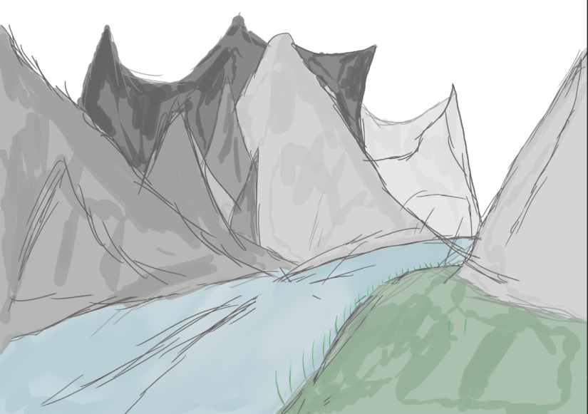
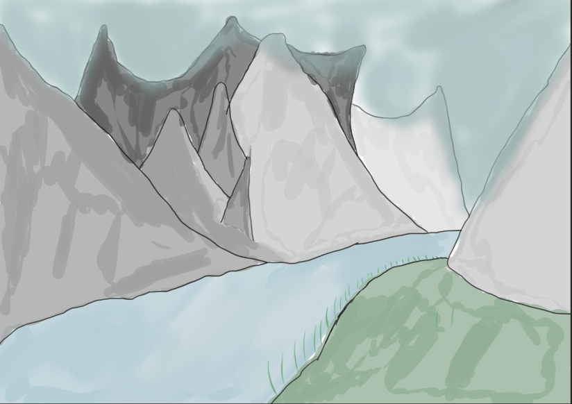
In this Image I have created yet another environment piece this time including all of my assets that I spoke about in my proposal, for this design I did multiple sketches in a different group folder and then selected the one which I liked the best, although in this image there is some colour seen on my assets I have made the decision to move on from it as I am not satisfied or pleased with how the appearance is and so I have halted any progression on this art piece.
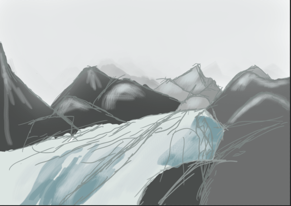
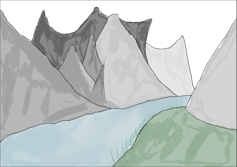
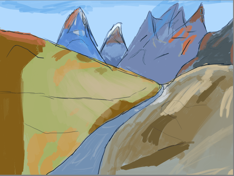
Later in the session after receiving some helpful feedback I have remade the image using a different style with a more realistic perspective implemented which can be seen in the lake that I have drawn in the center of the canvas, what I have done to make this lake seem larger and more realistic is that the ends of the lake now spread out creating a mouth whilst as the lake gets closer to the screen the lines get thicker which symbolise its distance. For the mountains I have drawn some upclose filling a void of space that was there previously and behind them I have faintly added distant mountain ranges that require little to no detail. With the tipis I have tried structuring them differently this time and put different details on the material wrapped round the wood. Overall this image is much more what I had in mind than my previous art piece and is something that I can take a valuable lesson from.
For these next to environment concepts that I have produced I utilised a different method of texturing my environments through the tools available on the free art application Krita, the brush that I used allowed me to implement a pastel like texture onto my environment which gave off the intended effect I wish for. As this is not a final piece and just a rough concept for my environment layout and a means for practicing with textures I have not implemented a large amount of detail onto my tipis in the second sketch as all I wanted them to serve as was just rough placements for where they should go and what the scale of them should be before I implement my final assets that include the weapons, fire and totem pole. What I like about both sketches is how they both stand out as an environment that can be recognised by anyone whilst the style I have used to create them is one that I believe is unique and although is simple still holds an aesthetic appearance that will appeal to a large amount of viewers that are included in my audience.
