Week Number & Date:
Week 8 30/03/2020
List of tasks for this week:
Sketch out outline and proportions of monster hunter
Apply detail and line art to rough sketch to polish the design
Produce in an illustrated stance
Begin texture and rendering to refine final product
Start Monster Hunter Turn Around outline and sketch
Current Position:


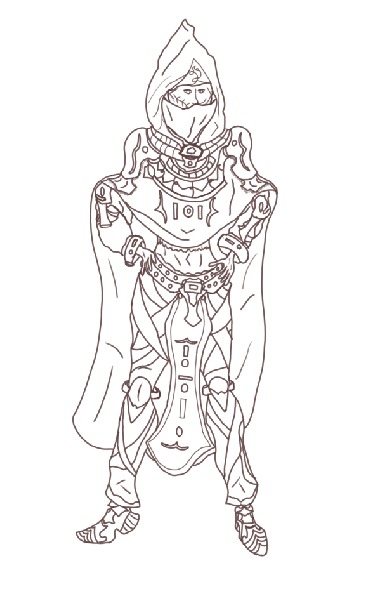
Before starting out on laying out my references and canvas on photoshop for the production of my final product I have gone through one last phase of experimentation which in this session I have focused on producing multiple concepts of the same character all on paper using different visual aspects to each design and I have numbered each character so that those who I send it to will be able to give me feedback on which design they see as the most visually appealing and with this feedback received I know which designs will be the most appropriate for me to develop further as I already know what my audience like about the rough concept and so this makes it easier for me to branch even further with it and get the best visual outcome possible using the feedback and knowledge that I have gained from sketching out these rough designs. What I wanted to go for in these designs was to keep the proportions and detail mostly the same but change small aspects of the sketches to see how each one looked differently and despite number 5 getting good ratings I personally have a bias towards number 1 as this one in my opinion despite the rugged cloak standing out near the waist line ahs the best facial and hood design with them both mixing in together accordingly, the legs have also been scaled properly and so with this concept I will be able to take it further and produce a more polished refined character turn around digitally in photoshop.
Before I start the sketching for the character I am starting with which is my monster hunter I have set up my photoshop canvas on an A3 Landscape page which I have chosen due to the length of its width which gives me enough space to produce the front side and turn around of my character all on the same document and so this is the format I have chosen to use for the production of my final piece. The process I went through before sketching the rough outline and concept of my product I have set up the layers and folders that I will be using so that I can have an efficient and organised work place setup and what I am starting with is the frontside of my character which has been placed in the front side folder and above this I have also placed all of the references that I have collected to help me with this design in the above folder which features 3 images in total. I have done this as drawing from a reference makes the designing more fluid and allows me to rely less on my imagination for when it comes to sketching out proportions and proper dimensions for my character and the work area I have set up now feels a lot more professional and will allow me to work effectively on this final piece.
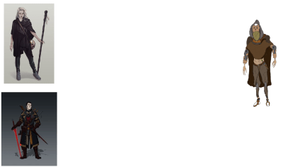
In the moment before I begin sketching this character design I would like to show the references I have collected which includes 3 in total with one that I have sketched up myself and the reason why I have included this in my references is due to its place as my favourite test piece whilst also how it gives me the most inspiration for my final product as this is the type of design I would like to go with. The character seen with the cream white background is one that I would also like to use to influence my development mainly due to the stance they are designed as I believe it would fit my character well and so taking inspiration from this design will allow me to create a more illustrated design with a professional presentation. The final reference I have chosen due to the sword design that is present in their hand and although not much else of this reference stands out I will be able to use it to help develop my illustration further through the implementation of a sword being wielded by my character in a similar way that is seen in this reference image. Overall these references will be of great assistance to me and I may expand upon them further should I encounter any struggles with my design and so I may be ending up with many more references being included within the folder of references that currently exist within the document and canvas that I have setup to benefit my workspace and outcome for this FMP.
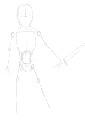
After gathering my references and setting up the workplace so I can work effectively I have now started sketching out the outline of my character which is a very simple construct yet will help me for when I start to produce the rough sketch and the reason why I have started out my design this way is so I have some sort of initial structure that I can work with instead of just immediately diving into implementing detail and making a mess of my work area and so to create this “skeleton” and use it to get an idea of the proportions, stance and structure I am working with will help me to sketch over it and create a design that is far more refined than what you can currently see in this image. I have also outline a rough sword design in the characters hand which of course will be further developed as I go through the multiple stages I will be working through for this design although I am not yet sure what type of design the sword will be presented with though this is to be decided in the following steps. Feet have been left out of the rough outline as I would like to begin developing the sketch further before I make any decisions on this area of the character as I may end up having to change a few areas of the outline should I encounter any complications.
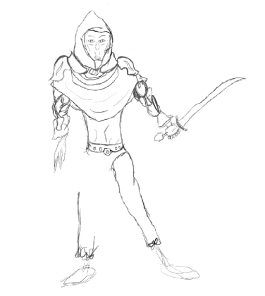
Following on from the production of my outline I have now started working on the rough sketch of my character which will be further refined in the steps that will be procured after this and what I have gone for in this rough sketch is a similar design that is presented in the test piece I worked on earlier and the reason for this because that test piece visualises what I would like to develop further in a more illustrated stance and so from what you can see is that I have designed the rough stance for this character that has them wielding the sword in a defensive posture and on the arms you can see some slightly sci fi features that I have ret conned over from the design I have produced previously and these blend into the arms and make the character more unique and diverse in the representation of this project. Although I am so far happy with the design of this characters head and arms there is some work to be improved upon for the legs and waist and so in the next session I will be working to resolve this and get a more suitable outcome for this aspect of the character before I advance upon any further steps of development. What I like the most about this design so far is the hood, cloak and shoulder plates as they are well sketched onto this character and makes them look more professional and organised whilst adding more illustration upon the design. As this is still the rough sketch it does not yet look refined and polished and will remain so due to its purpose to act as a more detailed outline and help me take it further down the line although there are still areas I need to work upon before I can call this sketch complete which will be my next focus before I create a professional art piece.

In this next image I am presenting my in progress rough sketch and the 2 references that have inspired me the most during the production of this design and the reason why I have taken this screenshot is so you can see where I have gotten inspiration for the design and stance of my character. Each reference holds multiple aspects that I would like to implement onto my own design such as the one on the left showing a face and head design that greatly appeals to me due to my appreciation of the art style used to create that character and the stance whilst simple shows a refined presentation and makes the character look less blend and more original/authentic. The detail can be seen to be heavily inspired by my self produced reference on the right which holds all key aspects that I am aiming to take further for this design and whilst I won’t be using all of those areas I will be taking inspiration from it so that I can create a well polished and professional looking final product that I have outlined within the proposal I have written up previously. Though these 2 references have greatly influence the process of my workflow I will be going back to my rough sketch so that I may change some of the key areas as there are still improvements that can be made upon the outline before I dive into producing the refined graphical design.

After reviewing my initial progress thus far on the final product and being unsatisfied with what I have produced to this stage I have decided to look through a new sheet of references presenting outlines constructed by an artist through the use of simple shapes so that I could replicate one of the outlines and use it to help me construct my character design and the sketch that appealed to me the most on this image is the labeled as D due to it being the most simplified and illustrated of the top row in the image and so this reference has given me inspiration for what I can use as an outline that will help me to have an efficient skeleton to build up my character design on. Looking at sketches for reference is personally for me more effective than viewing live photographs or finished art pieces as I tend to struggle with constructing an outline despite spending numerous hours at home practicing this aspect and so with images like these I can see the shapes and techniques used to construct such characters which is greatly beneficial to me as I can then construct my own outlines with assistance from images such as the one above.

After viewing an outline on the previous image that I found appealing I have produced two sketches of it which present the simple shapes used in its constructions and what I will be using this outline for is the exact same purpose that my previous concept was utilised for and so my skeleton pictured above will serve as the foundation for the building blocks of my character design which at this point has drastically changed from what was seen previously and is of a much better presentation due to this outline helping me with the stage of creating a stance and suitable position and proportions of legs and arms although hands are still not present this will prove a challenge for me due to the difficulty most artists have when it comes to this area of the body though I am confident I will overcome this by constructing a hand in the way that works best for me.

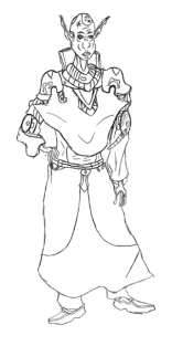
After the production of my initial skeletal sketch I have now began producing the detailed sketch of my character and for this stage I have gone through 2 processes of this concept with the goal being to get an effective outline that I can develop further to a more professional outcome and the sketch that I think suits me the best is the one present on the right due to it having a larger amount of detail as well as being presented with cleaner lines and overall better structure than the previous. The stance that I want to shoot toward in this illustration is for a relaxed though steadied posture that presents them with their hands on their hips and I would like to create my character in this position as it gives them more originality whilst presenting them in a polished and stylised outcome. With this stage of my character design coming to an end I can now move onto producing the next stage of line art for my character which will be done using a very dark shade of red instead of my overused black colour scheme thus far. Before starting the next process I have spotted an area that I find conflicts with the design which is the concept of the legs and a way that I will be resolving this issue in the next stage is through the implementation of more detail onto that blank space so that the legs look more refined and polished and one way I will be implementing the detail is through drawing a series of leather straps wrapping around the legs that give this area of the character more detail.
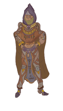
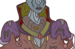
After the initial concepts and basic line art that I have worked on I now have produced the finished line art of my design which has been done using a dark red tone which I decided to go with due to my wish to experiment a bit with using a different colour for the last phase of sketching and from what I can see in my line art for this design is a large improvement in the neatened and straighter structure it is presented in and the reason for this improvement in my work is due to my usage of a cintiq tablet that I received as a birthday gift earlier in march and this has led to a large improvement in my line work which is greatly benefitting my designs as it looks a lot more polished and professional than some of my previous art pieces that appear more rushed and sloppy due to my dislike of working with ordinary graphics tablets. Other than just the improvement with my line work I have implemented a large amount of detail with the character now looking like something out of the Zelda franchise and although I was not aiming to hit this aesthetic in the beginning now that I see it I would like to continue with this style as it greatly appeals to me and allows me to visualise easily what texture would go best with this design. In this line art due to my sessions where I focused on producing the previous sketches I have been able to get rid of most of the obstacles I have encountered on previous character designs such as the waistline, feet and arms with them now looking fully supported by the rest of the design with little to no irregularities standing out. To make this design illustrated and interesting for the audience to look at I have added in as much detail as I could visualise in the areas that stood out to me as bland and too basic and so in areas such as the legs and arms I have put features such as leather straps and even some sci fi elements that are seen present on the characters arms. Now that this line art is finished I can go over any improvements and additions that I would like to perform such as the redesign of the face which stands out as an immense irregularity at this moment.

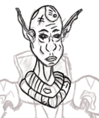
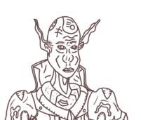
Before I begin texture I decided to return to the face of my character as what you currently see in the previous image is a horrific contortion of facial muscles and so I have remedied this and use one of my previous sketches to act as a place holder so I could draw over my previous design and use it for my refined line art and whilst not perfect this face is far better than my previous design and works with the perspective I have chosen to produce this design in far better than what was present in the original concept. On the face I have chosen to make the eyebrows slightly thick and the reason for this is so I can fill them with a darkened texture that can make the eyebrows stand out from the rest of the design without being overshadowed by the dominant texture that will be used to paint onto the face. To add some extra detail to the face and experiment with an area I have not touched on much I have added a series of eye lashes to the eyes just to add in a bit more character and besides this I have also added in a scar for the character which will reinforce them as someone who gets into danger often. To make this character seem more intimidating and mysterious I have added a balaclava over their face which connects directly to the hood and sweep down over the mouth which makes adds more detail to the design whilst removing the obstacle of having to design the lower sector of the head from the perspective I have drawn. With this area of my character now refined I can move onto the next adjustments that I have planned for this design before I begin texturing the character.
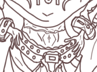
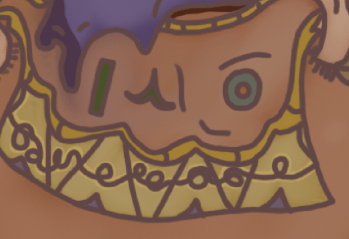
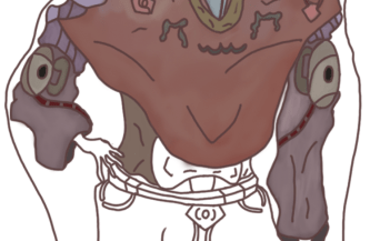
The next adjustments that I have made to this character are seen in the waist and wrist area and where I had originally planned for this design to feature the character wearing a shirt underneath the cloak and armour they currently bear I have now changed this and removed the shirt and added in an area of skin whilst above it I have drawn an serrated bottom half of a shirt which makes this character look more rugged and freelance than an undershirt would and alongside this I have also added in the top of the trousers he is also wearing that cut just above the belt with a slightly serrated and rounded waistline which adds to the rugged appearance of this design. The hands whilst simple have been produced in a way that has been most efficient for me and actually works well with the style of my design and so I have not changed the appearance of this limb as I like the way it looks and how effectively it works with the waistline of my character. For the wrists I have also implemented some extra features of detail on the cuffs which wrap around them and these features include the symbol of the religious order that I am conveying in this project which allow them to be identified and have an alignment.
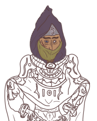
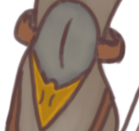
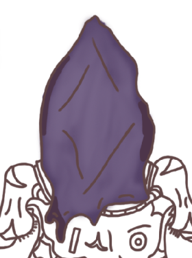
With the last details edited and implemented onto my line art in the described in the previous image I have now began the texturing process of my character and to start off this section of my work I have made use of the polygonal lasso tool which has allowed me to texture certain areas of my character without accidentally overlapping onto other areas that will not be using the same texture. In the design for the hood and overall character I want to go for a look of mystique which I am producing through the use of dark colour tones that give me the effect I want such as the dark purple that I have used for the hood and with this area appealing to me greatly I have now moved onto designing the face where I have used the ordinary texture I put into use when working on this area of my designs and I have lit up the areas beneath the hood using a very thin layer of the texture used for the face which has been done to make this area slightly more noticeable and the area seen above it on the hood acts as an emblem as for this character as well as using it to put out some extra detail for this area of my concept and to brighten it up some more I have highlighted the pattern seen using a thin coating of a very light creamy pink colour which adds a lot more to this product. Earlier I have mentioned that I wanted the eyebrows to stand out more from the rest of the product and I have done this by using a dark brown to colour them in and draw them out some more. Alongside the eyebrows I have also added a texture to the eyes and for one I have decided to make a pasty white texture as I believe adding a false eye to this design will make them more original as well as convey the danger of their profession. For the balaclava I have used the colour sampling tool to get the colour I used for my previous concept used in my ideas gen to get the colour design that I wanted for this sector of my character and I have once again added highlights into this area that light it up some more and make it eye catching for my audience.
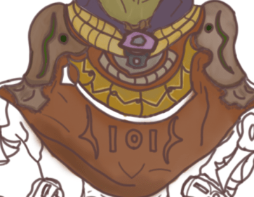
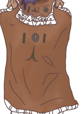
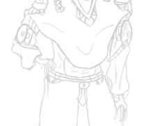
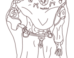
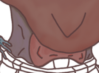
After finishing the texture for my head which I may return later should I make the decision to include highlights on the hood of my character I have now proceeded to begin texturing the center mass of my character and this is the area of my design that will be the most difficult for me to texture due to the amount of detail that I have drawn in this area and despite this fact I have so far managed to effectively overcome the issues that I was expecting to hinder me and the area that I began to texture first is the collar that is resting around the characters neck just below the hood which I wanted to look as if it was made of an aged gold like material and to get this effect I used a variety of light greys to gently sketch over the tope of the yellow and I have then blended it in using the mixture brush tool to get the desired effect I was aiming for which fits in suitably with my character design. After painting the collar I then began work on the shoulder pads which I have painted with a dark and light brown adding in a leather like texture that makes them seem more artificial and hand made and in this area of my product I have once again utilised the mixture brush tool to add shine as well as some wear and tear to this area of my product. With the armour on the shoulder pads I have added in the symbol that I would like to represent the order that this character belongs to and to texture it I have used the same colour tones that I utilised in my problem solving and so although the full design has not been carried over I have still used the original colour scheme I had envisioned to present this symbol. The step that followed after the texturing of the shoulder is the overhanging cloak which covers up most of the chest area and although it has not yet been fully textured there are currently areas that I have efficiently painted in the way I have originally envisioned this character such as the metal brace coming down from both of the shoulder pads that I have used multiple tones of yellow and grey to make an aged golden like texture such as seen in the collar located just below the hood and face. The next step that followed this area of my character design was the texturing of the cloak and for this aspect I wanted to use a darkened tone that makes it fit in with the mystique of the design though I was not able to achieve this as a darkened tone did not blend in well with the rest of this design and so I have used a lighter tone instead which has worked efficiently for me giving this character a good stylised appearance and to enhance this area I have used a cream like tone to lightly sketch in on the cloak followed by usage of the mixer brush tool to then blend it in together with the rest of the design. The next step after this is to finish off texturing the brace located around the chest of the product as well as colour in the order symbol present in the center which I will most likely utilise a new colour scheme for so I can make it seem different from the rest of the product.

Proceeding onto the next step of my design I have now finished the overhanging cloak presented in the center and the final phase of this area of my character was the texturing the symbol I have imprinted in the center of the cloak and I wanted to use the same colour scheme seen in the emblem on the shoulder pads as it all belongs to the purpose of conveying the same purpose and so I have kept the colour scheme whilst I have also added in a shine using a light grey and the mixer brush tool which I believe draws it out a lot more than it would without it. As well as finishing off the frontal cloak for this character I have also moved onto texturing the arms along with the hands and cuffs present at the end and for the arms I wanted to go for a dirty/rugged appearance whilst maintaining a shine to them and so I have given them a brown coating that I have then lightly sketched over with grey before once again making use of the mixer brush tool to blend the two textures together and get the desirable out come that I was aiming towards. For the hands I have used the same colour I used for the face of the character which is a medium tan tone that allows this area to easily be recognised as bare skin and for the cuffs preceding the hands I have painted them with an aged gold like texture that has been done through the use of a bright yellow and then a darkened tone that has been mixed in with the mixture brush and the symbols on the cuffs have been given their own texture so that they may stand out from the rest of the design. This area of character designing was one of the least conflicting so far due to the decreased amount of detail that I needed to texture and so this area was accomplished with efficiency in a relatively short amount of time which allowed me to focus more of my attention on the next area of my character.

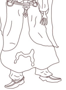
With the arms of my concept completed to this stage I have now directed my focus towards implementing a texture for the waist of my character and as said before in a previous annotation I spoke about this area originally containing an undershirt and my decision to edit this and replace it with bare skin instead which has made texturing this area much less challenging than it would have been originally and so I was able to use the light skin texture used before on the hands and face and effectively give the skin tone the correct feel I was aiming to utilise and to make it more realistic and stylised I have shaded in the areas where it has been deemed the most sensible and this makes the character stand out a lot more with this area easily identifiable as not being an undershirt.

To start off with the belt I have first coloured in the top layer of the trousers with a dark grey that replicates the colour used for the shading of the waist line and this is the texture that I will be utilising for when I get to the next step of this design below the waist but before I can get to that next stage I needed to apply a suitable texture for the belt and starting it off on the top layer I have made use of the eye drop tool to sample the same colour used in the hood design and then applied it to the belt before adding a shine to it using the grey tones and the mixer brush tool and to fill in the bolts on the belt I have made use of a light brown tone to fill in each bolt and make them stand out. The buckle has also been textured using a metallic colour scheme that draws it out and fits it onto the buckle. Overall this area of my character has come out looking as I envisioned it and I am pleased with the outcome thus far for the design.
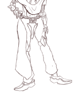
Onto the next part of this turn around I have worked on the legs which I started out with using a basic grey and the polygonal lasso tool which made sure I didn’t accidentally step outside the line art and once this was completed I then began painting the leather streps with a medium brown tone before transcending back to the trouser design so that I could add in some highlights and give them a shiny as well as silvery like mix to the original texture which at the moment is only partially seen in the design as on the right leg I have painted a few grey streaks before making use of the mixer brush tool that will blend it in with the trouser leggings. To finish off with the end of the legs around the feet I have coloured in with a dark brown the trouser material just to add some more colour to it and with this area of the design completed I can now move onto texturing the frontal cape and kneepads that are featured on this design.
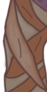
As mentioned above I have added a silvery highlight to a few of the leather straps present on the characters legs and the reason why I decided to do this is due to my own appeal of the look it gives the design as it makes it look more refined and polish whilst adding more character to the leather alongside some more detail that will help with the presentation of my character design.
With the main body of the legs now being fully textured I can move onto the final aspect of this area which is the knee pads and this area went through a straight forward design process that involved me using the mixer brush tool once again to add some wear and tear to the design whilst painting it with a scheme that made sense and held up with the rest of the design.

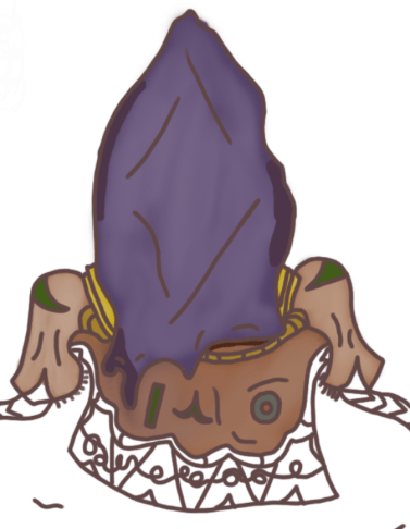
One of the last steps involving the texturing process for this design is the painting of the frontal cape which features the emblems of this characters order in the center which I have painted using the same textures for the previous emblem located on the center cloak despite in this area I have left out the shine as I believe it would be unnecessary and ineffective in this part of the design and so I have used the shine to bring out a more rough and polished appearance to the main body which was painted using a dark blue to fit in with the mystique appearance of this character. This is an area of the design that I enjoyed painting as it was a simple quick process and allowed me to use the same techniques of texturing I have utilised in the previous areas of this design.
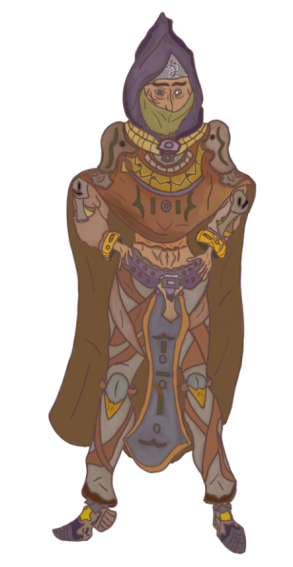
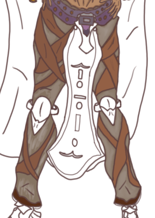
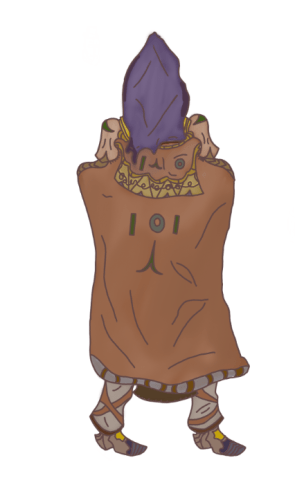
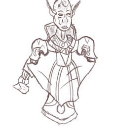
With all areas of this design now being fully textured I decided to return to the hood and make some final adjustments before finishing the product and what I have done to that area of the design is that I have added in shadows using a darker tone of the current purple colour that fills in the area inside the line art whilst I have then used a white tone to once again lightly sketch over the hood and then blend it in with the purple texture with the mixer brush tool to give it that highlighted feel like other areas of the design. After this last edit my design is now complete and what I like the most about this design is how the entire colour scheme works together to make them stand out and present the character that I had envisioned, this design also shows how I have successfully used a reference to inspired the work flow of this product as a lot of detail was taken from a previous sketch that I did for my problem solving which can be seen in an image located further above as well as in task 3. What I had outlined originally in my proposal was a monster who is intimidating and dangerous and what I’ve achieved at this stage is an individual who emits a large aura of mystery as well as order which I have presented through the presence of the religious orders symbol located on the frontal cape, leather shoulder pads as well as the cloak that drapes over the chest of the assassin. One aspect of this design that appeals to me is the stance and posture as the way in which I have chosen to create him allows an effective presentation that adds character and atmosphere to this design as they are properly illustrated with both hands on their waists and the face slightly looking towards the ground which makes them seem more original and creative. Before working on this design I had a number of concerns surrounding the style that I would be using to create them as well as what stance I was going to go for and how I would present them and to overcome this I made use of the references I have presented earlier as well as looking at outlines used by other artists to present characters which greatly helped to inspire the development of this product and with it now completed I find that I fully enjoyed the process of the frontal concept despite the lengthy amount of time I put into the design as well as annotations and with my confidence now solidified I should be able to produce the turn around design in a much shorter time period as well as with a renewed spirit as I am now starting to get more confident working at home whilst distancing myself from current events that cause me to experience a lack of motivation and so the way I am now working will allow me to effectively produce the FMP to a conclusion that I am happy with.
What did I find difficult or easy?
This was one of the strangest weeks for the course since all work was completed at home in an environment filled with distractions and although I have previously done work at home with practice sessions I am not used to full time college hours outside of the college itself and so this week was met with motivational struggles as well as obstacles such as creating a suitable outline. Despite the difficulties that I encountered this week I was able to overcome them and focus directly on my college work which once I was able to use the references I have gathered to notably influence my workflow it became a simple task of just working to the best of my abilities which enabled me to produce one of my final products that I am very happy with and will be continuing in a turn around.
What tasks didn’t I complete from this week?
The main priority for this week has been successfully created and what has been left out is the turn around which will show the back of the character so that the audience can see all sides of him.
Planning for next week:
How do I plan to catch up? Do I need to change anything about my work or planning?
For next week I will begin creating my turn around to show the other perspective of this character which I will be texturing in a similar was that is seen from this weeks product and in the event that I likely complete this early my extension task for next week will be to produce the first perspective of my Vampire Lord character design. To change about my work and planning I just need to find a way that can limit the amount of distractions that are present in my new working environment which I will be doing with techniques such as phone lock applications that will allow me to focus a lot more on my work.
Week Number & Date:
Week 9 06/04/2020
List of tasks for this week:
Begin flip around sketch for monster hunter
Produce clean line art that presents them clearly
Texture and fully present turn around
Begin sketching an outline for the Vampire
Simple sketch of Vampire
Vampire Line Art
Current Position:
Starting off this week I am going to be producing the turn around of this character and what you can see presented in the image above is the frontal perspective flipped around horizontally which I have done to make it easier to sketch over for the turn around as it will prevent me from having to start over with a fresh outline which is an area that I would otherwise struggle with and so to avoid this issue I have used the layer functions to duplicate the line art and texture of this design and then use the edit functions to enter the transform tool bar and then flip it around using the horizontal flip function which has given me this outcome. The flip around does not look perfect but it will serve as a suitable outline for me to design the backside which will hopefully be the easiest part of this character design due to the cloak I have included covering up the arms and legs for the most part which was an area that I was concerned about having to draw from a different perspective and so this inclusion has helped me to overcome those obstacles.
Before I start with the sketching of my turn around I have first set up the layer and folder so that I can have an organised work space which is much like what I have done for the previous work flow as it allows me to work more efficiently and easily navigate through the work I have produced on this document. So far I have two layers setup although more will be added which I will use to sketch over the line art layer and design with proper detail implementation so that it will present the character from a different perspective other than what is seen in the previous development process.
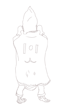
After setting up my workspace I have now produce the initial sketch of the turn around which will focus on the back of the character which I began by sketching over the line art featured in the previous image that I flipped using the horizontal flip in the transform edit to give me the right perspective and to get the design I require I simply added in the necessary detail I needed rather than sketching over the entire design as I was just using that as a guideline for what proportions and stance I need to follow. One area of this turn around that I was concerned about before approaching it is the way in which the feet will be designed as since it is from a different perspective I will find it a struggle to properly present this area of the design and so this will be a part of my product that I will be coming back to and updating as the design is developed further down the line. At the moment this basic sketch shows little detail as it is just meant to act as a place holder for my next phase although I have put in some minor detail as to just give myself some pointers of what I need to include such as the symbol presented in the center of the cloak along with a few folds that are present in the cloth. The hood design will remain the same though it will look more rugged and worn out from the back as I am planning on adding in a few tears that will make this part of the outfit look very well used. The shoulder pads will remain the same as they will maintain a similar look on both perspectives of this character due to the way in which they have previously been designed.
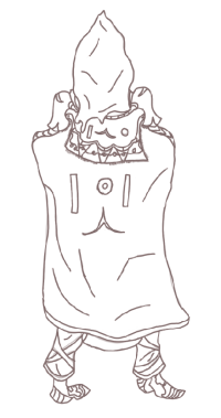
For this next phase of my development I have drawn line art over the sketch presented above using the same reddish tone I have previously utilised for the other perspective I have worked on and with this part of my design developed I now have clean lines to work with that give me a large area for implementation of detail and one area that I am finding a little bit conflicting is how much detail I should add as the majority of the back of this character is taken up by a cloak which has been done to remove the obstacle of designing the arms and legs from the back and I do not want to make the cloak look to exaggerated as then it will not effectively work well with the rest of the product and so for the detail in this part of the design I have focused mainly on the hood and neck area which features aspects such as shoulder pads and the necklace like brace which droops behind the character as well as on the front. To give this character more of an identity from this perspective I have once again imprinted the symbol of their order onto the cloak which consists of the same shapes I have presented previously. For the cloak I have added in the area that latches onto it which can be seen on the shoulder pads which was included to present the cloak as being clamped down onto the character rather than just coming out of nowhere which would have caused an irregularity with this development. Previously I mentioned that I wanted the hood to look more worn out and used and so I have attempted to portray this by making the start of the hood smoothly and steeply serrated so that it would slightly damaged which I believe has worked well for the design as it will make this character seem more independent and add to their personality. The legs are exactly the same just the leather straps are thinner on the back than they are on the front due to the way in which they are attached and to make them more realistic I may return to this area and add latches onto the center of each leather strap to show how they are wrapped round the legs of this character. The feet also remain the same though from a different perspective I have had trouble designing them and so I will definitely return to this part of the product and refine it some more as well as with other areas of this design as although I have the line art finished and cleaned up there is still more detail that can be added to it as well as areas that need to be smoothed out which I will be working on before I can begin to implement the texture.

Before I began texturing this turn around there were a few issues I still had to resolve and one obstacle that I encountered was the error I had previously made unnoticed where I had overlapped my drawing onto the sketch without using a different layer which caused a few complications for my design and so to remedy this I created a new layer and reduced the opacity on the original and drew the line art over the previous work on a separate layer whilst adding in a few more extra details which can be noticed just below the hood such as a few more wrinkles in the cloth that help to add a bit more realism to this design. One area that I wanted to direct my focus on the most is the feet as this area has always been a challenge for me especially when designing them from the back with the one on the left proving the most difficult to design due to the angle of the leg and so to fix this I used the same foot on the right but made some minor changers which can be seen in the trouser slightly overlapping the top of the shoe and to copy the shoe I used the previous layer to move it aside into this position and then trace over my original sketch and using similar detail due to them being the same set and copying it over helped me to quickly overcome this issue although finding a way to design them more efficiently without utilising this technique would be a great advantage to me.

Before I start texturing I want to compare both perspectives of the design before proceeding to any further phases of the development and from what can be seen in the image pictured above I have successfully kept the turn around easily identifiable as the same character due to the same detail I have used to keep them related to one another, the turn around is not in the exact same presentation as the front view due to some complications I met during the development of the design such as the construction of the feet from behind which although I have practiced in this area is one that I still find difficulty in and is one that I will need to continue practicing with. To make the turn around easier to design as well as removing any chance of going overtime on it I included a hood on the previous perspective to assist my development of the character as it now prevents me from having to draw arms and hands from a turn around perspective and to make it seem as if the arms are still there I have added the bulge on the cloak which drapes it slightly upwards as if it is being tugged on by elbows and now with the line art cleaned up and all detail implemented I can now move onto texturing this area of my design and document it.
The first area that I have decided to begin texturing is the hood and the reason why I have chosen to begin this area first is due to my preference of working from top to bottom and so it is easier for me to start in this area rather than anywhere else and to replicate the texture I used in the previous perspective I have utilised the colour sampler tool but during this task there is an issue that arose as I have not been able to get the exact same colour due to myself never laying out a colour palette which is a mistake that I need to make sure not to make again in the future and so I have gotten the colour to look as close as it does on the original design and then I have highlighted it with a silvery texture and then blended it once again with the mixer brush tool whilst following this action by adding in shadows through the use of a dark purple. The outcome of this hood now looks just as it does on the previous perspective.
Moving on to the next part of my design I have applied a texture to the cloak using the same colour scheme that I used on the previous perspective just so I can keep the design all consistent with one another and to make the cloak more real and graphic I have given a silvery highlight to it whilst also darkening a large area located in the center of the cloak using a white and dark brown tones that gave the appearance that I was aiming for when I first visualised the turn around. After texturing the cloak I have used the same green and turquoise tones to colour in the symbol presented on the back of the cloak which can be seen in two places with one below the neck and one placed directly in center mass. With the cloak now textured I can move onto the remaining areas of the turn around which present small details but require efficient texturing and so the next area that I will be texturing next is the detail I have missed on the cosmetic features below the hood. I wanted to texture this area of the turn around in this style as it allows me to give it a graphical appearance and give the cloak an eye catching presentation that is consistent with the rest of this character design.
Moving onto the shoulder pads and cloak area that I started off with before the previous image I have now given a suitable texture to show off with the rest of the design and the area that I started out with is the shoulder pads which have been textured using the same scheme as before which was taken from using the colour sampler tool on the reference I previously sketched up and then applying it to this area of my final product and to give it a highlight I then used a light white tone to sketch over it before then blending it with the mixer brush on both shoulder pads. To add some extra detail onto the back perspective of these cosmetics I have applied another symbol which drapes from the frontal edge onto the center of the back which has been coloured in as a dark green. From looking at the frontal perspective of my character the shoulder pads look to be darker and although I have failed to replicate this on the back this part of the design is still different from the rest and can be retconned in as just having a different coating on the opposite side of the pad. Along the neck I have also added in the golden armour pieces that drape down across the front and start at the back and to give these an aged and worn out appearance I have used dark yellows and then a dark brown/green tone to mix into the yellow and give it that aged texture which makes this design look all the more believable with no overly exaggerated aspects of presentation.
For this cosmetic area I was aiming to replicate what I had painted around the front side of the design and I have added in a few different areas of detail such as the arrows pointing upwards from the bottom of the piece which I applied a different texture to so that it would stand out more and have more of an impact on the overall outcome of this area of the design. In the loops that can be seen in the center I have used a similar highlight to what is previously seen in the frontal perspective and this has been done to add a bit more colour to this area as it seemed rather dull and too exaggerated without it and so to remedy this aspect the highlight was implemented to draw more light out of it and make it seem less rugged than it was previously. The reason why I have used a lot of yellow in this design is due to how easy it is to give it that aged feel as well as my own preference of the colour for designs such as this due to how well it fits and the ways in which it can be implemented. Another symbol can also been above this piece which has been textured in the same way as previous although the symbols are presented in different stances than can be seen in other areas which I have done to present the symbol as some sort of language that can have different meanings depending on how it is presented.
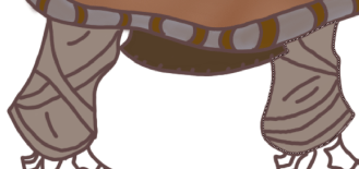
At the bottom of the cloak there is a new feature I have added which was done to make the cloak seem more lively and have an extra area of detail that isn’t going to just be textured brown and so what I have done to present this area is giving it a grey coating that I have mixed a light black into to darken it and then colour in the rings with a dark brown. This part of the design was just for some extra detail and has no major impact on the overall presentation of this turn around as it was just an extra area for me to focus on before moving onto the legs. The legs on this turn around have been given the same base colour which can be seen from the frontal perspective which is a medium grey tone and to finish off this area I will be highlighting it with a silver tone to give it the same appearance as seen in the previous perspective whilst the leather straps will be created through the same technique that I have utilised prior through use of the colour sampler tool.

As I previously outlined in my prior annotation I have now finished applying the texture to the legs of my turn around using the techniques I spoke about which involved me using a silver tone to sketch over the base colour before mixing it in with the mixer brush tool and then texturing the leather straps with a light brown and then the ends of the trousers with a dark brown as seen in the frontal perspective. This is one area of the character that I have managed to replicate easily without any minor conflicts due to all the colours used being present on the reference I have sketched up for the previous task 3 which allowed me to sample each colour and use them to get the presentation I required so that this part of my design could be developed to its final state. On the frontal perspective of this design there is also a cape that drapes down from in-between the legs which I have included on the turn around and to texture it I have applied a dark brown coating which makes it noticeable but not to detailed in this area as it is not meant to be viewed from behind but now that this part of the turn around is textured I can move onto the shoes and then compare the two perspectives in their entirety.

For the shoes I have used the same colour scheme through the same technique used on the frontal perspective so there is not much difference seen in this area apart from the lack of the symbol that you see in the previous perspective which can be viewed on the side of the left shoe in a purple tone and I have left it out in this design as I wanted it to be a one off aspect that can only be viewed from the front. This area was perhaps the trickiest of the entire design for both texturing and drawing due to the amount of conflictions that are present when drawing feet from a different perspective and so this area is one that although has been produced effectively does not look as consistent as the rest of the design.
After texturing the feet I have now applied a texture to every area of this design successfully replicating what I have done on the previous perspective which has since kept the design consistent and in line with what I presented in my proposal, now to see the biggest impact this design has made I will need to compare it with the previous perspective to get a better view of how effective this final product has been produced.
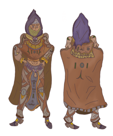
From what can be seen in both perspectives of this design I have managed to keep the colour scheme consistent as well as in making sure that the stance can be seen properly from both areas of the character and the perspective that I like the best is of course the frontal one due to the amount of detail I have used as well as the large amount of time I spent designing which took a little over 3 days to full polish and annotate all the screenshots I took as well finishing off detail and texture that fully presents the character in a way that I am overall pleased with. Whilst I like the turn around that I’ve produced I did not need to spend as much time on this area due to it being more simple with a lack of complexity due to the non existence of the arms and the majority of the legs not being present which allowed me to work faster than before and complete this area within a more reasonable time frame whilst still polishing it to a proper presentation that I outlined within my proposal. For this design I originally planned to include a sword and from what can be seen in the final product I have decided against this decision as I wanted to just focus on presenting the character and their outfit without any intervening assets that could prove a complication in the development process and so it has been left out of the final outcome and I believe this was the right decision to make as I have since made an eye catching and colourful design that does not require an asset to improve its overall appearance. With the decisions that I have made throughout the development of this first product I have gained a successful outcome that presents my character as one of mystique and lethality which can be seen through the colour scheme and stance that they are now presented in, the stance has also been another successful area of this design as previously I have only be used to drawing characters in a basic straight up stature that never gave them much character and so to have illustrated this one with their hands on their hips and a slight tilt of the head gives them the much more needed character that has been missed out on in previous designs and having it cross over between both perspectives successfully shows that I have learnt how to improve the way in which I design characters and what I enjoy the most about them.

Before I start sketching an outline for my vampire I at first wanted to gather a small number of references that can provide me with visual assistance for what I could add into my design and improve its final presentation and what I like about the top 2 references is how they are presented in a dark and mysterious aura whilst emitting a large factor of intimidation from themselves that allows them to be viewed as dangerous as well as highly intelligent which are all areas that I would like to implement into my character design so I can show them off as an agent of chaos. The reference located in the center is one that I utilised to help develop my previous design and I will implementing its assistance in the same way due to the many outlines and shapes that appeal to me and will help me get an effective design in the works which I would struggle to do if I were to use an outline that I draw from memory and so this is the best way for me to work and will let produce a professional final product that represents the theme of the project.
After gathering the references that I found the most suitable to help me in the development of this product I have setup my workspace in the layer box which will allow me to produce work in a more organised manner that will also help me keep it neat and without complexity and so I have organised 2 separate folders with one that includes all my references which can be toggled on or off at anytime I wish should I decide that I no longer need them present to help me with the product whilst the second folder will contain all the layers that I have produced sketches on. With the layers and folders I need at this point I can now start using the references to help me start out with developing the outline I need which will crucial in the first phase of this design.

With the sketches present on the reference sheet that I have annotated in a previous image I have used an outline that appealed to me for the design of my character and the reason why I have gone with this stance is due to my wish to present my Vampire in an illustrated manner that will make them seem intelligent and casual at the same time due to the immense power they possess and to this stance is one that I believe will help me depict this character design in such a way. At the moment this is only a simple outline and will be subject to change in the next phase of development should I decide to make any alterations in the design with one area in mind being the positioning of his arm on the right side which seems to be inconsistent with the hand that is currently resting on the hip and depending on how it comes out in my next sketch I will either be keeping or removing this part of the design.

In this next image you can now see that I have produced a more clean and straighter version of the previous sketch and despite outlining issues of possible altercations in the previous annotation I have not changed anything except for the lengthening of the arm that I spoke of before and I have sketched a simple hand block out to take up some of the room present as well as make the arm an actual limb, one area that could prove an obstacle for progress is the right leg which seems to not be as width as the left leg and despite my attempts to alter this I have not managed to be successful and so it shall remain on the design until I find a way to develop a new workflow to remove this confliction. In the sketch I have also produced a more ideal head shape which suits my design progress much more as this is a shape that I have used many times when doing practice sketches as well as personal projects that I have worked on prior to this assignment and so with this shape and construction I will be able to produce a design to the best of my abilities.
Now moving onto the initial detail sketching of this design I have at this point in the process produced a quick sketch that right now presents a concept of the face alongside the center mass design and cosmetic details which whilst seem to have detail implemented will be greatly expanded upon in the next phases of development. Seen in the design I have given my sketch the typical pointy vampire ears which I have efficiently implemented by using the perspective of the character to present them properly and these are a feature that I will be ironing out in the steps to come, also at this moment I have used similar features from the previous concept that I have produced as an additional final product and this is due to my wishes to have some relations be present between the character as the armour design is one that is commonplace among individuals in the universe that my project exists in and so whilst I will be implementing cosmetics that will present it in a different light there will still be clear correlations between the two which will hopefully keep both products consistent and relatable to one another. Currently in the image this sketch has not been finalised and it will not be the final line art for the product as I will be producing a few more to get a different look at each sketch before making the final decision for what one I will be using to produce the refined line art for this character of which will be including a vastly larger amount of detail that will give this character a professional presentation.
What did I find difficult or easy?
During this weeks sessions I have managed to use time suitably to get a large chunk of the project work done with the easiest tasks being the final texturing process on my turn around which was simple due to the perspective not presenting as much detail as the previous design and so I was able to work more effectively and bring one final product to a conclusion in the development and begin work on the next which I have so far proceeded in without many struggles as I am regaining confidence in character design and despite experiencing momentary lack of motivation and no longer having a decent sleep schedule I have worked through these issues and produced work whilst also managing to meet the weekly schedule I have set for myself and complete all the tasks set for the end of each week allowing me to keep up to date and maintain work efficiency
What tasks didn’t I complete from this week?
A task that I have started yet not completed from this week is the production of the vampire sketch and line art, this is because I spent the majority of this week finalising the final product of my monster hunter as well as adding in the necessary annotations to present the development process I have worked on and so although I have not completed all set tasks for this week I have made good progress on them with the beginning of my vampire character design taking place in the early stages.
Planning for next week:
How do I plan to catch up? Do I need to change anything about my work or planning?
To catch I will be setting my tasks for the next week to be focused on the production of my vampire sketches and line art and I will also include an extension task should I manage to finish all of these assignments ahead of schedule. At the moment I do not need to change anything about my work or planning as I have managed to keep up to date on my project and get all current tasks done effectively without falling behind and so I will stick with this workflow unless any complications arise that prevent me from working effectively.
Week Number & Date:
Week 10 13/04/2020
List of tasks for this week:
Produce sketches for Vampire Character Design
Draw Line art and produce necessary amount of detail
Refine Line art
Begin Texturing
Current Position:
As seen in the previous week I have begun the simple sketching of my final character design and starting off this first session I have sketched in a leg design block out as well as a concept for the arms and waist. When approaching this area of the design I encountered many inconsistencies in the presentation and so I have fiddled around with this area extensively until I got an appearance that I was happy with as well as being confident that I could mold it further into a more suitable appearance for final presentation. When sketching this part of the design I used a standard brush and a dark tone of red similar to the process I went through on my previous character design. One area that I found drastically easier than previous is the foot design as the reference I utilised for this area presented a foot design that I found easily inspired my creative thought and allowed me to produce a consistent design and whilst it isn’t perfect it does give me a great block out for what I can work with in the next stage of the design. The arms are also an area that I have struggled with due to the stance and perspective of the character and so with some extra time and work in the next phase I will iron it up a bit more so that it may appear more suitable.
Moving on from the block out sketch I have now chosen a different tone which is set as a black colour in which I will be using to perform another sketch over the block out and implement more detail before going over it one more time to produce the finished line art. From what can be seen in this image I have put some more small details onto the characters head with some sci fi elements that I have attempted to add into the fantasy theme of my project which can be seen through the metal plate welded onto the Vampires head and some features that are present along the metal collar worn around their neck. I have also changed the eye shape so that it appears slightly more sharper than it was before although now it is more difficult to view the pupils and so I may have to return to this area and adjust it further before approaching it one more time. The nose is another aspect of the design that I am also considering to be added to the list of possible alterations due to its inconsistent presence on the design.

After sketching the initial head design I have now moved on to the rest of the lower body directing my focus to the shoulders as well as arms and chest area which all present different areas of detail that I would like to present in this product. One area that I have gotten into conflict with a number of times on this design is the structure of the arms and one reason for this is due to the perspective I have used to present the character and currently one of the arms is utterly janky and does not have a good appearance due to the sloppy detail that it consists of and although this is just a sketch I do need to fix this area before moving on and another part of this design that I would like to improve is detail on the cape as currently it has the neck brace present on it but beside this it is presented as a little bland and dull and so to remedy this I will create a new symbol that I will sketch on to give it more variety than what it currently possesses.
After mentioning the difficulty I had with designing the arms I have decided to return to this area and start from scratch and use a similar design to the arms that I used in the creation of my monster hunter and with this new design I have implemented some of the sci fi elements I spoke about earlier in my previous development and the new appearance I have for this part of my design is vastly superior to what I had before due to it now looking cleaner as well as more consistent with the rest of the design and the hand design although not perfect and may undergo more changes presents a similar appearance as to what I used in the previous design which is janky fingers and a relatively simple hand structure. Some areas of the arm I have kept the same such as the initial armour pad that comes directly below the armour on the shoulder and I decided to keep this as I had trouble thinking of any alterations I could replace and so I made the decision to have this area remain the same and work it into the final product. After completing the waist in this sketch I then found difficulty in designing the legs as this is an area that I had to rework multiple times where I faced constant frustration and in the end I decided to overcome this obstacle by creating a cape which drapes down from the waistline and over the tops of the feet, this allows me to remove a problem whilst adding in a new feature to the design that fits the product and so the addition of the cape will allow me to have more time to begin texturing than spend it all getting frustrated on designing legs that keep on appearing out of place.
From what can be seen in the final sketch there is more detail present the higher you go and this is because I want the main focus of my character to be directed towards the head and waistline as this is the part of my design that will textured more heavily than the rest of the design. Although the leg design isn’t what I would have first thought of it was what I will now be working with as despite my frustrations it does fit in with the design and allows me to easily visualise how I would like it to look for when I begin to apply the texture. Despite my appeal of this design I still have one more phase of development to go through before I begin texturing which is to apply a different colour to my brush and then trace over the sketch to create the line art whilst also editing certain areas that do not appeal to me alongside adding in new areas of detail and fully finalising the character before approaching the conclusion of its final development.
Starting off with the line art I have drawn from top to bottom with the head first taking the priority and not much has changed in the design except for the tendons that I have added in for extra detail presented on the neck and along the collar taking place right below the neck I have kept the design the same except for adding in a series of freckles to make it look more aged and well worn as well as slightly mechanical which makes them look more of a hybrid between fantasy and sci fi which is one theme I would like to have present within this project. For the back collar which obscures the back of the neck the design has remained the same except for a few crinkles I have added in using curvy lines which is something I like to do on cloth like clothing as I feel it adds in more atmosphere to the outfit and works as additional detail. For the face I have narrowed the eyes down some more and made the pupils more visible than they were previously which will allow them to be easily viewed by the audience once I have successfully textured them with the colour scheme I aim to use for the face of my character.

Moving onto the shoulder pads I have added in some new areas of detail such as the symbol that I had in mind for this character which is their own respective emblem just like the one present on the previous design. Previously I spoke of including some more detail for the frontal cape which drapes down over the chest and this has now taken the form of the symbol that is currently present on the shoulder pads and the reason I have now replicated it here is to make this character appear more aligned and less neutral than they would appear with out it and so this part of the design now presents them as someone with an organisation and goal in mind which they are set out to follow much like my previous character design. To make the cape appear as if it is clipped onto the armour I have added in some visuals on the end of the shoulder pads which grab onto the cape to give off that effect that I was after and to finish off the detail for the cloak I have used the brush to quickly draw simple curved lines across multiple areas that make the cloak seem as if its folding and crinkling on itself which allows for a more realistic and believable cloak appearance which will be drawn out more when I begin to texture this product.
After creating the line art for the center cloak I moved onto the waistline and the arms, the arms have not changed since the sketch and maintain the same amount of detail despite some folds in the clothing that I have put in just to present some more detail for this part of the character, seen on the arm is a sci fi module that has a cord which I have designed so that it wraps around the arm and stands out so that it can be textured on its own as a separate module from the rest of the design, although I am happy with the design of the arms the hands are an area that I spent some time on trying to fix as this is a part of character design that almost every artist struggles with and although I am not too picky about this area I could still make them fit the design more and make the proportions even slightly better than what they currently are. Along the waistline I have added in a belt which fixes the cape around the Vampires waist which can be seen slightly overlapping at the top and I have added in the clips for the cape similar as can be seen on the previous one which whilst not too detailed here still serve the same purpose as before.
With the waistline completed I have now designed the rest of the cape to drape down to the start of the Vampires feet and near the bottom of the cape I’ve drawn out the symbol for their own order once again though I have enlarged the scale of it so it can be more clearly viewed by the audience. I have once again added in ripples for the cloth so that it is more drawn out and easily identifiable as an item of clothing, including this cape in my design will make it easier for me when I begin to create the turn around which will be occurring after I have textured this design and finalised it. In the feet I have followed a reference for a guide on how to create them which gave me the shape and size for how they should appear which has led to me creating a more appealing look for my feet which will be textured appropriately once I enter that phase. Although the legs are mainly obscured by the cape I have including one part of the trousers and to make these more visible I have draped them over the characters feet and I was originally planning to show a part of the Vampires leg descending into the shoe but decided against this upon encountering complications upon the initial phase of this design and made the choice to stick with this concept for the trousers. To make the turn around less of a complication I have also added in a cape on the back of the character which covers the arms and partially the legs allowing me to approach this area easier and hopefully finish it within a reasonable amount of time so that I can complete the remainder of my project.

To start off with the texturing for my Vampire I have started off with applying colours and highlights to the head and face area and to start off with a feature I have applied a medium base colour of blue to the head which gives them a pale and dark appearance making them seem more nocturnal and isolated than other individuals and to enhance this I have blended in a silvery tone to one side of the face to draw it out a bit more as well as make them seem more inhuman and appear more like a Vampire. A silvery tone can also be seen to be present on the nose which I have applied it to so that it stands out more on the face and is not obscured by the base colour that would originally have drawn little attention to it. For the eyes I have given this design red pupils which makes them look sinister and fits them into the role I outlined for them in my proposal which is one of a Vampire who possesses an evil nature and the colour red helps connote this due to its relation and usage with the theme of evil and danger and so this is why I have chosen this colour for this part of the design. On the head I have also included a scar and to highlight its present I have given the line art present on it an undertone of a medium red to signify its freshness as well as the nature of its presence upon their head. Moving on from the scar I then textured the augmentation on the forehead which I have applied a steel/silvery coating to that makes it look metallic unnatural which is exactly how I was aiming to present it. Wrinkles that are present on the forehead have been shaded in to cast a shadow down over certain parts of the head due to them overlapping one another and for the ears I used a darker tone of what I used for the base colour of the face and to make it so that the colour does not abruptly cut off as soon as the ears end I have blended in the border with the face so that it appears as a more natural transition. The final area I approached was the lips which I have given a simple dark blue that makes them seem pale and slightly dead and one final feature present on this face is the highlight that I have painted around the chin area which is to draw more life to the character as well as stand out as extra detail.
Moving on from texturing the face I have now moved lower down onto the neck and shoulder area of the character concept and I started this section by giving the neck a light blue base coating and then applying a silvery highlight to it which makes it slightly seem like its shedding whilst also giving this part of my character a unique appearance and this was created through the use of the mixer brush to blend multiple tones together and get the highlight I was seeking. For the collar surrounding the neck I aimed towards giving it an aged and metallic look whilst making the metal seem as if it was rusting with long term usage and I achieved this look by using a dark grey and then giving it that sickly brown/yellowish texture by switching to a very dark yellow/green tone and then blending it into the brown which has now made it seem as if it has been in use for a long period of time. The bottom half of the collar has also been textured to make it seem as if the design is metallic which was achieved through using greys and a dark red which gave off an artificial appearance for this section of my character whilst the medium blended into the grey gave a spray paint sort of aura off this area of my design. A module on the collar has also been textured a dark yellow to give it the appearance of a foreign compartment.

After painting the collar with the texture I have described in the previous annotation I then moved onto texturing the shoulder pads alongside the frontal cloak and for the shoulders I wanted to use a dark purple tone that inflicts an imposing aura around the Vampire and to light it up some more I applied a silvery tone that adds some shine to it and allows them to appear as more metallic. Alongside this base texture on the shoulder pads I have also included some other areas of detail such as the arrows and symbols added for visual purposes and these have been textured different though with fairly dark tones that help connote the presence of the Vampire in this setting. Attached to the shoulder pads you can see the clamps for the cape and I have coloured these in using a very dark red and then used a lighter tone to texture the clamps themselves which I have added a pink highlight to that draws them out a bit more than the previous base texture. Moving onto the hood I used a similar texture that was utilised for my previous character design and to differentiate the two from one another I have used a darker tone that is more suitable for this character than the previous and to apply this tone I first made use of the polygonal lasso tool to enclose it around the cape so that I could texture it without difficulty and once I had coloured this area I made use of a lighter white tone to sketch into certain areas and then blend it into the cloak to give it a more cloth like presentation and after this process I then moved onto texturing the symbols seen in the center which was done using a dark green and then a light grey to add that silver tone in.

Moving down onto the next section I have now started out with applying a texture onto the arms and I’ve begun this by applying a base coating of a medium grey tone to give off the dark aura I would like this character to emit and to finish off this part I will be returning to it so that I can apply a silvery tone that will draw this area out some more into the light. Once I ad applied a base coating to the arms I then moved onto the modules seen resting upon his arms which I have applied a grey coating to whilst the strap adjacent to it has been given a dark green tone and the button centred in the middle of the module has been given a black texture and to make this area of my design seem metallic and well worn I used a dark yellow tone to blend it into the metallic texture and give it the appearance that it has been in usage for a long period of time.
With the base coating applied to the arms I have now finished them off by applying that silver highlight which has now made these items of clothing appear more polished and finalised as this draws them out more and allows this area to stand out similar to the others as well as remain consistent with my current art style which involves heavy usage of this technique due to how well it works for what I want to present within my character designs. As well as just applying this to the arms I did some extra work on the cords that are connected to the modules and can be seen wrapped around the under side of the arm and to start off with this area I have given them a red base colour using a darker tone that allows to appear as more artificial much like the colour used for the collar surrounding the neck and to add some more detail as well as make them appear as a sci fi like element I have given them grey dashes that make it seem more lively. Now that the arms have been finished off I will be moving onto designing the waist of this design which previously is an area I have had consisted issues with but now that these have been resolved I am confident I can apply a consistent and well polished texture that will allow this part of my Vampire to stand out appropriately.
For the waist I used a medium grey tone to apply a base colour to this section whilst successfully missing the design in the center and once the base colour had been applied I then did some shadowing on the area directly beneath cape which I used a darker tone to paint a thin line to act as shadowing for this part of the design and to give off a multi colour vibe I once again used the mixer brush tool to blend in a light purple tone with the grey which has now gotten me the effect that you can view in the image above and once this area had been polished I moved onto the center design which was given a light red texture and then a silvery tone that I achieved through blending in white and red together that draws out the shine I was aiming towards, for the symbols that can be seen in the line art I have applied a light red to give them an aura of mystique. With this area completed I will be moving onto designing the belt and hands next before finishing this design off with the cape and feet.
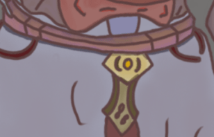
For the belt I began by giving the top layer a medium purple and the lower a medium pink tone which goes along the entire length of the belt and after applying this coating I have then worked on adding a orange highlight which has been blended into the base texture to give it a rust like appearance and moving on from the belt I turned my focus to the overlapped section of the cape which I have given a light blue/purple mix like tone whilst giving a center design more of a darker blue to give the cloak some extra detail. The buckle for the belt that is also attached to the cloak has been textured with a lite yellow and then highlighted with a darker tone before finishing off the center with a more medium shade that acts as a button for the buckle. The lower section of the buckle have been painted using a dark green and a medium grey where I have once again used the mixer brush to apply an aged appearance using darker tones of green to give the results I was aiming for.

After finishing the belt buckle and the overlapped cloak section of the design I can now direct my focus towards texturing the cape and this was the most simple part of the design as I never planned on adding in an exaggerated amount of detail and always aimed towards keeping this part the most simple area of the design and the texture I used for the upper layer is a light blue tone that I have then darkened using a dark grey tone and to finish off the second section I have used a dark purple to paint the area and then used a dark green for the symbol present in the center which has been given a silver tone much like previous areas on my character design.
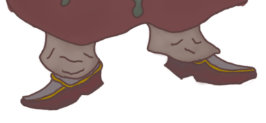
After applying the finished texture to my Vampires cloak I can now proceed onto finishing the legs and feet which have by far been the easiest aspect of this design to work on due to the low scale of the concepts and so to start off with the trousers I have applied a base colour of grey and then painted a light silver tone to it using the same technique previously utilised on different areas of this design and when I got to the feet I wanted to apply a simple texture that will allow them to stand out but not be over the top in colours and so the only area of the shoes where I have made use of the mixer brush is the bottom sections which has been given a dark pink highlight which is a feature I decided to include due to how it fits in with the Vampire theme and so I have made it blend with the design and given it a consistent look as well as I could.
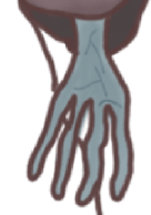
For the hands I returned to the texture for my face and made use of the colour sampler tool after which I then modified the tone to a darker colour and then applied the texture to the hand and to make them stand out more and seem undead enough for a Vampire I used a lighter tone to very thinly draw a number of veins on the surface to make them seem more unpleasant and chaotic. To darken the skin tone of the hands I sketched over using a darker tone of the previous light blue I had chosen and then blended it in with the base colour, this was done before the veins were added so that I could add detail in easier.

With the final area of my art work now textured this piece is now finished and presents my fully textured representative of chaos within my project. What went well for me in the process of this design was thinking of what textures would work best on each area of the character as this was an enjoyable part of the project that allowed me to focus on an aspect of character that is perhaps the part that I have the least conflictions with due to the more simple process that texturing requires. In designing this character I made use of my own character design techniques that I have used for previous designs and now with improvements in my art work such as the usage of a cyntique graphics tablet my line art is now cleaner and more consistent in all the important areas than what can be seen on my previous projects and this has allowed me to follow through with a cleaner process for texturing as well as removing and adding extra areas of detail. Despite my happiness with the completion of this design there is one area of the character that could still be worked upon which is the hands as I spent some time on this area attempting multiple concepts of hands as well as using reference although this was to no avail due to my focus at the time being more directed to detail on the arms, in the end this part of the design is one that I never aimed to draw too much attention to and is an aspect that I am currently not to picky about due to the presence of other features that completely overshadow this area of the design. Overall the completion of this final product is one that I am happy with as I managed to blend sci fi and fantasy elements together once more as well as relate this design to the previous through the inclusion of the arm modules and frontal/rear cape which allows them to bear possible relations with the other and create a larger theme of conflict within the theme of Order & Chaos.
What did I find difficult or easy?
During this weeks sessions throughout the Easter half term I encountered no major difficulties in completing the final product with the reason for this being the fact that I have effectively used the resources and references I have gathered to produce suitable sketches and line art that works well for the design that I had in mind and these references gave me insight as to what shapes I could use to build up the characters proportions in those outlines as well as how I can structure any detail that will implemented across those areas that I directed the most focus to developing such as the head and shoulders which are an area of the design that came out as well as I was hoping it would. Alongside this there were some difficulties that I encountered this week but that was mainly due to a minor lack of motivation which arrived when I was focusing on completing a large amount of annotations which have since come to be the bane of my existence due to the tedious nature of it though despite this all my work for this week has been completed and I have overcome the obstacles that hindered me the most though some minor do still persist.
What tasks didn’t I complete from this week?
For this week I produced enough work that I have completed all the tasks that I set myself to complete despite not expecting to finish the texturing process to my surprise, with this achievement I can now focus on the rear side of the character during the next session and push ahead of the schedule I set myself for this fmp.
Planning for next week:
How do I plan to catch up? Do I need to change anything about my work or planning?
Next week I will be focusing on producing my turn around as well as its texture whilst beginning to work on the propaganda poster I originally outlined. One area that I am hoping to improve on is my drive for annotations and although I have still kept them detailed and consistent this is remains an area that frustrates me that I need to keep doing my best at.
Week Number & Date:
Week 11 20/04/2020
List of tasks for this week:
Begin sketching turn around concept for Vampire Product
Produce Line art with any extra details
apply a texture and refine
Finish presentation of character turn arounds on Photoshop for exhibition
Begin producing propaganda poster using Photoshop
Current Position:

Before I start sketching the basic structure of the rear perspective my first priority was to make sure I had a suitable outline that I could make use of and sketch over and the way I went about gathering this reference is by returning to the perspective that I had just finished working on and then duplicating the appropriate layers and moving them into a new folder that holds all layers I need to work on for the next phase and then utilised the transform bar in edit to do a horizontal flip which gives me the perspective I need to sketch over and so with this area completed I am now free to begin adding in the necessary block outs and outlining that I need to do so I can produce the rear perspective as well as I can.

After fiddling around with setting up my reference so I would have a suitable structure I have now produced the basic sketch of my rear perspective where I have implemented some new details near the neck area which are present on the collar and this is an area I would like to focus on for this design as in the previous concept there is not much visibility of the collar and now that you can see it from the back I would like to detail it extensively so that I can present how it is attached to the overall outfit as well as what cosmetics are painted onto it in this new perspective and design it with a new texture that has not been used round the frontal side but remains consistent with the entirety of the character design. An obstacle that arose for me during the production of this segment is once again the design of the feet as this is an area that I struggle with especially from this perspective and what I currently have is not a design that I am yet happy with and so I will be redirecting focus towards this area and use my resources to get a more suitable outcome that I can work with easier than the current concept. I have also shown where the hood cuts off as well as what direction it drapes too with some serrated edges appearing at the bottom which present this Vampire as recently being in danger and underneath this I have also included the kilt which drapes around the legs of this character and although there will not be much detail on this part of the design I will still be including folds in the clothing that will help to bring it to life some more than what it currently stands out as.

With the current obstacle being the design of the feet from a rear perspective I returned to my presentation research where I have pasted a reference featuring a character turn around produced by a different artist and to use it to assist me I have pasted it into the photoshop document and scaled it appropriately so that I could draw over the foot design present in the image and then edit it so it appears more like a shoe than a foot, this was an effective way of sorting out this issue as it gave the best rear stance for feet whilst maintaining a similar design between the two and all that is left to now is to apply the detail before moving on to texturing. Despite failing to draw the feet myself I did still find success and made use of the resources I had available to me at the time that allowed me to reach the desired outcome without spending a great deal of time conflicting with the obstacle and so using the reference in this way will allow me to get greater results and although this reference is now no longer needed it is still one that was of great help to me and will be saved for future use.
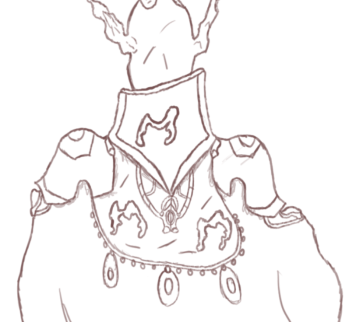
With the block out sketching done I have now refined the art work in the next phase in which I have gone about the process of producing a more detailed sketch that has the correct line colour I would like to use for the line art and the area of this design that I have focused the most detail on is the upper body which presents the most cosmetics and items of clothing due to it being the most protected area of this Vampire and earlier I spoke of adding in more detail to make the collar stand out which I have done in this phase through the inclusion of the Vampires symbol imprinted in the center whilst the top edge makes it look as if it is 3D and below this I have included extra features presented on the shoulder pads that show the rear perspective of the design that can be viewed in the previous concept, this was done to give the audience something different to look at whilst still viewing the same character all from an alternate viewpoint. Underneath the collar is a rear necklace like item which drapes down to link with a item in the center that irradiates more atmosphere that personalises the Vampire more as it shows them off with personal possessions of their own. Besides just the rear necklace the symbols are once again visible on either side of the design and are placed on a hood like piece of clothing that is attached to the shoulder pads as well as the collar which shows the viewer how the Vampire has fit into this outfit as they can now see that he must drop it on over his head before attaching the cape to the clamps present on the frontal perspective. Below this design I have also added in some beads which add some more personalisation to this design as well as give them a sprinkle of their own style in the design of their outfit.
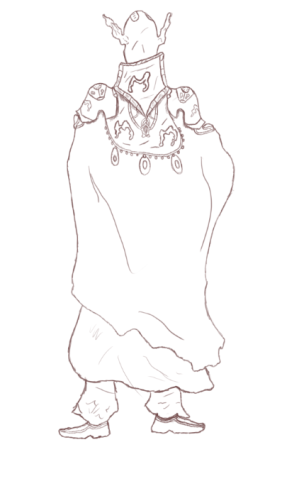
With the completion of the refined sketch I now have the detail that I originally envisioned for my turn around and with all conflicting areas that contained obstacles now being resolves I have a suitable concept to work with holds a large amount of detail in the areas that I would like direct the audiences attention too and so with this part of my design done and the detail on the shoes being implemented using the same detail present on the previous perspective I am now free to begin creating a new layer in which I will be reducing this ones opacity so that I can then draw the line art over the sketch and implement any new detail that I think might be necessary for the presentation of this product which might come in the inclusion of some features on the cape as I currently see this area as lacking in detail and so with some extra time spent in the line art phase I could improve this area and draw it out a lot more than the way it currently stands.
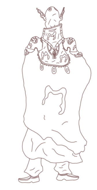
As I outlined in the above annotation my next step in the development of this product was to begin the creation of the line art which I have now completed to the degree that I found necessary that would give the right presentation of my product. The line art was produced so that I could have an easier process of texturing the design using maximum pressure and a small brush size to get a clear drawing produced and the way in which this will make texturing easier is that it will prevent the colours I use for painting from showing up beneath low pressured line art which on some of original project work previously has not worked well and so using the line art I will be able to get much cleaner results whilst maintaining a consistent look for my character. I also spoke of implementing extra areas of detail with one of those locations being the cape which I have added onto through the inclusion of the Vampires symbol that I have scaled to a large size so that it takes up a lot of the empty surface area present on this part of the turn around and although I did not add in much detail in this stage I have given some wrinkles and folds in the cloth just to go a tad bit further with this segment of the project and now that this area is successfully completed and is a design that I am happy with the next phase of this project will be to start developing the texture of the Vampire so that they can have a proper presentation.

Beginning work on the texture I have started out with painting the back side of the head which I have successfully completed through the process of once again making use of the colour sampling tool and using the same palette I previously used to apply the appropriate colour scheme for this area of the design, Not much of the head has changed though the back does feature the start of the implant that was seen in the previous perspective that has been coloured in and blended with a silvery tone whilst the border area of the head has undergone a smooth silver coating to give off some light in this area of the drawing and for the ears I have made the back side appear more darker and obscure due to the art work appearing more mysterious and eerie in this manner and so with the head textured and a silver highlight applied through using the blending tools I have since moved onto the collar and since this is an area that I did not get to draw as much attention to in the previous perspective I have used a relatively vibrant colour scheme to draw attention to it with the base colour being a dark blue/purple tone that I have then blended a medium yellow into to give it that aged and worn out presentation whilst the symbol has been blended together with a light grey to draw out the atmosphere in it. This part of the design is one that I was looking forward to progressing onto and the only area that stands out to me is the final areas that are present with the ring binders and so this will be an area I return to later on in the development that I will be patching up and refining some more before declaring it finished.

In the next phase of texturing I have directed my focus to the upper body and for this session I applied the texture to the shoulder pads and the hood attachment that allows this character to put on their outfit and the way I have textured this is by at first applying a light purple tone to the entirety of the outline before blending in a light grey to get that graphical appearance which afterwards I have then singled out the immediate details that required more attention such as the locket draping down which I have symbolised with the Vampire by painting it with a red colour scheme as this is a texture that I believe is well suited for this type of character and so to make sure I haven’t over exaggerated it’s presence I have blended in the colour white to make it look more polished and prevent it from obscuring any of the detail I have added on to it. For the Vampiric symbols I have gone through the same process through the use of the same colour scheme which has given me the desired appearance I had originally visualised and used previously. To make the locket seem more independent from the rest of the hood I have filled in the space above it with a blended blue and red texture that gives it a more solid presentation giving it a unique aspect to merge with.
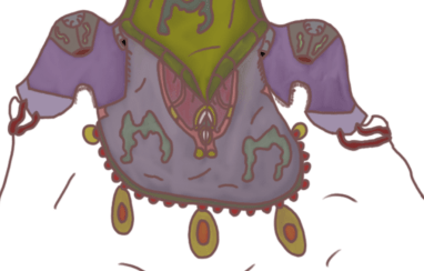
After returning to the areas where I had missed out on texturing the remaining detail I have now successfully applied the colour scheme to this area of my character design and the final process I went through was applying the texture to the beads that can be seen hanging down atop the cape and this was an area that I spent some time thinking about as I was not completely sure how I should have gone about texturing it but after some reflection and viewing the previous perspective I have developed, I decided to work with what I had already been using at the time which is a red and golden colour and the reason why I chose to remain with this palette is due to the way it blends with my character design as this is a texture that conveys well with a Vampire and can be manipulated to fit appropriately into any colour scheme and so with this area now textured I can observe it fitting in well with the rest of my design which will now allow me to move on to applying the base texture and final coating to the hood which takes up the largest area of this perspective.

Before I began painting this section of the art work I went through the process of using the polygonal lasso tool to form an imprisonment around the detail I wanted to texture. This was a tedious process of the development as I spent some time clicking across the design before linking it with at where I had first started it which although a tedious process it will allow me to texture this area without any fear of overlapping onto different parts of the design that already hold a texture. The colour I selected is a lighter tone than what can be seen from the previous perspective which holds a dark appearance due to being obscured by the body of the art work and so for this one I applied a relatively light base colour to it before darkening certain areas with the mixer brush by blending in a darker tone of the same texture. The symbol although larger has undergone the same process of development that I previously outlined and so there have been no changes in this regard besides the overlap I made when blending the shadows into the design which I thought would go well on the symbol also. The bottom section of the cape has painted with the same colour as on the frontal perspective which is the red that was used for painting the bottom half which is mostly what you can see in this image, to apply a shadow to it I used a darker tone and blended into the largest part of the design to make it more detailed than it was originally presented.
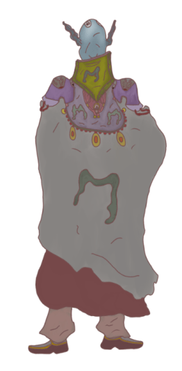
Moving onto the final part of this design I directed my focus onto the feet which consist of the same colour scheme that I have previously utilised for these two art pieces and previously this was an area that I had many conflicts with both on this art work and the previous though despite this I have pulled through with a design and texture and whilst lacking in some detail it does hold the stance that I was hoping to place it in as well as standing out consistently and not conflicting with any area this art piece. With the legs and feet now done the turn around is so far complete and although it has now been fully textured I do still need to work on how I am going to present it as well as implement any final edits that I wish to include before submitting it and finalising it as my final product and some edits that I have in mind include shadowing and highlighting certain areas and implementing some sort of lighting that can bring more life to my character design as this will help me out a lot more for when I move onto final presentation.
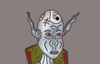
One area that I wanted to return to is the facial design of my character as previously I was happy with the design but I saw something lacking overall for the design and so to give it more atmosphere and go further in texturing and implementing a light flow for this art work I made use of the dodge tool and used the midtones option to bring out the detail on the face as well as shadow in the cheek bones which can be seen in the form of v’s and with the dodge tool being utilised the presentation of my characters head and face is a lot better than what it was previously as the tool has allowed me to implement more detail and aesthetic tones through a very simple process, the original texture looked to dark despite my happiness towards it and so the utilization of the dodge tool to go over the surface has definitely helped me bring out this area of my character some more and present them in a solid style.
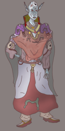
To add more of an arcane feel to this frontal perspective I have added a highlight to the left shoulder pad which has added sparks of bright purple that appear almost magical in nature which helps to refine my character design a lot more than how it was originally presented. After using it in this area of my art work I then added in mid tones and shadowing across the cape that drapes down the front to blend it together in a more appropriate style before moving onto the cape and brightening up the mid section and I have focused this tool more on the left side of the character as this is where I want the light to be coming from due to the impact it has on the presentation of my art work.

With both perspectives finished and after comparing the two I can now see how much resemblance there is between the two art pieces and with the results shown in this image I am pleased with this outcome as I have managed to develop a full character design showing off two perspectives that are the most important areas of detail in designing an individual as they possess the largest surface area that will always contain most visual aspects of a design. After implementing the detail I wanted put into the design I went through the additional process of using the dodge tool to give some extra highlights and showing onto my art work that helps to draw out extra detail as well as implement more of an atmosphere onto my drawing as it helps to present it in greater detail and show the audience some sort of working light flow reflecting onto the character from a certain perspective. Although I am happy with the outcome of these turn arounds there are still a few areas that I want to touch up a little bit on with one of these being present on both perspectives which is the bottom cape as at the moment I believe it is lacking in detail and could be shown off a bit more if I were to spend some time implementing some more detail to it that will allow it to stand out and appear more polished than it does now.
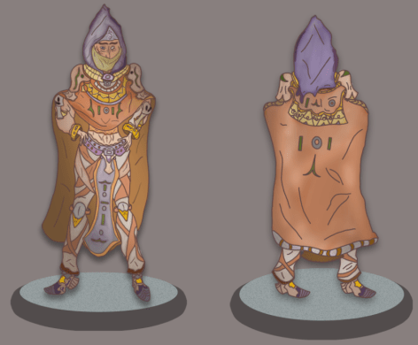
Returning to my previous turn around concept I looked over this design and pointed out a few areas that needed some highlights as due to the success of the dodge tool on my previous session I figured I might as well use it to its full potential to assist the presentation of my previous design and so I have added lighting to the upper body of this character as well as adding light reflections on the cape in the turn around which shows off a more realistic and detailed art piece and the reason why I wanted to put the lighting on the upper body is because this is the most detailed area of my design and I want to present as clearly and consistently as possible and so using the dodge tool allows me to add in a highlight that allows this to take place and with this now done I can return to implementing extra touches of detail as well as refinements in both areas of these character designs.

One area that I was originally displeased with was the presentation of the mouth as I did not see it as an appropriate feature in the way that I had designed whilst the texture also did not fit the overall concept and after referring to sketches produced in my ideas generation I made the decision to completely redo the mouth and although I have kept it in a similar structure to what it was originally I have now added in fangs and changed the colour of the lips to a pinkish red which allows this part of the design to stand out more as well as now having it bear an iconic feature commonly utilised in Vampires as the fangs are their main center point in presentation and so with these now included this area of the design is now much better than it originally looked especially when I compared it the first one.

In a previous annotation I spoke about wanting to add more detail into the cape of my character to make it stand out some more than it currently does due to its dull appearance and so I have added in some simple cosmetic features in the form of symbols and shapes that can be associated with vampirism and some of these shapes are presented as little raindrop like designs which drip down the front of the cape and for all added features I have applied gold texture to them and clustered these features into random areas on the cape to add some chaos to the design even if it is fairly simple. As well as adding in these features I also worked on an additional highlight to the area once again making use of the dodge tool and brightening it up with a light pinkish red tone that blends well with the rest of the design and lets the viewer see this part of the art work in more detail than originally.
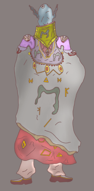
Originally on my turn around the cloak could be seen as relatively bland and lacking in detail and so to change this I returned to this area of the design and added in some small features that take up more surface area of the design that are also suitable to the presentation of the artwork and what I started off with were the little golden symbols that can be seen in the previous image to decorate some of the blank space personalise this areas a bit more, whilst I am currently using a cyntique tablet for this art piece I have due to the small scale of the symbols encountered minor issues in straightening the lines although this is not a large issue due to the presence they hold as well as the current location of them being that of a cape which constantly moves and folds in on itself and so not having completely straight lines actually helps this part of the design with some minor detail even if it is not that noticeable. On the beads I have linked the largest 3 together using a golden link which snaps between them in straight lines though with very sharp corners and the reason why I have decided to implement this into the design is due to my wish for making the beads have an extra feature that lets the viewer take more notice of them whilst holding a secondary asset that acts as type of support role. On these beads I have also added in an extra highlight onto the golden oval to show the reflection of light which works well with the rest of the design and gives my art work a much better presentation that what I was going to go for before I made additional decisions as to what I should be improving on. The shoulder pads have also been given an additional highlight and this is not due to light reflection but to the arcane sorcery whose presence I want to connote and this works well as it gives the art works shoulder pads the mystical aura with a purple like mist texture that has them stand out as more unique than other areas of the design. Implementing these additional features gives my artwork more presentation qualities as well as showing it off as a more polished product than what I have originally worked on and comparing this newer upgrade with the original that I almost stuck with I can see clearly that adding in additional detail and experimenting with new tools that I normally don’t utilize has been effective in finishing this final product and with both areas now finished I will be able to start working on presentation boards before I move onto designing the poster that I outlined within my projects proposal.
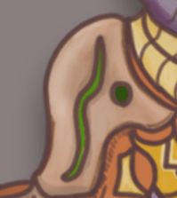
Before moving onto the presentation experiments for these art pieces I first wanted to return to my assassin character design and touch up an area that I had been eyeing up since I started the highlights with the dodge tool and the area that this was is the shoulder pads as these are one of my favourite features on this art piece due to the way I have presented them on the character as well as the colour scheme that I have painted them with. For the highlight I have gone over the entirety of the design to give it as much shine as possible and though this may have overexaggerated it upon first thought I have kept it consistent with an effective result that presents it to a greater quality than what it was originally.
What did I find difficult or easy?
The tasks that I found easy this week included the final texturing and detail implementation of my Character turn arounds as at this time I had already completed the designs but wanted to focus on adding in detail to areas that didn’t stand out as much which was an easy task due to the simplicity of implementing small features that bring attention to different areas of the design. Another easy task that I encountered was the production of my presentation board studies which show ways in which I have experimented in laying out my art pieces so that I can get them finalised and ready for exhibition. Overall this week was one were I kept on task and got ahead of the schedule that I set myself.
What tasks didn’t I complete from this week?
Despite finishing off my character turn arounds I was unable to begin working on my propaganda poster, though this is not too much of an issue as I have plenty of time to develop it and although it is an area that I am rough with I will be using resources online and my own skills to get the best outcome possible within a realistic time frame.
Planning for next week:
How do I plan to catch up? Do I need to change anything about my work or planning?
Next week I will be focusing entirely on developing my propaganda poster as well as performing work on my presentation research which at this time is still outstanding due to my preference to first complete the artwork. With the extension handed down I am confident I will have all tasks completed by the deadline and any time made available I will spend implementing more detail and final touches on my art pieces as well as making sure that they are all developed to the best outcome.
Week Number & Date:
Week 12 27/04/2020
List of tasks for this week:
Begin development of propaganda poster
Produce final product for poster concept
Finish presentation research and expand upon exhibition studies
Current Position:

Starting off this weeks session I have focused on laying out the background for my propaganda poster and before moving onto this stage I thought about how it would look best with the first thing coming to mind being a rough and grainy sheet of paper with a dark overtone that helps connote the message of the poster as well as provide it with a darker atmosphere and what I did to achieve this in photoshop is that I started out by setting up an A3 portrait canvas and then painted the background in dark brown tones using quick dabs that allowed to quickly cover the canvas and once this had been achieved I then went over it with some lighting as if it the poster is pinned to a wall then it will be shown in a spot where there is plenty of light to reflect off of the canvas and with this done I can now work on the dominant image of this design.
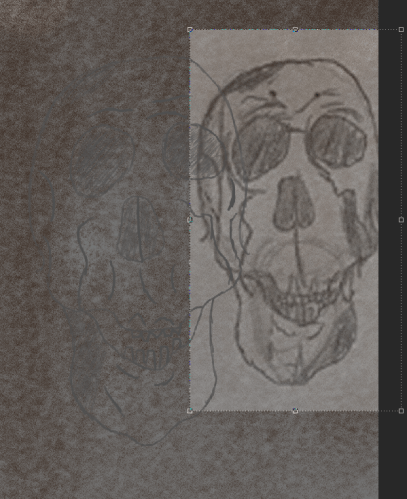
After setting up the canvas and applying a background texture I have now began the design of the center skull which I have chosen to take the place of the dominant image as it is the concept I am most comfortable with designing due to its aesthetic appeal to myself as well as my audience and so I will be creating this skull to be the center piece of this propaganda poster. To sketch the skull I imported an image of a sketch I have done previously which was produced a few months ago during a study session at home and the skull that I liked the most from that session is the one I have imported and sketched over in photoshop. At the moment the sketch of the skull is very faint as I failed to notice what colour I was using whilst sketching over my art work and so this will need to be refined as I progress onto the next stage. To help me with sketching the skull I lowered my references opacity so I would be able to see my own line art a lot clearer when I made use of my graphics tablet to produce this work.
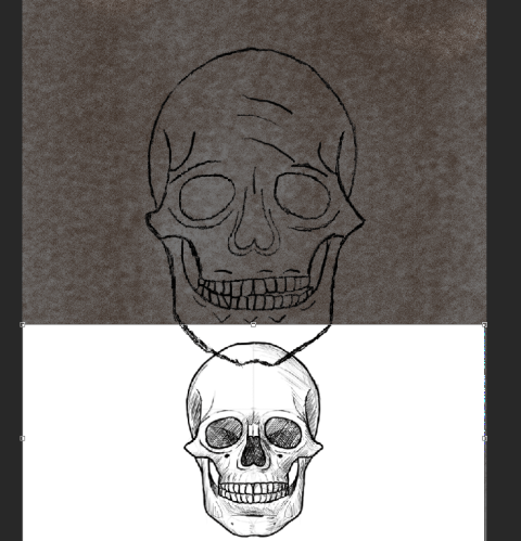
In the next session I took a more direct look at the structuring of my skull and although the previous design I produced was one that I am happy with it still did not hold up to what I was hoping to produce for this poster and so I gathered a new reference online and sketched a new design with assistance from this image which has given me an outcome that I am much happier with than what I previously sketched and to refine it once I had finished the basic sketch I then shaded in the line art to make the work appear darker and stand out more on this canvas and the brush I used was a charcoal one featured within the photoshop brush list and the reason why I decided to use this brush is due to the way in which it blends in with the background as the rough blotchy feel of the brush blends in well with the background texture as it appears a lot more hand crafted and is a style that I want to blend with the presentation of this art piece. With this sketch produced I will now be refining it further whilst keeping a sketchy feel to it that sets it within the fantasy/medieval genre which I have focused my project around. One area of this design that was not as polished as other areas is the teeth as drawing that many in close proximity to one another whilst maintaining them all at the same scale proved a small challenge for me and so most of the teeth are designed in a different shape and scale from one another though this does not pose an issue and instead makes this aspect of the skull feature differentiation which works well towards the final design.

With the sketch finished and refined I have now fiddled around with the background to create a more rough and hand made feel to it with more reflections of light being implemented through the use of the brush tool which I have dabbed over certain areas of the canvas to give the surface a stain like effect which would be present on a poster such as this due to it being permanently outside for public viewing and so it is left vulnerable to degrading effects when set up in an open environment. Alongside the skull I have placed two symbols that are representatives of the order that my monster assassin belongs to and the reason why I have designed them in this style is due to what I have already imprinted on the character design and so to keep them consistent and relevant I have designed them in such a way that allows them to be seen as relatives of the previous symbols and I have placed them on either side of the skull as I wanted to take up the negative space that was featured there. Below the design I have placed another symbol which can be seen on the turn around for my Vampire character design and this has been included on the poster as it presents another relation between the two individuals that I have designed for this project and connects a narrative element to the two characters through simply being presented in this manner.
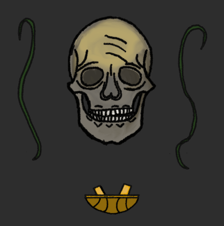
Moving onto the next phase of my design I have focused on applying a texture to the symbols and skull that I have sketched and presented in the center, for the skull I wanted to give it an aged and deteriorating appearance with certain areas such as the forehead being worn down than most and to start this off I applied a base colour from a grey tone to the drawing which best suited the design and following this I then went over specific areas such as the rim and edges with a dark yellowish brown that I have then blended in with the rest of the design before moving onto the forehead where I used the mixer brush to blend in a yellow/gold texture in with the rest of the colour and after performing this process for the base I have since applied a separate texture to the eye sockets which have been done with an even darker grey and some black mixed in to hollow them out some more. After the rest of the design had been textured I then moved on to the teeth which have a pasty white colouring to them that gives the effect of deterioration wearing down the teeth which shows the state of disrepair that the skull is in. After I finished off with the texture for the skull I then applied the colouring to the symbols that represent the order both character turn arounds are related to and for the strands I have applied a dark green that I believe suits them quite well and fits them in appropriately next to the skull that I have designed. To finish off texturing the dominant features of my poster I did the final symbol presented at the bottom in a dark and bright golden colour and I chose to go with this scheme as that is how it was presented on the design of my Vampire turn around and I would like to keep the designs relevant to one another so that I can maintain the resemblance.
Due to my displeasure with the previous backgrounds that I worked on I have made the decision to dislodge the plan for a realistic poster with a paper like texture and appearance and so my new idea for this area of my project is to create a graphical poster where I can use techniques that I have previously utilised in past projects such as the inclusion of a distant moon which can be seen being currently developed in the image featured above. To create this moon I followed an online tutorial to refresh my memory of this development which began through the use of the marquee ellipse tool after creating a black background for the poster where I have then added in the clouds by using the filter functions available on photoshop and once this had been achieved I then spherized the feature which gives its current appearance. After creating the moon I have then moved into the top corner of the poster so that it has an overarching appearance that allows it to look down on the additional features of this product.
After creating the moon I added in a number of stars using the brush tool with the majority focused around the rim of the moon so that I could highlight this area whilst keeping a natural like appearance for it as well as make this part of the poster more eye catching. After the implementation of the stars and focusing them in one area I then applied a rectangular marquee over the entire canvas and implemented the cloud function on a different layer that was placed at the top of the stack, after this I then applied a layer mask and cleared the clouds from the center of the poster once I had lowered the opacity of the brush and layer to 50%. With this done my poster is now setup and ready for me to begin adding in the assets that I have created for it into the center, these will be transferred from a separate document once I have copied the layers to allow for this process to take place.
For my poster I wish to add in the title and title theme of the project and so I have made two text layers with one saying “Silver Moon” which is the title of my art pieces whilst the second text says “Order & Chaos” which is what the overall theme of the project is titled and so too include these two would be appropriate for my design as I no longer wish to have this act as a propaganda poster due to the idea never really appealing to me and so it now acts as an overall advertisement for the prominent art pieces that I have created for the theme. To make the text more suitable and appropriate for this art piece I have changed the colour to a silvery tone and after that added in a shine using the outer glow which gives the silver more notice and fit in with the design of the moon and background. I have also given them a blocky 3D like appearance using the drop shadow function featured within the blender box where I have adjusted the size to a scale I found most appropriate.

To finish off the poster I have now moved over all of the assets that I created in the previous document with the skull and strands being featured directly in the center surrounded by the clouds whilst also being located just beneath the moon and the reason why I made the decision to include them in this area is due to the vast amount of negative space that was present in the area and so to locate these assets directly in the center allows a dominant image to take place that takes center point of the poster. For the text I have included the title of my project above the skull directly aligned next to the moon in a scale that allows this to be the first area that the audience sees whilst the title of the theme Order & Chaos is located directly beneath where I see it as a suitable location due to how well it mixes in with the rest of the poster. To finish off this produce I added borders to each corner that show an end to the poster which I have textured with a golden colour to suit the graphical appearance. Although this poster has not come out how I originally envisioned I have edited its original purpose to suit my creative abilities more efficiently and allow me to get an outcome that is consistent with the theme of the project and despite not enjoying this part of the project I am still pleased that this is an area that I was able to wrap up and progress onto the next phase.
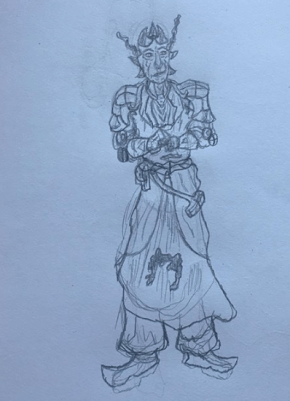
For one final piece I have decided to make a character design of a mutated priest who I will be fitting into the project and I’ve decided to do this as after viewing the slides for the project I see that an artist needs to have at least 4 presentation boards and at this moment in the way that I want to present my work I will only have 3 and so to expand on this I am producing one more character design to go with my project, this design will not feature a turn around and will be produced on a portrait canvas in photoshop as this will be the most efficient way to present it. Seen in the image above is a sketch that I have produced on paper and it is presented in a more illustrated manner with his arms almost crossing along his chest and what I wanted to go for in this concept is a priest like monster who represents the order in this project due to the status that priests hold. To make this sketch seem mutated monster like I have given him long janky ears much like the vampire and have also implemented a number of horns which protrude from the top of his head. This sketch presents a design that I enjoyed creating and is one that I will be expanding upon in photoshop. Although I have given myself more work to do before the deadline I am confident that with my work ethic I will get this character done before the end of this weeks sessions so that I can spend the final days working on my presentation boards and making sure they are all suitable for the final hand in which I am certain I will be able to meet without any complications despite the additional work I am now producing.

After importing the previous sketch that I have produced into photoshop I then went through the process of sketching over the design I created on paper which I did after lowering the opacity so that I could see my digital sketch being produced over the top of it which was produced on a separate layer though it has been kept as part of the same folder titled sketches on the psd. I decided to sketch over the image I had taken of m previous design as this is a workflow that I have been interested in experimenting with as designing characters is something I am commonly more used to working on traditionally and so with producing a traditional sketch and then producing a digital version of it in photoshop is a technique that I believe will work well for me in this design and it also helps me save time in producing the digital version as I have not had to work on an outline to get the proportions correct. One area of this design that will be needing improvement though is the arms and hands as at this moment although they are in an illustrated stance they do need to be refined so they look more in line with how an arm should actually appear and I will be working around this over the development process of this character design though at the moment I am currently happy with the appearance and design of this art piece and I am confident that I will be able to produce a suitable outcome for my project.
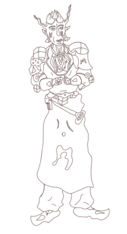
Once I had worked through producing the sketch of this new character design I made a new layer overlapping the previous and drew neater lines over the sketch so that I have a solid outline for this art piece and in this process I have also added in extra variants of detail which can be seen along the upper body with a similar construction process that I have utilised in the production of my previous art pieces. After completing this structure I took a closer look at the areas of the art piece that I found to be the most conflicting and inconsistent in the way that they have been designed and two areas that I want to look at in greater detail are the arms, hands and shoulders as at this moment they do not look well structured and could do with some more time spent on developing them. One final area that I would also like to look at further is the lower body as the cape and feet do not look as well as what I can make them appear to be and so I will need to work on this area to get the best outcome possible for my art work.
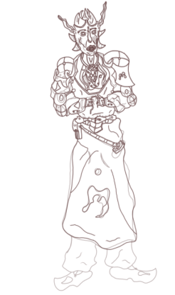
After producing another layer and stacking it over the previous one featuring my original line art I have used this session to produce another draw over with a new set of line art and this time I am making edits to the areas that conflicted with the rest of the design with one area being completely changed which is the satchel strapped to the cape as previously it had a very awkward design that did not suit the drawing and so I have refined it and changed to a more satchel like structure that is more sensible and well suited to be presented. Since my final art piece is of a mutated priest I have made the decision to make the hands appear more janky and mutilated with one at this moment looking as if it has been amputated with stumps protruding from the sides. Although this design for the hands is looking better than the previous I would still like to get a better outcome in this area and so I will return later on to have another go after refining the rest of the design. For the arms I have made use of the previous sci fi fantasy modules present on the arms of my previous two art pieces and these fit in well with this design as they take up a good amount of negative space and present a less conflicted presentation of my drawing and so I am now happy with the way this part of my character has been constructed. For the face I have made changes to the design of the mouth and it now looks more vicious due to the inclusion of fangs which is a key element of designing a humanoid monster due to the way it allows the viewer to identify them within the theme of the product. For the shoulder pads I have given a similar design to both though you can still tell the two apart through slight differences in detail though this is what I was aiming for as it makes the character look more rugged and outlandish if they are wearing different items of clothing that do not match with one another and seen on the open space is the vampiric symbol that was previously located on my most recent turn around. At this time I have not moved onto the feet as I have been struggling in this area to get the structure right and it is not my inability to draw this area that is hindering me but my own wish to have this area stand out more instead of looking identical to the Vampire turn around that I have recently finished working on and so I am going to be spending more time on this part of the monster so I can achieve a unique appearance that fits in with the illustrated stance of this character whilst also applying any necessary finishing touches to the line art.
Once I had improved the shoulders and arms to an outcome I was happy with I have since moved back to the face to focus on further developing the eyes and eyebrows as in the previous image they did not suit the design at all and were very conflicting for the final product and so I have changed the presentation of the eye to make it more of a slit that will be noticeable for the viewer and add further personality to this art piece which I will do by adding in a Red texture to draw it out. For the eye brows I wanted to be able to fill them in with a texture and so I have made them into a janky rectangle that now forms a V above the eye and with these areas revitalised I can now move onto implementing the finishing touchers for the line art of this character design.
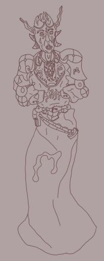
In this image we can see that I have now applied the finishing touches to this character whilst also changing areas of the design, one of these areas is the legs as previously I outlined my issues with the design flaw in this are and so I have decided to have the cape overlap it entirely which I believe was the right decision to make for this part of the art work as it fits in well with the posture of the character and focuses the viewers attention towards the upper body which is where most of the dominant detail is focused. The inclusion of the cape also gets rid of a conflicting area within the design one that I would have struggled to apply a texture to even if I were to successfully construct it. For this design I have also rectified the conflicting arm design that can be seen up in the previous image and the way I have overcome this is by reflecting on the name of the character mutated priest and allowed it to influence the design of the hands and so I now have a janky and jagged appearance of the hands which are seen as disturbing present the priest as if they are in great pain due to the unnatural contortion I have applied to them. On the arms I have also added in the sci fi modules which were seen on my previous art pieces and including it on this design helps to present how important these are in the world where they exist and it also helps relate all characters to one another as they now each have one thing in common. The Vampiric symbols have also been included on this priest presenting them as one of great importance within this order with the dominant symbol present on the cape to take the negative space located there. On the neck area I have also limited the detail and made it less convoluted and simplified it to a series of patterns that will be much easier for me to texture which is what I will be starting in the next session.
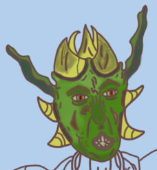
Starting off with the texture for this final art piece I have began with the face beginning in this area I started off with applying a base texture to the face which was a light green tone and following after this I have then worked on applying detail to these areas with the center of the face featuring the nose and area above the mouth I have made use of the mixer brush to apply a darkened tone to this area and to the side I have used a silver tone and blended it in with the forehead and side of the face to reflect the illusion of light. For the eyes I have given the pupil a red tone to make it stand out as more menacing and evil with the area surrounding the pupil being given a darkened yellow texture to help connote the evil stance of this character design. For the horns I have used a yellow/cream like texture to give them that aged appearance as well as stand out as suitable for this art piece and to apply some extra detail I have blended in a darker tone to make these horns look worn down and beaten with some cracks drawn in with a darker blue colouring. For the head I was aiming towards making use of a green colour scheme that gives the character an orc like appearance as well as make them appear sickly with an unnatural appearance and with the way I have textured this area of the design I am happy with its outcome and will be returning to add highlights and mid tones to bring it out some more than its current state.
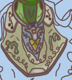
Working down from the head I have now applied the texture to the lower neck area and for the area of skin on the neck I used the same technique I made use of during the creation of my Vampire turn around which has involved me giving the skin a silvery overtone and blending in a shadow with the center of the neck to give off a more realistic appearance. Previously I spoke of removing some detail from this area of the design due to the convolution taking place and with that rectified I found a much easier time of texturing this part of the design which involves a base colouring of a white/cream tone which is a colour scheme I would like to use for the other areas of clothing on this design as I believe it will help connote their presence in the theme as a priest as it is a fairly neutral texture scheme and so I will be using it throughout the rest of this development process. Besides the cream texture I have also applied the cosmetics located in the center below the collar with a blue and golden tone with a silver coating that helps to give it that graphical and grainy like appearance. The vampiric symbols are once again present on this part of the drawing and have been textured using a dark green with a silver tone once again similar to what I have done on my Vampire turn around.

After applying the texture to the area beneath the neck I have worked on the clothing that is attached this cosmetic piece and so for this part of the design I went with the usage of my white/cream texture that fits in with the previous scheme painted in the above image and to improve on this area in the next phase I will be mixing some more tones in with it and as of now I have successfully applied a shadow to the lower area that is present just above the belt which suits the realistic lighting of this character.

Moving on from the center mass of this character I am now working on applying the texture to the arms and for this section I began at the shoulder pads where I have utilised a brown and cream texture which I have created after blending multiple tones of colour together with a red dot in center of these assets and once I had completed painting this area I finished it off with a highlight from the colour dodge tool to make it seem more lively and polished. For the Arms I tried to go for a similar look that was presented on my vampire turn around and so I have added in a pink shine to the armour with some symbols that represent the order this priest belongs to and once I had finished this procedure I then began blending in lighter tones to give it that fantasised presentation. Moving on to the arms I have used a darker texture than what was painted onto the body and this was done to prevent any inconsistencies between these two areas and for the modules present on the joints of the arms I have given them a dark grey texture with the connecting strap a medium red and to finish off this area I will be blending in multiple tones together to get a suitable appearance that will fit my character well.
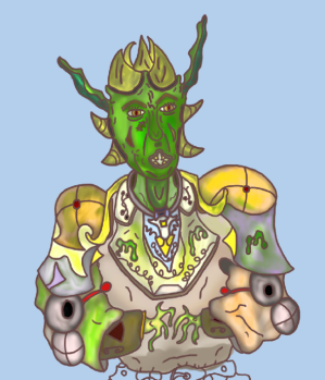
After mixing in colours together on the arms with the creation of a silvery tone I then made use of the paint overlay function to give some more detail to this section and give one of the arms a mucus like sickly texture that looks as if it is dripping off of his arm which I decided to do as it gives more atmosphere to this character and fits in with them serving a role as a mutant. With the green paint overlay I have also added in textures to the upper body to draw out a more refined appearance for this concept. Moving on to the hands I made use of the same colour scheme I painted with earlier which has allowed the skin on the hands and face to remain the same tone with a few different highlights but overall looking as if they belong. To finish off the upper body I have also added in more highlights such as the face which gives the appearance a more detailed and characteristic presentation.
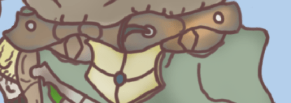
With the upper body now fully textured I can begin to paint the areas making up the detail on the cape area which I have assigned to the layer titled “lower body” to differentiate the two areas and allow me total control. Starting off in this area I have began texturing the belt which started out with a mid grey tone and then a brown highlight using the dodge tool with the belt holes being textured white and the belt lock a dark green. The under area of the belt with the cosmetic feature at the front has been textured a cream white gold colour which I created through the process of blending the two schemes together to grab a suitable appearance for this area of my design. With this belt complete I can now see that it fits in appropriately with the design and remains consistent with what I had envisioned for this section of my project that makes up the character design of my mutated priest.
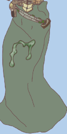
Moving on the to cape I first worked on implementing the base texture which was a light green tone which I have applied to the entirety of the design and for the symbol in the center I have given it a silvery tone once again blending colours together to get the necessary appearance I outlined in my previous designs. For the bandolier attaching the satchel to the cape I have designed it in a similar way to what you can see on the belt and this was done to implement a correlation between these two areas whilst the capsules present on the bandolier have been painted with a dark green to make it seem as if they possess a foreign substance inside them. For the satchel I have given it a dark appearance to make it look as if it has been constructed from a leather like material which I figured would be the most effective way to make this area of the design stand out in the most efficient way.
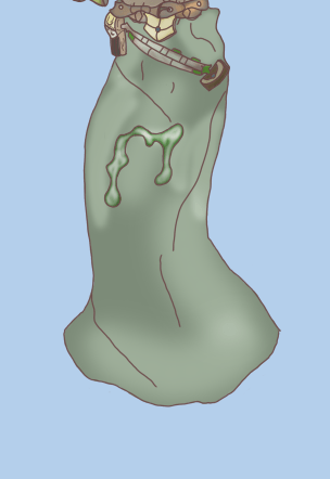
To finish off this character design I worked on applying highlights to the lower body area of the art piece and the way I did this is by making use of the colour dodge tool and implementing it on areas where I wanted to include lighting such as where I have shown the creases in the line art. Implementing a series of highlights has been done to add more detail to the character and present them in a fashion that makes it seem as if they are being acted upon by an outside force in this case it is the lighting and so add this in the lower body area of the design in the same way I did the upper body has helped me to get a more solid conclusion to this product and now that I have fully textured it I can begin to work on developing the presentation boards for my project and submitting in time for the final deadline of Order & Chaos.
What did I find difficult or easy?
During this weeks sessions my main struggles were encountered during the design of my poster which is one art piece that I would like to have had more experience in creating before getting to work though besides this I am very happy with my additional art pieces presenting my character designs. An easy task this week was designing my final art piece which is the mutated priest that originally was not included as part of my project outline but is one I decided to include as I felt it would help to branch out my project some more with an additional final art piece and this product was easy to complete as the procedure for designing it was simple and I worked my time effectively which has led to me remaining on track and with the deadline approaching I am confident I will meet it on time.
What tasks didn’t I complete from this week?
This week I have been unable to work on my presentation research due to my focus directed towards the final product and one area that I am also yet to complete is setting up the final presentation of my art work for the exhibition.
Planning for next week:
How do I plan to catch up? Do I need to change anything about my work or planning?
To catch up I will be focusing my work next week to producing my presentation research with my exhibition boards and then setting up my final products for the exhibition and ensure that they are presented professionally before the final deadline hits next Friday.
Week Number & Date:
Week 12 04/05/2020
List of tasks for this week:
Finish Presentation research showcasing ideas for how to set up work
Present final Product
Current Position:

Working back to my presentation and exhibition research I have laid out my experiments in a way that will allow them to be presented effectively for my audience to be able to view each of my art pieces in an organised manner that connotes the theme of my project that I originally outlined in my proposal brief. After producing the presentation board layout I have then uploaded it to the exhibition research section of my blog where I have outlined the reasons as to why I have presented these boards in the manner I have and what I used to set them up appropriately on the canvas. I have also stated what I like about these exhibition board layouts and what effect they have on the viewer through the way in which the work is presented.

Returning to the poster that I have created I found myself disliking its current state as it looks very bland and does not have a polished feel to it as its present appearance does not connote a consistent presentation and so I have decided to return to this art piece and make some final touches which will involve me removing some areas and editing others so that I can get a more professional feel to this art piece and so to start off with this refinement process I have gone onto the site pinterest and selected an image featuring a portrait of a vampire which was produced by the artist featured in the following link :https://www.deviantart.com/adlovett/about#about. What I aim to do with this image is to use the tools present on photoshop to edit this image into a suitable background piece for this poster and the inspiration for this procedure has come from the recent concept art production live stream that was shown in the announcement stream for the new Assassins Creed title where the artist used photobashing skills to blend and manipulate pre existing photos into a professional conceptual art piece and so for my poster I will be going through a similar process though I will keep it relevant to the theme and not go over board with all the potential features I could implement into it.

After importing the image onto photoshop once I had saved it off of pinterest I then worked on removing the background which I began through the process of utilising the polygonal lasso tool to remove the black background from the Vampire Portrait though after completing this process I was left with some sharp edges and areas of black that remained on the art work and so to fix this I made use of the lasso tool and went over the areas that featured these issues and made the necessary improvements though this did not fix my problem with the sharp edges and so I selected the smudge tool to smooth the areas out and add a little blur to them which has removed the sharp edges and allowed it to appear less rugged. Now that this has been completed I can work on transferring the artists edited piece into my posters document and implement in an effective way there.

After transferring this image over onto my current poster document I then hid the other layers so that I could focus directly on this image and edit it the way I desire. To give it the most effective appearance I have placed the artists portrait directly at the bottom of the stacks so that it would appear behind the other dominant features and to give it an effective presentation I have made a number of edits to this portrait such as scaling it to a more suitable size for the presentation of my art work and then darkening the canvas by making use of the hue/saturation options box and once this was achieved I then went over the face and areas of the neck with the dodge tool to add in a fire scheme highlight and I have focused this on areas like the eyes, forehead and the collar of the outfit that they are wearing. This was done as it gives the art piece a more sinister appearance and provides them with that more chaotic appearance that fits them more into the theme. Previously in the development of this poster I have added in my own personally made features and two of these were strands that I sketched in to act as symbols of the Vampiric order and seen in this phase of the development I have edited the positioning of these features where I have now placed them at an angle on the inside of the collar that now act as cosmetics of the image and have allowed me to blend in my own assets with a pre existing image that I have blended them with.

After adding in the necessary highlights and transferring the image onto my canvas I have now arranged it in a way so that it appears behind all other features on this poster and this was done due to my wish to fill up more background space as well as implement an imposing feature that will grasp the attention of my audience and with the darkened background the cloudy shadowing I have painted around the outline blends this manipulated image in well with the pre existing background produced during the earlier phase of this project. The highlighting procedure focused primarily around the eyes and forehead area of the image as these are the areas that I want to be the most noticeable for the audience and the lighting on the forehead was also done due to the presence of the moon in my poster which casts a light down onto this painting adding in more atmosphere to this piece as it implements the illusion of the moon directly effecting the flow of the scene. For the skull that I have created I made the decision to include it in the top left corner and add a noise field around it using the blending options box to give it that particle like effect and for the moon I have used a drop shadow tool to implement a very light red shadow over this asset to give it that blood moon like appearance. Once this was done I then moved onto the text layers and edited their appearance using the Bevel & Emboss functions present in the blending options box which has given them a more effective presentation whilst the glow helps give them a more relevant appearance due to the presence of the shadows in this scene. To finish off the poster I used the brush tool to select a natural texture brush and painted some leaves at the bottom which gives off a more unique presentation for this poster. Returning to this part of my project and performing a touch session was well worth it as previously I was unhappy with my work as I knew I could do better even if I was struggling at the time with motivation and so after thinking back on viewing the live stream featuring concept art production and taking note of the photobashing techniques showcased I was influenced to add more to this poster and make it more solid and ready for presentation and whilst not perfect I am far more happier with this version of the poster due to it being vastly superior to what I previously created.


Before the final deadline hit I returned to my products and made the final adjustments necessary to ensure they are ready for presentation on the show reel which will be taking place of the exhibition this year due to the college closure and to achieve this I created a new custom canvas on photoshop using the dimensions of 42 by 23 centimeters and then transferring the art work across and scaling it appropriately, in doing this I have also applied the same gradient to the art work as used for the exhibition boards as this was a background that I was happy with and with these new documents produced and saved they are now ready for presentation on the games dev show reel.
What did I find difficult or easy?
A task that I found easy this week was finishing up the production of my presentation research as this required me to perform a very simple task of setting up an experimental exhibition layout using basic knowledge of photoshop. Another task that I found easy was the touch up of my poster which is one area that I am glad to have returned to as before I had done this it was presented very poorly and so using photobashing techniques and a pre existing image I have blended the poster together effectively and it is now more relevant to the theme of the project and suits the atmosphere that I have presented it in.
What tasks didn’t I complete from this week?
During this weeks sessions I have managed to complete all tasks that I have set myself which included the final production of my project as well as ensuring that everything was presented effectively and set up all prepared for the show reel and online exhibition.
Planning for next week:
How do I plan to catch up? Do I need to change anything about my work or planning?
At the moment I am on track for this final major project and to start off next week I will be beginning the final evaluation where I will outline the workflow I went through and delve into greater detail about the decisions I made and how I feel about the outcome of this project.
Week Number & Date:
Week 8 30/03/2020
List of tasks for this week:
Current Position:
What did I find difficult or easy?
What tasks didn’t I complete from this week?
Planning for next week:
How do I plan to catch up? Do I need to change anything about my work or planning?
